Loading...

Wednesday, March 12, 2014

R: World Wheat Production Part II, Linear Filtering and Regression Forecasting


Hello Readers,


Today we will continue analyzing the wheat production and harvest area data from the Food and Agriculture Organization of the UN. In the previous post, we imported the data from Data Market and proceeded to plot the production quantity and harvest area time series, reproduced below:


With the wheat production increasing more than the harvest area over the years, we also plotted histograms to track the lag of the log of wheat production. We noted that the mean difference were, as expected, above zero.

Next we move on to model the time series single component of trend in the wheat production in R. We will not focus on the Harvest Area series because it does not fluctuate like the Production Quantity series, as seen above. Let us get started.


Linear Filtering


Now that we have a good grasp on the wheat data, we can model the time series to find a trend. A time series is usually decomposed into multiple components: a trend, a seasonal component, and a remainder component. One method to accomplish trend discovery is by using linear filtering with moving averages and equal weights. Each element of the time series X is filtered through average a, such that X-a to Xa are multiplied by coefficients (1/(2a+1)). For example, with a filter of a=2, for an element Xn, sum of the previous two and next 2 elements and Xn, are divided by 1/5, as 1/(2*2+1).


In R, we model the trend component with the filter() function, and specify the coefficients. This allows us to plot the trend with different moving averages of 2 and 10 over the wheat production quantity time series.

Plotting Wheat Production with Moving Averages
Below, we can observe the moving averages of 2 and 10 overlaying the Production Quantity time series.


Note that the red moving average 2 trend line more closely follows the fluctuations of the time series than the green average 10. Why? Because the moving average = 10 takes the average of the last and next 10 for that series element. 


So the green trend line incorporates more values in calculating the moving average (a=10, n is 21; a=2, n is 5) than the red trend line. Therefore green trend line is smoother and depicts a trend covering a longer time frame than the red trend line, which shows the average over a shorter time frame, thus fluctuating more with the wheat production data.


Time Series Decomposition


Now that we have covered the trend component, we turn to the next component, seasonal. The seasonal component attempts to capture the variation within a time frame, usually a year- so that the fluctuations between the seasons or quarters, are captured. However, for our wheat data, we only have yearly measures in the time series so seasonal decomposition will not be possible. There are no data points within each year to determine seasonal variations.


But do not worry! In the future, we will cover additional time series data sets which do have multiple measures through each year, enabling us to perform the seasonal decomposition. The posts will be linked back to here.


We can model the time series further by using regression.


Regression


We covered linear regression with chemical predictors in this post. With our wheat time series, we can use the years as the predictor to determine coefficients to fit a trend for the log of wheat production. The equation is modeled as follows where
t is the years variable:

log(wheat) = a0 + a1*t + a2*t^2 + e


log Wheat Regression
Evaluating the model summary, we see that both t and the squared term, t^2, are both significant in predicting the wheat production time series. Next we plot the fitted regression line over the wheat time series to observe the fit.


Plotting Wheat Regression
Look how well the red regression line fits wheat production. Not to shabby, and the R squared value confirms this, at 0.9798, which means nearly 98% of the variance is captured by the regression model.


However, the regression model is based on a parabola equation, with the t^2 term. So it appears that the continuation of the log of wheat production in fact decreases according to the regression model. Let us plot the prediction forecast for the log of wheat production to year 2020 based on our model.


Plotting log Wheat Production Prediction
We create a new data.frame with the two t terms from 1961 all the way to 2020 for the prediction data points. Then using the predict() function, we obtained the predicted values from the regression model for log of wheat production from 1961 to 2020 in wheat2.lmp. Next we transformed the wheat2.lmp into a time series and we plotted it with the log of wheat production time series:


And yes, the prediction does curve down! From the available data and quadratic regression model, the log of wheat production was modeled to be parabola-like. Thinking logically, wheat production should not decrease in the near future due to rising demand from the increasing world population. The regression model we have fits the wheat data we used to generate the model. 

In this case, it is difficult to forecast the model to future years using stl() because there is no seasonality in our data points (no seasonal decomposition here). By only using yearly points, we can only predict the trend. Here is a recent post with seasonal decomposition of Amazon stock prices.

In the future, take note of the time resolution of your time series data. If it lacks seasonal data points, it will be more difficult to forecast accurately by only relying on the overall trend.


One More Regression Model


Let us consider one more regression model based on the wheat production, rather than the log of wheat production. The larger values in log of wheat production actually correspond to higher values in wheat production, and the scale of the differences are much larger. So there is a possibility that the higher values in log production were closer together, resulting in a highly parabolic model. 

Using the regular wheat production numbers might alleviate this issue. Below we model the linear regression model with two terms, and plot the log prediction and the wheat production over the predicted wheat production time series.


wheat[,2] = a0 + a1*t + a2*t^2 + e


Wheat Production Regression Prediction and Plotting
By plotting both the log wheat predicted production and wheat predicted production, we can see which models the time series better into the future.


We see the regular regression through the red line, extending outwards but not quite decreasing (yet) by 2020. This is more reasonable than the prediction from the log of wheat production in blue, where after 2007, the predicted production drops. However, this is far from the finished model, and as more production data from subsequent years are obtained, those points can be added to the time series and enable us to predict the production in the near future better than without most recent data.

Through 2020 is where the model begins to break down (the log model begins at 2007), so with further data points, we can extend the forecast corresponding to the number of yearly data points we add.

Stay tuned for more time series in R!


Thanks for reading,

Wayne
@beyondvalence

Sunday, March 9, 2014

R Time Series: World Wheat Production and Harvest Area, Part I


Hello Readers,


Welcome back folks. Today we will revisit time series through the lens of World Wheat Production Quantity and Harvest Area. I recently discovered a data repository called Data Market, which has data sets by industry, country, and other various topics and sources, including the United Nations.

This particular data set on wheat was provided by the Food and Agriculture Organization (FAO) of the United Nations. This UN organization helps developing and developed countries "improve agriculture, forestry, and fishing practices, and ensuring good nutrition and food security." They are headquartered in Rome, Italy.


*Tasty Wheat*
The world produced 651 million tons of wheat in 2010. The cereal grain production was behind maize (844 million tons), and rice (672 million tons). Wheat is the leading source of vegetable protein in human food, and also the trade for wheat surpasses all other crops in the world combined.

So wheat is an important crop, and many of us eat some form of that cereal grain everyday, whether it be as bread or cereal product. So let us start number munching!


Getting Wheat from (Data) Market to R


Many data sets exist on Data Market, and with a quick search, we can find our wheat production data. I found the wheat data sifting through in the Food and Agriculture Industry under the Crops header, shown below.


Food and Agriculture Industry
Here it is, and after scrolling down and clicking explore, we arrive at the wheat data page. Make sure to select "Area Harvested" in addition to the "Production Quantity" under "Element/Unit". Multiple formats are available for download under the Export tab. I used the CSV format separated via commas. Choose a file format with which you are familiar.


Wheat Harvest Area and Production Quantity

Now that we have the wheat CSV data, we can import it into R and begin the analysis.


Wheat Data


We saw what the data looked like online, and we would like to reproduce it in R. Let use plot the wheat time series data.

First read in the CSV file, and now we have 3 columns with 48 rows of data. The first column in wheat denotes years, the second- Area Harvested in hectares (Ha), and the third- Production Quantity in metric tonnes. Note the last row. It is a comment-NA and we need to remove it. Also, let us specify the beginning of the time series at year 1961 with 1 measurement per year. 

We can do all this by selecting the elements of wheat to convert into a times series object. The first column is not required and the 48th row needs to be excluded, which gives us wheat[-48, 2:3]. The time units are described as starting in 1961, with 1 measurement per unit time.


Reading in Wheat CSV
Now we can plot the wheat data with plot(). First plot the Production Quantity in the second column of wheat, then add the Harvest Area in the first column with lines(). The default x axis tick marks only print by decade so I specified a custom x-axis with axis() and the pretty() function for aesthetics. It is a useful function for axis customization, along with legend() to clarify the plot lines.


Plotting Wheat
And below we have the world wheat production in tonnes (metric) and harvest area (Ha) graphic. Observe a general trend upwards in wheat production over 47 years, with a relatively stable harvest area. It appears that the amount of wheat produced per area has increased dramatically over the years.


Wheat production in 1961 measured about 222 million metric tonnes and in 2007, it had increased to over 600 million metric tonnes. Surprisingly, the Harvest Area remained relatively stable from 1961 at 204 million hectares to over 214 million hectares in 2007.


Perhaps this relationship would be better visualized in a plot of the ratio of the two series. Take the the production series and divide it by the harvest area to obtain the ratio.


Wheat Ratio Plot Code

Observe the ratio close to 1.09 at 1961 and rising to around 2.82 in 2007. This is a 260% rise in wheat production efficiency per hectare over the 47 years.


Those figures are obtained below by dividing the ratio from 2007 by the ratio from 1961:


Wheat Production per Hectare


Time Series Distributions of Wheat


Before we dive into any time series decomposition, let us look at the distribution of wheat Production Quantity and Harvest Area first. Since the tonnes of the wheat produced and hectares used number in the hundred millions, we will make the production quantity and harvest area more manageable by passing it through the
log(). Then we plot the differences between each measurement with diff() to see how the time series elements differ from each other.


Plotting Wheat Distributions

The abline(0, 0) simply adds a line y=0 to designate no difference between points as a reference.


Most of the distribution for Production Quantity (red) lies above y=0, indicating that the differences between each element are mostly positive, and the over all trend of the time series is increasing more than it is decreasing. On the other hand, Harvest Area differences do not appear to lean towards either direction, and is more stable than Production Quantity. These observations are confirmed when looking back at the Wheat Time Series Plot.


Distribution Histograms


Another way to visualize the distributions is with a histogram. First, we plot production quantity with hist() and specify that it plot the probability density. Next we overlay the probability density line to show how distribution of probabilities on the histogram. Then we assume the differences follow a normal distribution so we calculate the mean and the standard deviation from the differences of the log of production and plot the parametric normal distribution over the histogram as well.


Histogram for Wheat Production Differences
Below we can see the rendered histogram for the differences of the log of wheat production with the density estimate and the normal distribution with production quantity parameters. According to the normal distribution, the mean lies above 0.0, indicating increasing successive production quantity values.


We can observe the more stable wheat harvest area distribution with the same code, only modified for column 1 of wheat, and different colors in the histogram.


Plotting Wheat Harvest Differences
Here we have a more balanced histogram of harvest area distribution, with both the estimated density and parametric normal distribution means above 0.0. This, again, shows that the wheat harvest area stayed relatively more stable over time than the wheat production quantity.


After analyzing the distributions of both wheat production quantity and harvest area, we have a better grasp of the wheat time series data. Now we can move on to time series decomposition- in the next post! (Had to cut this post here; it was getting too lengthy.) 

So stay tuned, and stay curious!


Thanks for reading,


Wayne
@beyondvalence

Thursday, March 6, 2014

Sochi #Olympics and #Crimea Tweets in R (and Justin Bieber?!)


Hello Readers,


With the 2014 Olympics in Sochi over, we can reflect upon the social media coverage in the Olympic Games. What were Twitter users tweeting about that involved #Olympics during the games? And read on to see how Justin Bieber pops up (I was confused/surprised too).

In other news across the pond, if you have not been stuck in a cave recently, you might have heard about Russian forces 'occupying' the southern Ukrainian island of Crimea. And here is a series of informative satellite images of Crimea and military force disposition around Ukraine. We will see what Twitter users are talking about concerning #Crimea.

The twitteR package in R has many interesting features which we will use to query tweets from the newly modified Twitter API. So be sure to double check your unique consumer and secret keys, though they should not have changed. Also verify that the URLs used in the OAuth generation includes https://, and not just http://. 

Let us see what Twitter users have been tweeting about the Olympics and Crimea. Onward with text analysis!


Querying Tweets


In previous posts I covered retrieving tweets from the Twitter API, and transforming them into documents to be analyzed. So here I will simply show the R code,  beginning with establishing a handshake with the Twitter API (use https:// with recent changes). 


Setting Up OAuth

During some of the times I queried tweets I found that the number of tweets returned from the API varies from 25 to 199, even if n was set at 300. A way around was to query multiple times and join the resulting tweets together. I had no problem with the Olympics tweets however, but they were queried weeks ago during the games.


Give Me More Tweets!
For the Olympics tweets the code would simply be:

olympics <- searchTwitter("#Olympics", n=300)


Text Transformations


Next we would convert the lists to data.frames, and then to a text corpus. After they are in a text corpus, we can transform the text so we can query the words effectively. The crimea.c transformations similar to the olympics.c so they are omitted.


Raw Lists to Transformed Text Corpus
Now we are ready to normalize the text so that we can count their frequencies, and turn them into term document matrices.


Word Stemming and Term Doc Matrix

From the term document matrix, we can calculate the frequency of terms across all tweets. For example, from the crimea.tdm tweets, we can print the words occurring more than 20 times:


High Frequency Words in Crimea Tweets

The next step would be to visualize these frequencies in a word cloud. #Olympics is up first.


#Olympics


In a previous post, we created a word cloud visualizing words from @nbastats. Here we shall do the same for the trend #Olympics.


Creating a Word Cloud

And here it is!


#Olympics Word Cloud

We see olympics, gold, sochi, and other strange terms such as jeremybieber (what!?). Who is Jeremy Bieber? An athlete? I had no idea, so I Google searched him, and he is definitely not an athlete. Apparently he is the father of 'notorious' pop star Justin Bieber. Some celebrity drama was unfolding during the Olympic Games and people flew to Twitter to comment. But it was weird (for me anyways) that music celebrities would be included in the same tweet tagged with #Olympics.


Upon more digging with Google, I found possible reasons: ice hockey and Canada. So the Beibers are originally from Canada and many Justin Bieber 'haters' want him to go back to Canada. With the American and Canadian hockey teams facing off at the Olympic semi-finals, this billboard popped up in Chicago:


Loser Keeps Bieber
So there was the cause for all the hullabaloo on Twitter. Unfortunately, so the 'haters', Justin stays because the USA men's hockey team lost to Canada's team 1-0 in the semi-finals. I could not make this up.


#Crimea


For Crimea (Bieber is not Ukrainian too, is he?), the word cloud code is the same, except change the *.tdm to crimea.tdm. And here is is:


#Crimea Word Cloud

We see many terms which associate with Crimea, such as ukraine, russia, putin, referendum, kiev, and etc., and also some Ukrainian terms as well- kyiv (Kiev, the Ukrainian capital). The majority of people in Crimea are Russian, while many in Western Ukraine are Ukrainian, wanting to join the EU. Crimea previously held a referendum for joining Russia in 2004 and would held another one today March 6th, 2014. The local lawmakers in Crimea voted unanimously in a referendum to join Russia, and would hold a regional vote in 10 days. For a video on the history of Crimea/Ukraine/Russia, click here.

I thought the terms in #Crimea were more logical and politically relevant than terms in #Olympics, although it was amusing to see Justin and his dad mentioned.

___________________________

Hopefully this post shows you how Twitter keywords or trends can be analyzed and visualized, especially when current events are concerned. It is near real-time text data of what people thinking about, and it is easy to analyze the tweets using R. Stay tuned for more R posts!


As always, thanks for reading,


Wayne
@beyondvalence

Monday, March 3, 2014

RSA Encryption and Decryption in R


Hello Readers,


This post will delve into RSA encryption, discovered by Ron Rivest, Adi Shamir, and Leonard Adleman in 1977. However four years prior, in 1973, English mathematician Clifford Cocks already discovered the method but it remained classified until 1997.


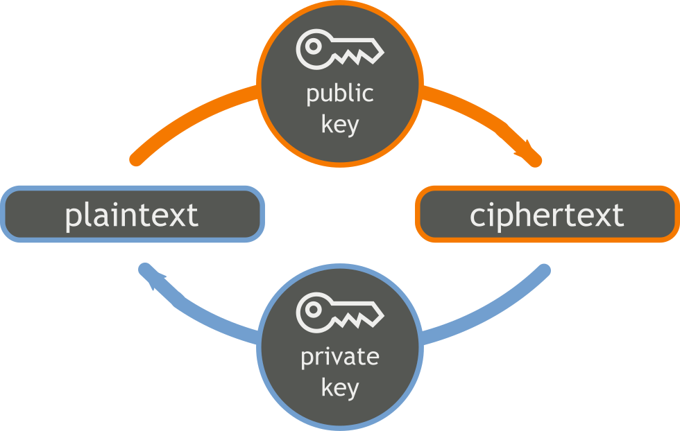
Public and Private Keys


The RSA cryptosystem was one of the first public-key systems widely used for secure data transmission. Let us use a bank as an example. For secure transfers, the bank makes a public key available to bank users to encrypt their banking data, instead of giving each user a separate independent key. This streamlines the amount of data the bank handles, and occurs in the background when users accesses their online accounts. The bank holds the secret private key, which can decrypt the encrypted data to verify the user identity. Even if a malicious third party obtains the encrypted data and has the public key, the lack of the private key renders the decryption unfeasible through brute force.

RSA is considered an one way function, where the encryption is simple but the reverse, decryption is fairly difficult and/or time consuming. (Here's one ingenious way to crack the algorithm.)

Let us see how to accomplish this one way function in R.


Generating Public and Private Keys


First, we need to figure out how the one way function works. We require two items: prime factorization and a function that depends on it. Euclid discovered that any integer has one set of prime factors. This is important because finding prime factors takes exponentially more time than multiplying equally large numbers. 

Euler discovered the phi function where the phi of integer N gives the number of integers less than N which does not share any factors with N (so phi(8) = 4). Finding the phi of prime numbers is relatively easy as the prime N is the only similar factor, so the phi of a prime number is simply prime-1. It follows that the phi of the product of 2 prime numbers is simply phi(p1*p2) = (p1-1)*(p2-1).

Connecting this together is Euler's theorem with a and n co-prime integers, a ^ phi(n) is congruent to 1 (mod n). We can use two prime numbers in our phi function to create a difficult code to break unless the user knows the prime numbers, due to the difficulty of prime factorization. Since we pick the prime factors first and multiply them to obtain the public key, it is relatively easy for us.


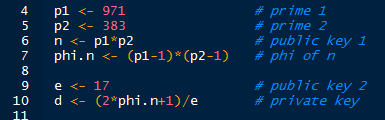
To continue the process we need to create an exponent involving phi. We pick an arbitrary public key e, whose value is less than n, and is coprime with our pre-specified prime factors. This will be our encryption exponent. Our private key, d or decryption exponent, will be (2*phi(n)+1)/e. This is the result of manipulating Euler's theorem so that a ^ 2*phi(n)+1 is congruent to a (mod n).


a ^ e is congruent to c (mod n), and converting c back to a, we use c ^ (2*phi(n)+1)/e which yields a (mod n).

Some sample values are shown below:


Sample Values


Calculating the Modulus


Right off the bat if we try to find the remainder of 5^55 mod 221, we see that R gives us a warning message because the numbers are so large. Just look at 5^55! 38 zeros! There has to be another way of calculating the modulus.

Warning!
Well one way to calculate it would be to break down the exponents by looping through the iterations and finding the modulo at the end. With a sufficiently small a1 value, we will avoid numbers larger than m^2. We iterate through the exponent while keeping track of the current modulo.


Modular Algorithm
Here is the result, at the end of 55 iterations:


Success! 112
We see that the modulo is 112. Now that we have the methods to create RSA encryption and decryption.


The Encrypt Function


For these following functions, we will use the sample values as shown again below.


Sample Values
As we recall, we have the public keys n and e and we have a integer message, msg. Remember that our very large n was generated from 2 prime (secret private) integers. Say msg is 89 for 'hi' in alphabetical position. We iterate through e times finding the modulo and carrying it over until the last exponent iteration. Then the function returns the encrypted message.


Encryption Function
Let us see it in action.


Encrypted Message, 154827
We receive an encrypted message of 154827. Now to decode the message using our private key.


The Decrypt Function


Keeping in mind the sample values, they are posted here again.


Sample Values
To reverse the process, we raise the encrypted message by d, which is (2*phi(n)+1)/e. We iterate through the same process like the the decrypt function.


Decrypt Function
Let us see the decrypt function at work, using our secret message, 154827.


Decrypted Message, 89
There it is! Our 89 is returned to us, and using the simple alphabetical cipher, we get 'hi'. 

Note that we used the private key to decrypt the message. Someone with the public key would be hard pressed to factorize the large n into prime factors: in 1999, a 512 bit, 155 decimal digits, factorization was performed in 6 months- quite a long time! The current record is 768 bit integer factorization in 2009, taking 4 years.

Gmail and Facebook use 1024 bit encryption and Twitter uses 2048 bit (many upon many digits). Here is a video on YouTube about RSA.

Hope you guys liked this scenic detour from data analysis and into cryptography. Stay tuned for more R!


Thanks for reading,


Wayne
@beyondvalence

Thursday, February 20, 2014

R: Partial Least Squares Regression, RMSEP, and Components


Hello Readers,

Here we will continue our R regression series and after working with ordinary, and robust regression, we will address partial least squares regression. Using the same chemical descriptors data set, we will predict solubility of compounds with a different approach of looking at the predictors themselves and how they relate to each other. 

In many data sets, the predictors we use could be correlated to the response (what we are looking for) and to each other (not good for variability). If too many predictor variables are correlated to each other, then the variability would render the regression unstable.

One way to correct for predictor correlation is to use PCA or principle component analysis which seeks to find a linear combination of predictors to capture the most variance. The jth principal component (PC) can be written as:


PCj = (aj1 * predictor 1) + (aj2 * predictor 2) + ... + (ajp * predictor p)


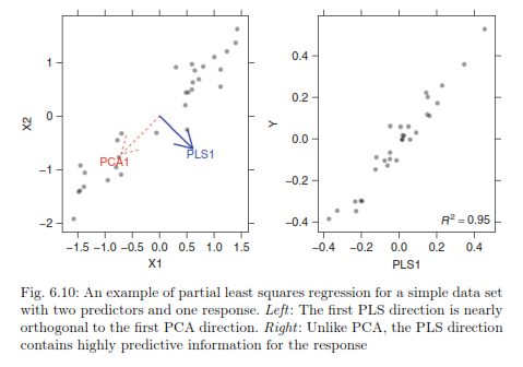
However this method does not always produce a PC that correlates with the response variable as shown below:


From Max Kuhn's Applied Predictive Modeling

Whereas using partial least squares regression, we see that it is correlated with the response variable.


From Max Kuhn's Applied Predictive Modeling

So start R and let us look at partial least squares regression!


Partial Least Squares


PLS regression, like PCA, seeks to find components which maximize the variability of predictors but differs from PCA as PLS requires the components to have maximum correlation with the response. PLS is a supervised procedure whereas PCA is unsupervised.

First we require the following R packages, specifically the
pls library:


R Packages
The Solubility data from the AppliedPredictiveModeling package is summarized and transformed in the ordinary regression post.

In the pls library, we will use the plsr() function for partial least squares regression. We specify the response variable as solubility, use all the predictor variables with a ".", and include cross-validation parameter as "CV".


plsr() and Prediction
With the familiar predict() function, use the plsFit list object which contains the predicted values for each component iteration of the PLSR algorithm, with default set at the Dayal and MacGregor kernel algorithm "kernelpls". We predict the first 5 solubility values "solTestXtrans[1:5, ]" using 1 and 2 components "ncomp=1:2". The results are shown below.


Solubility Values for 1 and 2 Components
But how do we know from what number of predictors to choose? Well there are several methods, let us take a look at the summary() output of plsFit, truncated into two parts. We look for component number which adequately explains both predictors and response variances.

The first section displays the root mean squared error of prediction (RMSEP), cross-validation estimate, as well as the adj-CV, which is adjusted for bias. Take note of the dimensions of X and Y of the data towards the top of the output.


pls Summary Part 1
The next section shows the percent of variance explained by components for predictors and response. See how the variance explained rises quickly from 1 component and stabilizes above 10..13 components. That would be a good component range for the pls model.

pls Summary Part 2
Another method is by plotting and locating the lowest Root Mean Standard Error of Prediction (RMSEP).


PLS Prediction Error


There are two methods able to produce the visualization of RMSEP. The first uses the function
validationplot() from the pls package which will give us the RMSEP plot for each component iteration in the model. Specify the validation type to be "val.type=RMSEP".


validationplot()
We see from the validation plotting function that there is a sharp decrease in the root mean standard error for the first few numbers of components and then plateaus after about 10. Keep in mind the summary information about the explained variance increments stabilizing around 10.


However we want to find the component number corresponding to lowest point in the RMSEP. Using the RMSEP() function with estimate parameter set to "CV" we can derive the desired value. The plot() will give us the initial graph- see how similar it is to the plot obtained from validationplot(). (They should be the same.)


RMSEP() and plot()


To calculate the lowest RMSEP, we use the which.min() function, which returns the index of the lowest value. The minimum value is found at 10 components and we add a point to the plot using the points() function such that the x and y values are: (component number, minimum RMSEP value).


Finding Lowest RMSEP
The plot with the added locating point in red is shown below.


RMSEP() with points()
Using the training data, we can plot the predicted solubilities from the training set to the actual solubilities, using another plot() function:


plot(plsFit, ncomp=10, asp=1, line=True)


Checking Training Predictions
From the above plot, we see that the points mainly lie along the line. This is expected because the data is from the same training set used to create the plsr model.


Predicted Solubilities


Now that we have an optimal component number (10), we can go ahead and use the plsr model to predict new solubility values for test predictor data. Again we use the
predict() function and specify the test data (solTestXtrans) and the number of components (ncomp=10).


Predicting Solubility from Test Data
Then we plot the observed ('test' data with actual values,  lucky us) and the predicted values together with a line, determining how close the values are.


And the plot does not look too bad, with no indication of anomalies.


Evaluation of plsr Model


Because we have the observed solubility values for the 'test' data we can evaluate how well the model performed. However in the usual circumstances, we would not know the actual values, hence what we are doing- predicting values from the test predictor data.

Using the observed values in solTestY and the predicted values in pls.pred2[,1,1], we can use the defaultSummary() function to obtain the RMSE and Rsquared, as shown below.


Evaluation
From the output, we see that the RMSE is around 0.7366, and the Rsquared is approximately 0.8744, explaining 87% of the test data variance.


And there we have it, folks! This (lengthy) post covered partial least squares regression in R, starting with fitting a model and interpreting the summary to plotting the RMSEP and finding the number of components to use. Then we predicted solubilities from the the test data with the plsr model we fitted to the training data.

Check back for more posts on predictive modeling! Happy programming guys!


Thanks for reading,

Wayne
@beyondvalence