Loading...

Thursday, June 26, 2014

Why LeBron James Should Leave Miami: A Look At Win Shares


Hey Basketball Fans,

The NBA 2014 postseason is finally over, and the San Antonio Spurs have emerged victorious in the Finals over the Miami Heat in five games with stunning decisiveness. This sums to five Larry O'Brien Championship Trophies for the Spurs if you were counting. Let Tim Duncan help you out:

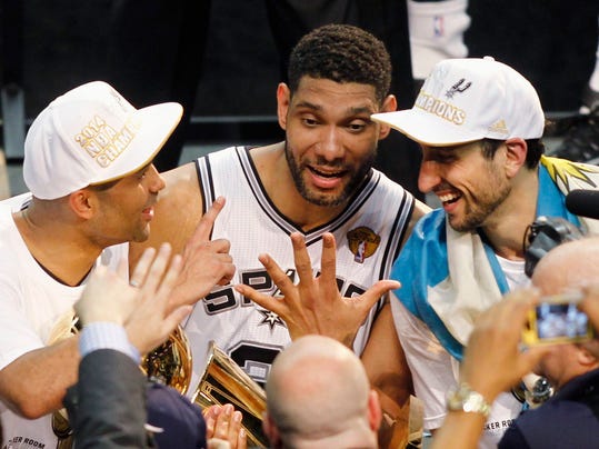
1, 2, 3, 4, and 5. Maybe a 6th? Maybe next year.

San Antonio never forgot Game 6 last year, and played with a vengeance in this year's Finals, taking down the defending champions, the Heat. Last year's Game 6? Consider that demon banished. 
The difference between last year's Spurs and this year's Spurs are glaring. To counter the Heat's athleticism, the Spurs relied on consecutive passing plays to create mismatches or find the open man for the easy bucket, awing many analysts.  The Spurs set two defining Finals records in this series: accurate shooting in the first half of Game 3 at 75.8% from the field to win 111-92, and a 70 point differential between the teams in 5 games.

While the Spurs celebrated in San Antonio, the Heat retreated back to Miami, regrouping and focusing on the 2014-2015 season. Now in the off season, the Heat roster is bound to change, especially with major player contracts ending. What I am talking about is LeBron's Decision 2.0, since he opted out of the final year of his contract with the Heat to explore free agency. Would King James stay in Miami, or would he choose to 'bring his talent' to another team?

Going into a potential season ending Game 5, LeBron made several remarks on his performance and the team's performance in the first four games in this pregame interview. He says "its team basketball", and maybe increasing his shot attempts and shooting percentage might help the Heat win. However, looking at the win shares, through the season, LeBron has been shouldering the majority of the responsibility to win. The Heat's supporting cast was not doing too much supporting, even during the Finals- namely the other 2 of the Big Three. Outside the Big Three- somebody find Mario Chalmers!

(Note: Win shares, as per basketball reference, estimate the number of wins contributed by a player.)

Which is why I think LeBron should leave Miami to play with a stronger, younger supporting cast. Being one of oldest teams in the NBA, the Heat struggled to stop the Spurs machine, exposing the Heat's reliance on LeBron, Wade, and Bosh. The Spurs's team basketball unmasked the weak of impact of Wade and Bosh on the court, despite Wade resting during the regular season. But this was not a sudden phenomenon in the playoffs; the win shares in the regular season show the unbalanced contributions from the Heat's Big Three.


The HEAT Big Three: James, Wade, Bosh


Heat Big Three

Taking the win share data from basketball-reference, we can create a win share visual for the Miami Heat Big Three, starting from the 2010-2011 season to the season that just ended, 2013-2014. For all the R code in gathering and plotting the data, see the Appendix at the end of the post.

For each of the four seasons the Big Three have been together, we plot their individual win shares for the regular season, along with their average win shares with the heavy red dotted line.


Fig. 1

LeBron clearly takes the cake, with win shares around 15 for each season, peaking at 19.3 in 2012-2013. The King certainly adds many wins to the Heat team on paper. While Dwyane and Chris start above double digits in their first year together, they eventually regressed through the seasons down to 5.5 and 8.0 in 2013-14, respectively. The gap in win shares in the Big Three in '13-'14 illustrates the Heat's reliance on LeBron, and the regression of Dwyane and Chris. The star power fades without LeBron, and as we saw in the Finals, he can only contribute so much. With two of the Big Three in the decline, LeBron must look to another team with scoring and point guard options, unless the Heat are able to infuse their roster with those role players.


The difference has been Dwyane Wade's performance. Even though he has been resting during the regular season for the playoffs, he had a lackluster stat line in the Finals: 15.2 PPG , 3.8 RPG, 2.6, APG, while playing 34.5 minutes per game. Dwyane's offensive rating (points per 100 possessions) numbered to 89, compared to LeBron's 120 and Chris Bosh's 119. 
His regular season win shares have declined from 12.8 in '10-'11 to 7.7, 9.6, and 5.5 in subsequent years. His fall in win shares are attributable to him sitting out regular games to maintain healthy knees. Dwyane only played in 54 games in the regular season compared to LeBron's 77.

Though Dwyane Wade has had an excellent career, his win share contribution in the regular season, and performance in the Finals have fallen dramatically- and if LeBron chooses to stay, I would call them the Big Two, not the Big Three. Sorry Dwyane, but if LeBron signs with another team, I would not blame him.


The SPURS Big Three: Duncan, Ginobili, Parker


Spurs Big Three

Let's take a look at the NBA Champions in the West. A winning consistency has been a hallmark of the Spurs for 17 seasons, a year after Gregg Popovich joined as head coach in 1996-97. From the '97-'98 season onwards, the Spurs have never dropped below .500 in their regular season record, in fact their lowest W/L was .610Check out the Spurs' gear throughout those successful years (I spy 5 trophies):


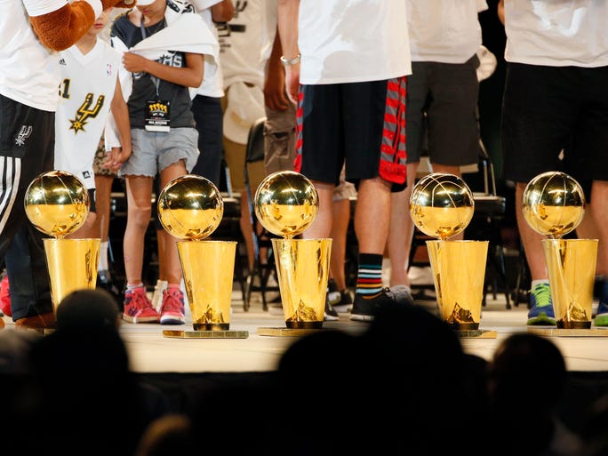
Nice Set of Bling, San Antonio

So how consistent were the Spurs trio of Duncan, Parker, and Ginobili after Miami formed their Big Three? Pretty consistent and similar:


Fig. 2

Looking at the Heat in Fig. 1 and the Spurs in Fig. 2, we see a few differences:


1. Not one of the Spurs trio had a win share above 10,
2. the three were close to the mean (each other),
3. and no large gap in win shares like LeBron and Co. (point 2 rephrased).

Why do we see much similar numbers for the Spurs? Well, we can attribute them to their mantra of team basketball and passing. On any given night, the Spurs might have 4 or 5 players in double figures in points, highlighting their balanced scoring options. For the Finals, the Spurs averaged 5 players in double figures: Tony Parker 18.0, Kawhi Leonard 17.8, Tim Duncan 15.4, Manu Ginobili 14.4, and Patty Mills 10.2. Compare that to the Heat, who had 3 players to do the same.


Also, the Spurs managed their players' minutes played down to a science: not a single player averaged more than 30 minutes per game. Good thing Tim Duncan opted in the last year on his contract, he can make another run for his 6th trophy in 2015 alongside rising Spurs star, Kawhi Leonard, the Finals MVP.


If LeBron James wants a fine set of NBA Finals bling like Tim Duncan, he should decide to sign with another team. King James won 2 rings in 4 Finals trips with Miami, but all good things come to an end.


Thanks for Reading,

Wayne

@beyondvalence
LinkedIn

If you were curious to examine the win shares of the stars on both the Heat and Spurs, here you go:


Fig. 3


R Code Appendix


Creating data.frame Code:
 1
 2
 3
 4
 5
 6
 7
 8
 9
10
11
12
13
14
15
16
17
18
19
20
21
22
23
24
25
26
27
28
29
30
31
32
33
34
35
36
37
38
39
> # data ####
> names <- c("Player", "Team", 
>            "2010-2011",
>            "2011-2012",
>            "2012-2013",
>            "2013-2014")
> # LeBron James
> lebron <- c("LeBron James", "MIA", 15.6, 14.5, 19.3, 15.9)
> # Dwyane Wade
> dwade <- c("Dwyane Wade", "MIA", 12.8, 7.7, 9.6, 5.5)
> # Chris Bosh
> cbosh <- c("Chris Bosh", "MIA", 10.3, 6.9, 9.0, 8.0)
> 
> # Tim Duncan
> tduncan <- c("Tim Duncan", "SAS", 7.7, 5.9, 8.3, 7.4)
> # Tony Parker
> tparker <- c("Tony Parker", "SAS", 8.2, 7.1, 9.3, 5.9)
> # Manu Ginobili
> ginobili <- c("Manu Ginobili", "SAS", 9.9, 4.2, 4.5, 5.7)
> 
> # cbind
> ws <- rbind(lebron, dwade, cbosh, tduncan, tparker, ginobili)
> # create data.frame
> ws <- as.data.frame(ws, stringsAsFactors=FALSE)
> names(ws) <- names
> # format columns
> ws[,2] <- as.factor(ws[,2])
> ws[,3] <- as.numeric(ws[,3])
> ws[,4] <- as.numeric(ws[,4])
> ws[,5] <- as.numeric(ws[,5])
> ws[,6] <- as.numeric(ws[,6])
> ws
                Player Team 2010-2011 2011-2012 2012-2013 2013-2014
lebron    LeBron James  MIA      15.6      14.5      19.3      15.9
dwade      Dwyane Wade  MIA      12.8       7.7       9.6       5.5
cbosh       Chris Bosh  MIA      10.3       6.9       9.0       8.0
tduncan     Tim Duncan  SAS       7.7       5.9       8.3       7.4
tparker    Tony Parker  SAS       8.2       7.1       9.3       5.9
ginobili Manu Ginobili  SAS       9.9       4.2       4.5       5.7

Plotting Win Shares Together Code:

 1
 2
 3
 4
 5
 6
 7
 8
 9
10
11
12
13
14
15
16
17
18
19
20
21
22
23
24
25
26
27
28
29
30
31
32
33
34
35
36
37
38
39
> # win share means
> heat.mean <- apply(ws[ws$Team=="MIA",3:6], 2, mean)
> spurs.mean <- apply(ws[ws$Team=="SAS",3:6], 2, mean)
> 
> # plotting win shares both teams ####
> plot(1:4, ws[1,3:6], type="l", 
+      main="Win Shares in Big Three Era",
+      xlab="Season", xaxt="n",
+      ylab="Win Shares", ylim=c(0,20),
+      col="red", lwd=2)
> axis(1, at=1:4, labels=names(ws)[3:6])
> for (i in 2:nrow(ws)) {
+   
+   if (i < 4) {
+     lty=i
+   } else lty=i-3
+     if (ws[i,2]=="MIA") {
+       col="red"
+     } else col="grey"
+     lines(1:4, ws[i,3:6], type="l",
+           col=col, lwd=2, lty=lty)
+ }
> 
> # add big 3 averages
> lines(1:4, heat.mean, lwd=6, lty=3, col="red")
> lines(1:4, spurs.mean, lwd=6, lty=3, col="grey")
> 
> # add legend
> col <- c()
> for (i in 1:nrow(ws)) {
+   if (ws[i,2]=="MIA") {
+     col <- c(col, "red")
+   } else col <- c(col, "grey")
+ }
> legend("bottomleft", col=col, lwd=rep(2), legend=ws[,1],
+        lty=c(1:3), cex=0.85)
> legend("bottomright", col=c("white", "red", "grey"), 
+        lty=3, lwd=6,
+        legend=c("Average Big of 3", "Miami Heat", "San Antonio Spurs"))

Plotting Win Shares by Team Code:

 1
 2
 3
 4
 5
 6
 7
 8
 9
10
11
12
13
14
15
16
17
18
19
20
21
22
23
24
25
26
27
28
29
30
31
32
33
34
35
> # plotting win shares for heat ####
> plot(1:4, ws[1,3:6], type="l", 
+      main="Win Shares in Big Three Heat Era",
+      xlab="Season", xaxt="n",
+      ylab="Win Shares", ylim=c(0,20),
+      col="red", lwd=2)
> axis(1, at=1:4, labels=names(ws)[3:6])
> 
> # add lines
> lines(1:4, ws[2,3:6], lwd=2, lty=2, col="red")
> lines(1:4, ws[3,3:6], lwd=2, lty=3, col="red")
> lines(1:4, heat.mean, lwd=6, lty=3, col="red")
> 
> # add legend
> legend("bottomleft", col="red", lwd=c(2,2,2,6), 
+        legend=c(ws[1:3,1], "Big 3 Average"),
+        lty=c(1:3,3), cex=0.85)
> 
> # plotting win shares for spurs ####
> plot(1:4, ws[4,3:6], type="l", 
+      main="Win Shares in Big Three Heat Era- Spurs",
+      xlab="Season", xaxt="n",
+      ylab="Win Shares", ylim=c(0,20),
+      col="grey", lwd=2)
> axis(1, at=1:4, labels=names(ws)[3:6])
> 
> # add lines
> lines(1:4, ws[5,3:6], lwd=2, lty=2, col="grey")
> lines(1:4, ws[6,3:6], lwd=2, lty=3, col="grey")
> lines(1:4, spurs.mean, lwd=6, lty=3, col="grey")
> 
> # add legend
> legend("bottomleft", col="grey", lwd=c(2,2,2,6), 
+        legend=c(ws[4:6,1], "Big 3 Average"),
+        lty=c(1:3,3), cex=0.85)

Disclosure: I support the Spurs.


Monday, June 23, 2014

Predicting Capital Bikeshare Demand in R: Part 1. Data Exploration


Hello Readers,

In order to promote alternative public transportation, many major cities in the U.S. have established bike sharing programs. These systems use a network of kiosks for users to rent and return bikes on an as-need basis. Users can rent a bike at one kiosk and return it to another kiosk across town. The automated kiosks gather all sorts of bike usage data, including duration of rent, departure and arrival locations. These data points act as proxy measures for analysts to estimate city mobility. (Check out the YouTube video in the middle of the post.)


Capital Bikeshare Station

This "Bike Sharing" R series involves the prediction of bike rentals over 2011 and 2012 for the Capital Bikeshare program in Washington D.C. The CSV data for forecasting can be obtained from the Kaggle Knowledge Competition


Capital Bikeshare Data


The training data are the first 19 days of each month from January 2011 to December 2012, and the test data from which we aim to predict the bike rental numbers, are the remaining days in each month. The variables include the "datetime", seasonal data, temperature, humidity, and wind speed measures. Because Kaggle gave us this information along with the time stamps, we will have to evaluate whether a model with the weather data, or a time series model without the weather data can better predict the bike rental counts.

Before we get ahead of ourselves and start modeling, we need to understand the data first. Remember to point your working directory in R to the proper location. Load the training data with "read.csv", and get a glimpse of the data with "head" and "summary":


First Look Code:
 1
 2
 3
 4
 5
 6
 7
 8
 9
10
11
12
13
14
15
16
17
18
19
20
21
22
23
24
25
26
27
28
29
30
31
32
33
34
35
36
37
38
39
40
41
42
43
44
45
46
47
> # set working directory
> setwd("~/Documents/Kaggle/BikeSharing")
> 
> # load libraries ####
> library(xts)
> library(gbm)
>
> # load train csv
> train <- read.csv("train.csv", stringsAsFactors=FALSE)
> head(train)
             datetime season holiday workingday weather temp  atemp
1 2011-01-01 00:00:00      1       0          0       1 9.84 14.395
2 2011-01-01 01:00:00      1       0          0       1 9.02 13.635
3 2011-01-01 02:00:00      1       0          0       1 9.02 13.635
4 2011-01-01 03:00:00      1       0          0       1 9.84 14.395
5 2011-01-01 04:00:00      1       0          0       1 9.84 14.395
6 2011-01-01 05:00:00      1       0          0       2 9.84 12.880
  humidity windspeed casual registered count
1       81    0.0000      3         13    16
2       80    0.0000      8         32    40
3       80    0.0000      5         27    32
4       75    0.0000      3         10    13
5       75    0.0000      0          1     1
6       75    6.0032      0          1     1
>
> summary(train)
   datetime             season         holiday          workingday    
 Length:10886       Min.   :1.000   Min.   :0.00000   Min.   :0.0000  
 Class :character   1st Qu.:2.000   1st Qu.:0.00000   1st Qu.:0.0000  
 Mode  :character   Median :3.000   Median :0.00000   Median :1.0000  
                    Mean   :2.507   Mean   :0.02857   Mean   :0.6809  
                    3rd Qu.:4.000   3rd Qu.:0.00000   3rd Qu.:1.0000  
                    Max.   :4.000   Max.   :1.00000   Max.   :1.0000  
    weather           temp           atemp          humidity     
 Min.   :1.000   Min.   : 0.82   Min.   : 0.76   Min.   :  0.00  
 1st Qu.:1.000   1st Qu.:13.94   1st Qu.:16.66   1st Qu.: 47.00  
 Median :1.000   Median :20.50   Median :24.24   Median : 62.00  
 Mean   :1.418   Mean   :20.23   Mean   :23.66   Mean   : 61.89  
 3rd Qu.:2.000   3rd Qu.:26.24   3rd Qu.:31.06   3rd Qu.: 77.00  
 Max.   :4.000   Max.   :41.00   Max.   :45.45   Max.   :100.00  
   windspeed          casual         registered        count      
 Min.   : 0.000   Min.   :  0.00   Min.   :  0.0   Min.   :  1.0  
 1st Qu.: 7.002   1st Qu.:  4.00   1st Qu.: 36.0   1st Qu.: 42.0  
 Median :12.998   Median : 17.00   Median :118.0   Median :145.0  
 Mean   :12.799   Mean   : 36.02   Mean   :155.6   Mean   :191.6  
 3rd Qu.:16.998   3rd Qu.: 49.00   3rd Qu.:222.0   3rd Qu.:284.0  
 Max.   :56.997   Max.   :367.00   Max.   :886.0   Max.   :977.0 

With our initial look at the data, we can make a few observations:


1. The "datetime" variable is formatted "year-month-day_hour:minute:second",
2. "season", "holiday", "workingday", and "weather" are categorical variables,
3. our target variable, "count", is composed of "causal" and "registered" users,
4. and each row entry increments by the hour for 10,886 observations.

Now we need to change "datetime" into a date type, and "season", "holiday", "workingday", and "weather" into factor variables. Keep in mind for our prediction model, we need not include all the variables.


Variable Reformatting Code:
 1
 2
 3
 4
 5
 6
 7
 8
 9
10
11
12
13
14
15
16
17
18
19
20
21
22
> # set categorical variables ####
> # season, holiday, workingday, weather
> train$season <- factor(train$season, c(1,2,3,4), ordered=FALSE)
> train$holiday <- factor(train$holiday, c(0,1), ordered=FALSE)
> train$workingday <- factor(train$workingday, c(0,1), ordered=FALSE)
> train$weather <- factor(train$weather, c(4,3,2,1), ordered=TRUE)
> # set datetime ####
> train$datetime <- as.POSIXct(train$datetime, format="%Y-%m-%d %H:%M:%S")
> str(train)
'data.frame': 10886 obs. of  12 variables:
 $ datetime  : POSIXct, format: "2011-01-01 00:00:00" "2011-01-01 01:00:00" ...
 $ season    : Factor w/ 4 levels "1","2","3","4": 1 1 1 1 1 1 1 1 1 1 ...
 $ holiday   : Factor w/ 2 levels "0","1": 1 1 1 1 1 1 1 1 1 1 ...
 $ workingday: Factor w/ 2 levels "0","1": 1 1 1 1 1 1 1 1 1 1 ...
 $ weather   : Ord.factor w/ 4 levels "4"<"3"<"2"<"1": 1 1 1 1 1 2 1 1 1 1 ...
 $ temp      : num  9.84 9.02 9.02 9.84 9.84 ...
 $ atemp     : num  14.4 13.6 13.6 14.4 14.4 ...
 $ humidity  : int  81 80 80 75 75 75 80 86 75 76 ...
 $ windspeed : num  0 0 0 0 0 ...
 $ casual    : int  3 8 5 3 0 0 2 1 1 8 ...
 $ registered: int  13 32 27 10 1 1 0 2 7 6 ...
 $ count     : int  16 40 32 13 1 1 2 3 8 14 ...

In our training data.frame, we have 12 reformatted variables, and from the "str" function, we see the changes reflected in the variable types. I set the "weather" variable as a ordinal factor, where order matters, instead of a regular factor variable. Looking at the data dictionary, you can see the categorical "weather" variable describing the severity of the weather conditions, with 1 being clear or partly cloudy, and 4 indicating thunderstorm, heavy rain, sleet, etc. So 1 is the best weather condition, with 4 being the worst.


Now let us examine the distribution of our bike sharing data.


Exploring Count Data


Since we aim to predict the bike share demand, the obvious place to begin is with our target variable, "count".  We can stratify the "count" distribution as boxplots for the categorical variables, and draw the "count" and numeric variables in another plot. We group the two sets of plots together, and designate their plotting order with "layout".


Count Distribution Code:
 1
 2
 3
 4
 5
 6
 7
 8
 9
10
11
12
13
14
15
16
> # count is our target variable
> # plot count distribution
> # by categorical var
> layout(matrix(c(1,1,2,3,4,5),2,3,byrow=FALSE))
> boxplot(train$count, main="count")
> boxplot(train$count ~ train$weather, main="weather")
> boxplot(train$count ~ train$season, main="season")
> boxplot(train$count ~ train$holiday, main="holiday")
> boxplot(train$count ~ train$workingday, main="workingday")
> 
> # by numeric var
> layout(matrix(c(1,2,3,4),2,2,byrow=TRUE))
> plot(train$temp, train$count, main="temp")
> plot(train$atemp, train$count, main="feelslike temp")
> plot(train$windspeed, train$count, main="windspeed")
> plot(train$humidity, train$count, main="humidity")

The R code above will yield the two "count" distribution graphics below:

Count Distribution by Categorical Variables

Observe the five "count" boxplots above, with the larger plot being the overall "count" distribution. We see the median count hover around 150 units, and we see many outlier counts above 600. The range of counts is from 0 to under 1000 units. When stratified by "weather", besides extreme weather (==4), the median count increases, with higher usage count the better the weather. There is not much difference other than the outliers for non-"holiday" days, and also for days which are designated a "workingday". We see increases in median counts for "season" 2 and 3, summer and fall, respectively.

Count Distribution by Numeric Variables

Now we move to the numeric variables. Looking at the distributions, we see a general trend of higher "count" values for temperatures from 25 to low 30's (in Celsius). Not surprisingly, there were more "count" values for lower "windspeed" values. There was not much difference for the "humidity" variable, as "humidity" values from 30 to 70 had similar "count" values.


Take a Break- How the Capital Bikeshare Program Works:


Examining All Variables


Since we looked at the relationship between the "count" variable and the other covariates, what about the relationship between the covariates? An obvious guess would support correlation between temperature, season, and between weather and wind speed. To visualize their relationships, we create a pairwise plot with the size of the correlation font relative to their correlation strength in the upper panel of the plot. A best fit regression line is also added to give an idea of trend.

Pairwise Plot Code:
 1
 2
 3
 4
 5
 6
 7
 8
 9
10
11
12
13
14
15
16
17
18
19
> # pairwise plot
> ## put (absolute) correlations on the upper panels,
> ## with size proportional to the correlations.
> panel.cor <- function(x, y, digits = 2, prefix = "", cex.cor, ...)
> {
>   usr <- par("usr"); on.exit(par(usr))
>   par(usr = c(0, 1, 0, 1))
>   r <- abs(cor(x, y))
>   txt <- format(c(r, 0.123456789), digits = digits)[1]
>   txt <- paste0(prefix, txt)
>   if(missing(cex.cor)) cex.cor <- 0.8/strwidth(txt)
>   text(0.5, 0.5, txt, cex = cex.cor * r)
> }
> pairs(~count+season+holiday+workingday+weather+temp+humidity+windspeed,
>       data=train, 
>       main="Bike Sharing",
>       lower.panel=panel.smooth, 
>       upper.panel=panel.cor)
> 

Below we have the resulting pairwise plot with correlations:


Pairwise Plot

I suggest enlarging the plot to view the graphic in all its complexity.


Yes, we do see the seasonal temperature variation, however we do not see too much variation in wind speed other than with humidity. We so see higher humidity with increased weather severity, which makes sense since it requires precipitation to rain/fog/sleet/snow. And yes, if it is a holiday, then it probably is not a working day (not all non-working days are holidays though).


Good. Our pairwise plot revealed no unexpected surprises.


A Closer Look at Count


Let's go back and analyze "count" again, but this time with the "datetime" variable to incorporate a temporal aspect. Recall that we reformatted the variable so now it is recognized as a date type (POSIXct), by year-month-day hour:minute:second format.


So let us visualize the counts over the time of our data. Additionally, since we have the breakdown of casual and registered users, we can examine the percentage of registered users using the Capital Bikeshare each hour over the two years.

Count and Percentage Plot Code:
 1
 2
 3
 4
 5
 6
 7
 8
 9
10
11
12
13
> # plot
> # count of bike rentals by datetime
> plot(train$datetime, train$count, type="l", lwd=0.7,
>      main="Count of Bike Rentals")
> 
> # percentage of registered users
> percentage <- train$registered/train$count*100
> plot(train$datetime, percentage, type="l", 
>      main="Percentage of Registered Users")
> 
> summary(percentage)
   Min. 1st Qu.  Median    Mean 3rd Qu.    Max. 
   0.00   74.66   85.53   82.90   93.83  100.00 

Immediately we see differences within and between year 2011 and 2012. Observe the seasonal spike in the summer and fall in each year, and also the general elevated counts in 2012 compared to 2011. It appears that the Capital Bikeshare program became more popular in 2012 relative to 2011! We see our maximum count is located in 2012.


Note the gaps in between the months- they are the days after the 19th of each month. They are the entries we aim to predict with our model from the first 19 days.


Next we have the percentage of registered users from the count. We see drops in the summer and fall, which could be attributed to tourists who are only visiting Washington D.C. to see the sights and have no need to register with Capital Bikeshare. 


From our summary of "percentage" in the code, we notice that our median percentage of registered users hovers around 85.53%. 


So while there are casual users of Capital Bikeshare, the majority of users are registered. Also, there was an decrease in number of occasions where the majority of users were casual users from 2011 to 2012.


OK folks, in this R post we have explored the Capital Bikeshare data from Kaggle, while to prepare to predict the bike share demand with various weather and type of day variables. So stay tuned for Part 2, where we start using regression to examine how well each covariate predicts the bike count.


Thanks for reading,

Wayne

@beyondvalence
LinkedIn

Wednesday, June 18, 2014

Visualization with D3.js: Part 1


Hello Readers,

Plots, graphs, and visualizations. They are ways we interpret data, allowing us to examine patterns in the numbers, and to form analyses from our understanding of the data. Some might say graphics capture the big picture or represent a thousand words, exemplified by the famous infographic describing Napoleon and his fate at Waterloo drawn by Charles Joseph Minard in 1869: 


'The Greatest Infographic

While I have been using R mainly for creating visuals (other than the time where I used Photoshop to fine tune a palladium price plot), here exists libraries outside of R for visualization, namely, D3.js. Created by Mike Bostock, Data Driven Documents (D3) operates under the Document Object Model (DOM), and provides an efficient, functional method to code visualizations in Javascript.


Here I will demonstrate how to setup an simple environment for tinkering with D3, and to create a bar chart of when Github users commit (submit) code. I assume you have a basic understanding of HTML and Javascript to begin. The data is available here. Start your favorite text editor (I use Notepad++), and the console (I use Cygwin bash).


Environment Setup


Before we begin working with D3, we need to setup the environment to view the results. D3 combines HTML (hypertext markup language), CSS (cascading style sheets), and SVG (scalable vector graphics) to display graphics. In your designated working directory, create an "index.html" file to house the HTML, and a "code.js" Javascript file to store the D3 script. Using Notepad++ I created two files and named them such. 

Here is the link to Swizec Teller's Github repository for the code for you to download if you do not want to type or copy the code. However, I find that typing the code reinforces your learning of a language's syntax.

Using the basic structure of HTML, we set up a <div> element with "id=graph", and as "class=span12" nested inside <div> class "row" and "container". For the <style>, we use CSS to specify the font size at 11, and the color of the bars as "steelblue". The <script> we designate the D3 javascript file at "http://d3js.org/d3.v3.min.js", and our graph code in "code.js". At the top, spot the <link> tag. Download that CSS bootstrap package which makes the resulting webpage visually appealing, or here at Github in the top under "bootstrap".

HTML and CSS Code:
 1
 2
 3
 4
 5
 6
 7
 8
 9
10
11
12
13
14
15
16
17
18
19
20
21
22
23
24
25
26
27
<!DOCTYPE html>
<title>testing</title>
<link href="bootstrap/css/bootstrap.min.css" rel="stylesheet">

<style>
 .axis path,
 .axis line {
  fill: none;
  stroke: #eee;
  shape-rendering: crispEdges;
 }
 .axis text {
  font-size: 11px;
 }
 .bar {
  fill: steelblue;
 }
</style>

<div class="container">
 <div class="row">
  <div id="graph" class="span12"></div>
 </div>
</div>

<script src="http://d3js.org/d3.v3.min.js"></script>
<script type="text/javascript" src="code.js"></script>

Note that we reference the D3 script at the end of the "index.html" as "code.js". Make sure to name the file that particular name.


D3 Code


After we establish the HTML, we can move on to scripting the graphic. The JSON file is available here. First we specify the size of the plot, and scale, and x-y axis locations from lines 1 to 10.

Following in line 12 to 15, we use the crucial "d3.select" to select the graph element from the HTML file, and ".append" or add a Scalable Vector Graphic (SVG) object with width and height attributes.

Beginning in line 17, we parse the "histogram-hours.json" file using "d3.json", and in lines 19 to 22 map the json elements to a "bucket" as an index and a "N" with the value. We rescale and set the plot boundaries with the "bucket" and "N" in lines 24-25.

An important D3 concept is the origin of the plot: the x starts at the left and the y starts at the top. So adding the x and y axes in lines 27 to 35, we take that into account.

Now we can use the "svg.selectAll" method to start adding the "rect" rectangles to the plot starting at line 37. Associate the data with ".data", and add or ".append" the data as a "bar class". We add a ".transition" to demonstrate animation to force the bars to appear from left to right. We specify the 'x' and 'y' values from the "bucket" and "N" values we mapped. The "width" and "height" of the bars take into account the areas of the plot, and the white-space padding. D3 Code:
 1
 2
 3
 4
 5
 6
 7
 8
 9
10
11
12
13
14
15
16
17
18
19
20
21
22
23
24
25
26
27
28
29
30
31
32
33
34
35
36
37
38
39
40
41
42
43
44
45
46
47
48
49
50
var width=900, 
 height=400, 
 pad=20, 
 left_pad=100;

var x = d3.scale.ordinal().rangeRoundBands([left_pad, width-pad], 0.1);
var y = d3.scale.linear().range([height-pad, pad]);

var xAxis = d3.svg.axis().scale(x).orient("bottom");
var yAxis = d3.svg.axis().scale(y).orient("left");

var svg = d3.select("#graph")
   .append("svg")
   .attr("width", width)
   .attr("height", height);

d3.json('histogram-hours.json', function (data) {
 
 data = d3.keys(data).map(function (key) {
 return {bucket: Number(key),
  N: data[key]};
 });
 
 x.domain(data.map(function (d) {return d.bucket; }));
 y.domain([0, d3.max(data, function (d) {return d.N; })]);
 
 svg.append("g")
  .attr("class", "axis")
  .attr("transform", "translate(0, "+(height-pad)+")")
  .call(xAxis);
  
 svg.append("g")
  .attr("class", "axis")
  .attr("transform", "translate("+(left_pad-pad)+", 0)")
  .call(yAxis);
  
 svg.selectAll('rect')
  .data(data)
  .enter()
  .append('rect')
  .attr('class', 'bar')
  .attr('x', function (d) {return x(d.bucket);})
  .attr('width', x.rangeBand())
  .attr('y', height-pad)
  .transition()
  .delay(function (d) {return d.bucket*20; })
  .duration(800)
  .attr('y', function (d) {return y(d.N); })
  .attr('height', function (d) {return height-pad-y(d.N); });
});

The majority of the code is nested in the "d3.json" callback function (the part in between the curly braces {...}). Next we need to open the "index.html" file in Chrome to see it in action. Make sure all the files are together in the same working directory.


Chrome Developer Tools


Since the HTML code calls for local files, we start a simple HTTP Server with Python to avoid the security issues. In your console, type "
python -m SimpleHTTPServer", and the Python will create a server on port 8000. Remember to start the Python server in the same directory as the HTML and Javascript files.


Starting Python Host via Console

In Chrome, point the address bar to "localhost:8000" and the graphic will appear. If not, there is either a typo in the code, no server opened, or the files are not present in that directory. Below is a screenshot of the "steelblue" colored graphic. We see an expected elevation of activity during daylight hours ~9AM to 6 PM.


Code Submissions by Day Hours


To make use of Chrome's Developer Tools, press <CTRL+SHIFT+J>. A similar window should appear with the Javascript content shown below. Examine the tabs at the top, "Elements", "Network", "Source", and etc. The Chrome Developer Tools (or DevTools) is quite a powerful website and debugging suite, and you can read more about it here. In the "Source" tab, we can select our code files hosted by Python.


"code.js" in DevTools
As an added bonus, we can use the "Console" tab on the far right to interact with the content. That way we can see the changes live as we type them into Chrome.

I hope you enjoyed this post introducing the capabilities of D3.js, and how it thrives creating graphics in the HTML environment. Although we just created a bar graph, there are many other visualizations created by others at its main website. Stay tune for more visualizations and analysis. 


Let me know if you want to see more of D3.js.


Thanks for reading,

Wayne
@beyondvalence
LinkedIn