Loading...

Sunday, December 29, 2013

Cluster Analysis: Hierarchical Modeling in R


Hello Readers,


This post will cover another method on data clusters. Last time we talked about k-means clustering and here we will discuss hierarchical clustering.

We will use the cars data set available here. It describes a set of cars from 1978-1979. 

Start R and let us get started!


Hierarchical Clustering


A large difference in hierarchical clustering and k-means clustering lies in the selection of clusters. K-means (covered here) requires that we specify the number of clusters first to begin the clustering process. In hierarchical clustering, the process requires a distance matrix, and the processes creates a cluster with the two closest points after evaluating all the points and re-evaluates the distance with the rest of the points and the new cluster. There are multiple distances we can use, with different results. Therefore, we can get a solution with a trivial case, where each observation is a separate cluster, to the opposite trivial solution where all the observations are in one cluster.

The hclust function in R will enable us to perform hierarchical clustering on our data.


Cars Data


Read the tab delimited file, 'cars.tab' with the read.delim() function in R. To get an idea of what we are working with, pass cars through head() and observe the data.


cars Data and cars1

We see cars has 2 character variables (Country and Car model) and 6 numerical (MPG, Weight, Drive_Ratio) and integer (Horsepower, Displacement, Cylinders) variables. In a new data set cars1, we can keep all the variables we can analyze numerically, and not pass the first two.

Next we need to standardize the various variables so that a variable with high magnitude compared to others will not overwhelm the clustering. Essentially we create a 'z-score' for each variable by computing the median and the median average deviation. We take the difference between the variable and the median and divide it by the median absolute deviation, like a z-score. This is shown below with the apply() and scale() functions. Remember, the "2" represents the columns for apply.


Scale Standardization of cars1 Variables

Now that the variables are centered, we can calculate the distance between each observation for each variable by using the
dist() function. We will obtain a distance matrix will be a lower diagonal matrix with all the distances between the i and j observations.


dist() and hclust() Functions

Next we pass the
hclust() function the cars.dist distance matrix to get the cluster object, cars.hc. Then we visualize the results.


Plotting the Dendrogram


Using the car types in the original cars data as the labels, we can create a dendrogram to visualize the cars1 data.


Dendrogram Plot Code

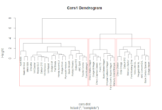
The plot() function yields the tree diagram below. The cex argument allows us to scale back the size of the label text for readability.


Cars1 Dendrogram

At a given height in the plot, there are vertical lines each representing a group with objects when they were grouped together into a cluster. If we cross the y-axis at 6, we will encounter 2 lines, so there are 2 groups there. The y-axis represents how close together observations were when they were merged in groups, so if the height was small, like those in heights 0 to 1, then those clusters are not too reliable. However, if the height was higher between the last cluster and the current one, then the clusters do a good job at showing the structure of the data.

So by looking at the diagram, we see that at a high height, there seems to be two distinct groups which first emerge. The right hand group has two groups in itself, while the left hand group appears to have similar clusters, as their heights are smaller. Therefore, we can make an argument for 2 or 3 clusters. But as you can see, the hierarchical clustering considers both trivial conclusions- 1 cluster for all observations or 38 clusters for each individual observation from top to bottom.

Using the rect.hclust() we can visualize which branches are in which cluster- when we specify the cluster number. Let us choose k=3.


rect.hclust() Function

Which outlines the clusters in the plot and yields:


Clusters in the Plot

Just like we predicted earlier, we thought that the left and right clusters would be groups, and the right cluster would be split further into two for a total of three clusters, as outlined above.


Cluster Groupings


Now that we have the clusters, we can analyze the clusters and the observations in each cluster. We can start by seeing now many observations are in each cluster by using the cutree() function and specifying the number of clusters.


Counts for 3 Clusters

We see that all three groups have 8 in cluster 1, 20 in cluster 2, and 10 in cluster 3. There are over half of the observations in the second cluster. Is this because we need more clusters? Let us see what happens when we look at the counts for 2 clusters up to 6. We can use the sapply() function for efficiency.


Counts for Clusters 2 to 6

From the 4 cluster count, the difference is negligible as another cluster was created of size 3 only. By 5 clusters, we see the counts becoming more similar.

Next, we can see which cars are in the 3 clusters. Again, we use sapply() and we get the car types in a list.


Car Types in 3 Clusters

Also, we can see what happens when there are 4 clusters:


Car Types in 4 Clusters

Observe that the 'Audi 5000', 'Saab 99 GLE' and 'BMW 320i' are now in new cluster # 3 with the 4 cluster model.


Cluster Grouping Analysis


Remember that we removed the Car and Country variables from the data set that we used because they were character variables. Some of the times we take out variables to see if the clusters from the analysis naturally group themselves with those removed variables.

Let us see if the origin country of the cars, given by Country are reflected in the clusters. Create a table with the group index and Country name to see any patterns.


Group Country Count

In cluster 1, we see that all the cars were produced in the United States. This is obvious if we remember the car names in the first cluster- they were Buick, Chevy, Mercury, Ford, Chrysler, and Dodge, all American car manufacturers. For cars in cluster 2, most of the cars were produced in the United States, Japan, and Germany. In cluster 3, the United States also produced the most cars at 7 models.

A useful method for characterizing clusters is by using summary statistics. Here we can use the median to evaluate the averages of each variable in the clusters with the aggregate() function.


Median Variable Values of 3 Clusters

But these numbers are not the same because we standardized them at the beginning. To get a better idea of what we are looking at, we can use the original numbers, as in a3. Instead of using cars1, we use the original cars data set.


Median Variable Values of 3 Clusters, Unadjusted

In a3.df we created a data.frame to encompass the cluster number, the frequency of observations in each cluster, and then the un-standardized median values for the variables. From the readable data.frame, we can see cars in 

  • Cluster 1 have lower gas mileage (MPG), higher Weight, more Horsepower, larger Displacement, and more Cylinders;
  • 20 very light Weight cars in cluster 2 have the highest MPG, a higher Drive_Ratio, the lowest Horsepower and the least number of Cylinders;
  • Cars in cluster 3 are average compared to the cars in the other two clusters, but more similar to cluster 1.


Likewise, we performed the same procedure for 4 clusters as well:


Median Variable Values of 4 Clusters, Unadjusted

We can see that the new cluster, #3, was created from a grouping in cluster #2 in a3.df with cars having lower MPG, more Weight, higher Drive_Ratio, more Horsepower, and increased Displacement.


And that is it! As you can see, hierarchical clustering had an advantage of being able to analyze results from different cluster numbers more quickly than k-means clustering. It also allows us to see the groupings in the plot visual from one trivial cluster to all observations into their own cluster.

Next up in the Cluster Analysis Series will be PAM- partitioning around medoids. So stay tuned! 


Thanks for reading and Happy New Year!


Wayne

@beyondvalence

Thursday, December 26, 2013

Cluster Analysis: Choosing Optimal Cluster Number for K-Means Analysis in R


Hello Readers,

Last time in Cluster Analysis, we discussed clustering using the k-means method on the familiary iris data set. We had know how many clusters to input for the k argument in kmeans() due to the species number. 

Here we shall explore how to obtain a proper k through the analysis of a plot of within-groups sum of squares against the number of clusters. Also, the NbClust package can be a useful guide as well.


We will use the wine data set in the rattle package. Open R and load the rattle package and let us get started!


The Wine Data


Call str() on wine and study the components of the wine1 data set after taking out the first variable with wine[-1].


Wine1 Data

We see that wine1 is a collection of 178 observations with 1 variables- 13 numeric and integer variables. The variable we removed is a factor describing the type of wine. Try not to peek at the original data!

To see what the data look like, we could call pairs() on wine1 but good luck with analyzing that plot! Instead call head() on wine1 to get an idea (first 6 observations) of the set.


First 6 Observations in Wine1

Now we are acquainted with the data, we can go ahead a determine the best initial k value to use in k-means clustering.


Plotting WithinSS by Cluster Size


Like we mentioned in the previous post, the within group sum of squares (errors) shows how the points deviate about their cluster centroids. So by creating a plot with the within group sum of squares for each k value, we can see where the optimal k value lies. This will use the 'elbow method' to spot the point at which the within group sum of squares stops declining as quickly to determine a starting k value.

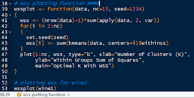
We do this by writing a function in R. I will call it
wssplot(). The function will loop through fifteen k values to ensure that most reasonable k values will be considered. The first value for wss is assigned the sum of squares for k=1 by canceling out the n-1 term in the sum of the variances. Then the for loop starts at k=2 and loops to k=15, assigning the within sum of squares from the kmeans$withinss component for each iteration.

The wssplot also creates a plot of the within groups sum of squares.


wssplot Code

This yields the within groups sum of squares plot for each k value:


Within Group Sum of Squares by Cluster Number

We see that the 'elbow' where the sum of squares stops decreasing drastically is around 3 clusters, then the decrease tapers off. This is our k value!


The NbClust is a package dedicated to finding the number of clusters by examining 30 various indices. We set the minimum number of clusters at 2 and the maximum at 15.


NbClust Code

The table will yield the clusters chosen by the criteria. Note not all of the criteria could be used. As we can see, 3 clusters had the overwhelming majority.


Clusters Chosen by Criteria


These are just some ways in which we can obtain the optimal k value before starting the kmeans clustering. The kmeans output is shown below in aggregate(), with k = 3.


Variable Averages in Each Cluster

We can check how well the kmeans clusters =3 clustered the data by using the flexclust package. See how well the clustering was for wine types 2 and 3? Not very well with a low index of 0.371.


Wine Table and Index

In following posts, we will cover hierarchical clustering. So stay tuned!


Thanks for reading,


Wayne
@beyondvalence
LinkedIn
(link)

Wednesday, December 25, 2013

Cluster Analysis: Using K-Means in R


Hello Readers,


Hope you guys are having a wonderful holiday! (I am.) Today in this post we will cover the k-means clustering technique in R.

We will use the familiar iris data set available in R.


Let us get started!


K-Means Clustering


Start by loading the cluster package by library(cluster) in R. The first and very important step in k-means clustering occurs when choosing the number of final clusters (k). 

Therefore the k-means clustering process begins with an educated 'guess' of the number of clusters. With the k number of clusters, R selects k observations in the data to serve as cluster centers. Then the Euclidean distance is calculated from observations to the cluster centers, and the observations are placed in the cluster to which they are closest.

Then the center of each cluster is recalculated and the Euclidean distance is taken for each observation and the new cluster center. R checks every observation to see if it is closer to another cluster center and reassigns it if it is closer to another cluster. The process of center cluster recalculation and observation distance checking is repeated until observations stay in the same cluster.

The kmeans() function requires the choosing k observations as the centers of the clusters.

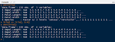
Before clustering, remove the species column from the iris data set to retain the numerical values only.


Iris2 Data Set Without Species
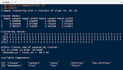
Now use the kmeans() function on iris2 with 3 centers, or number of clusters, as shown below with the output.


K-Means Result
Note that the output includes the size of each cluster (50, 38, 62), the means of each variable in each cluster, the vector of the cluster number, the withinss for each cluster, and the components of the km.result object.

kmeans() seeks to minimize the withinss for each cluster, which is the sum of of squared error (SSE) or scatter. It is calculated by taking the sum of the squares of the distances between the observations and centroid of each cluster.

To see how well the k-means clustering performed, we can create a table with the actual species of iris and the cluster numbers:


Species and Cluster Comparison

As we can see, the clustering successfully clustered all the setosa species, but had difficulty with virginica (14 off) and versicolor (2 off). To quantify the agreement we can use the the library(flexclust) package, as shown below:


Adjusted Rank Index

An agreement of 0.73 is not too bad, as it ranges from -1 (no agreement) to 1 (perfect agreement). We have a 0.73 agreement between the iris species and cluster solution.


Plotting Clusters


Next we can visualize the clusters and their centers we constructed, with the code below:


Plotting Code

And that yields the visual below. Note that the three diamonds are the cluster centers in black, green and red.


Iris Clusters Plot
The model looks OK, except for a few red cluster points close to the green center, possibly miss classification of the virginica and versicolor species, because setosa was completely categorized properly. As we can see, the clustering is not perfect, hence an agreement score of 0.73.


In the next Cluster Analysis post I will discuss finding a suitable k to begin the k-means analysis. In this case, we knew we had 3 species to begin, so it was easy to plug in the k. However, we will look at the within sum of squares and sets of criteria to see what k we will use for a data set on wine. Stay tuned!


Thanks for reading,


Wayne
@beyondvalence

Tuesday, December 24, 2013

Time Series: 2. Forecasting Using Auto-Regressive Integrated Moving Averages (ARIMA) in R


Hello Readers,


Welcome to the second post in the 'Time Series' series! Last time we discussed decomposing the data to obtain the decomponent factors of the time series. 

Here we will continue from the previous post into forecasting, using the same data set, AirPassengers to forecast future data points.


Let us get started!


Forecasting


As you may recall, in the last post, we plotted the additive decomposition model of AirPassengers, as shown below.


We observe in the trend component that the number of passengers are generally increasing over the 1950s into the early 1960s. How about in 1961? Or 1962? That is where forecasting comes into play. We can use the different components we have to predict the components and therefore, the data, in the subsequent years.


ARIMA (p, d, q) Model


ARIMA is short for auto-regressive (p) integrated (d) moving averages (q). The arima() function has 3 parameters: p, d, and q in the order argument, which describe the terms of auto-regressive, integrated, and moving average parts of the model. 

The p number of auto-regressive terms allows us to include p number of previous terms in the model. An order of 1 p gives us simply:

Xt = u + Ï•1X(t-1)

and order of 2 p gives us:

Xt = u + Ï•1X(t-1) + Ï•2X(t-2)

d is the number of differences if the time series is not stationary when looking at the correlogram representing the autocorrelation function of the time series, AirPassengers. The correlogram will show if there are periodicities in the data via the autocorrrelation and partial autocorrelation functions.


ACF and PACF Code

Which plots the correlogram:


ACF and PACF

So the ACF shows a possible need for differencing because the trend from left to right does not approach 0. Using the diff() function, we can compute the differences in AirPassengers.


diff() Function

After differencing, we observe the autocorrelation function does narrow in range and approach 0. It appears if first order differencing is enough. Note the peak at lag = 1.0. This suggests a cyclical spike every 6 years.


ACF and PACF Differenced

Beware of over-differencing as it can push the lag-1 and lag-2 values far negative. A good sign to stop is when the standard deviation increases, and take the order differencing prior to obtain the lowest standard deviation.

The q is for exponential smoothing, which places an exponentially weighted moving average of the previous values to filter out the noise (like present in random walk models) better to estimate the local mean. With a constant and exponential smoothing, we can model Xt by:

Xt = u + Ï•1X(t-1)θe(t-1)

But we will not use this for forecasting AirPassengers for now. With this knowledge of the data, we can use the (p, d, q) parameters to fit the ARIMA model.


Fitting ARIMA


Here, we will use one auto-regressive term (p = 1) in forecasting AirPassengers for now, so the p, d, q, will be (1, 0, 0). We assume a seasonality autocorrelation as well, but with two terms and 1st order differencing and no exponential smoothing.


Fitting by ARIMA

Using the predict() function, we can specify the unit number beyond the data, and in this case, 24 months so 2 years. Then we calculate the 95% confidence interval bounds by multiplying the standard errors by 1.96 and adding and subtracting the result from the predicted value for upper and lower bounds


95% CI Bounds

Now we will take into account what we saw in the ACF and PACF plots showing that the time series was not stationary. Afterwards, we plotted a better looking plot for the ACF and PACF for the differenced data and now we will fit a model with that first order difference in mind. Instead of the order=c(1,0,0), we will include a first order differencing term in the d place.


Forecast with AR and 1st Order Differencing

Note that we have 3 coefficients, one for the auto-regression, and two for the seasonality, along with their standard errors. The AIC (1019.24) is included as well for comparison to other fitted models.


Plotting the Forecasts


Next we plot the 24 month forecast, the upper and  lower 95% confidence intervals, along with the differenced forecast on the time series graph extrapolating the predicted data with parameters from ARIMA.


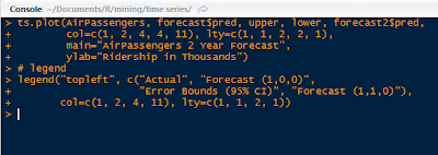
Plot Forecasts and Legend Code

This yields the forecast visual below. Note the red forecast line oscillates similar to the previous years, and lies between the blue error bound lines. The blue error bound lines are important in a forecast graph, because they indicate the reasonable area between the two blue lines where 95% of the forecast values might lie. Notice that the error bounds progressively widen as the forecast months increase, as it becomes more uncertain the farther we forecast.


Forecasts Plot

The green line is the differenced forecast and is similar to the only auto-regressive forecasted red line. There is a certain art to fitting time series data to an ARIMA model, and many tweaks and modifications can be explored.

And there we have it, folks. R actually makes the forecasting processing relatively simple using arima() and visualizing the result is a straightforward in a ts.plot() function. 

There is also time series clustering and classification techniques, which I might cover in later posts, given demand. For now, I would like to discuss more prediction modeling techniques in future posts.


Thanks for reading,


Wayne
@beyondvalence

Monday, December 23, 2013

Time Series: 1. Decomposition into Components-Additive Model in R


Hello Readers,

Today we will discuss time series in this post. We will be using the AirPassengers data set available in R. It describes the monthly ridership of international airline passengers from 1949 to 1960. 

We will perform time series decomposition of the data to gain a better understanding of the airline passenger patterns (trend, seasonal, cyclical, long-term, residual, etc.) during that time. This is the first part of the 'Time Series' series (we will conduct series forecasting later).

Open R, and let us get started!


The Time Series Class


To begin, R has a class of objects especially for time series analysis. They are designated as ts (click me!), which are data sampled at equidistant points in time. Below is an example of a time series. It has values from 1 to 30, repeating 12 times indicating by month, starting from year 2011 in the third month, March. The attributes() tells us the properties of the time series and the class.


Sample Time Series


Call attributes() and str() on AirPassengers to see what we are working with. The attributes show the low and high time values (1949.000, 1960.917) followed by the interval between the data values (12.000). Usually an interval of 7 represents weeks, 12 means months, and 4 means yearly quarters, so here, the AirPassenger data is measured monthly.


Attributes and Structure of AirPassengers

Next, the structure informs us of the value numbers (1 to 144), the years (1949 to 1961), and then the actual passenger volumes, in thousands starting from 112, 118, 132, and so on. We can also visualize the data with a simple plot:


Basic AirPassengers Plot

Now that we have a good grasp of the ts() object and the data set we will analyze, it is time for the decomposition process.


Time Series Decomposition


Fantastic. But what is decomposition? Simply put, decomposition breaks down a time series into components- such as trend, seasonal, cyclical, and irregular (see Note at end). Trend refers to the long term trend, seasonal is seasonal variation- fall, winter, etc. Cyclical means repeated fluctuations, that are non-periodic, and the irregular component refers to abnormal fluctuations, also known as residuals.


  • Time Series Data = Seasonal Effect + Trend + Cyclical + Residual


First, create another time series set with ts(), apts (short for AirPassengers Time Series) with a frequency of 12. This set will start at a default year 1 with the AirPassengers numbers. The decompose() function will yield a list containing the various components below. Take note of the class name.


apts Time Series Decomposition

The apts.de is a decomposed.ts class object, with various vector measurements of the components. For example, we can look at the estimated seasonal decomponent in apts.de$figure, and see that in the 11th month, November, there was a low seasonal factor of -53.59, and in July (7) there was a high seasonal factor of 63.83. It appears that airline ridership peaks in the summer and fall months and falls during the winter.


Plotting Seasonal Decomponent

Naturally, we can visualize the seasonal factors with the above code to yield a graphic. And yes, it looks as if the airlines are really popular in the summer- makes sense for vacation time (in North America)!  


Seasonal Factors

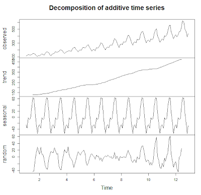
 We can also plot the all the components together with the observed time series in a single plot. Notice that the over all trend is increasing, the seasonal factor peaks during summers, and there is more fluctuation in the earlier and later years in the data than the middle. It is obtained after removing the long term trend, and seasonal factors from the data.

Decomponents Plot


Seasonal Factors Adjustment


Also, we can adjust the AirPassengers data now that we have some decomposition factors. Let us adjust for seasonality. Begin with the original AirPassengers data to have the years intact. Next, use the decompose() function to obtain the components. Next, subtract the seasonal factor from the original data into another data set and label it appropriately.


Seasonal Factors Adjustment Code and Plot

After plotting the adjusted data, we can observe how from the end of 1953 to middle of 1956 there is little fluctuation compared to the earlier and later years. Because we adjusted for seasonality, that means from '53 to '56 much of the fluctuation was due to differences in season, whereas the years prior to 1953 and after 1956, the fluctuations are not really influenced as much from season time. 

This is shown by how after the seasonal factors were removed from the time series, the ridership from 1953 to 1956 increased more stably. It appears that passengers were not influenced as much by the season in which to fly before 1953 and after 1956.


Note:

This decomposition assumes that the time series is calculated as an additive model as opposed to an multiplicative model, where the components are multiplied together. Multiplicative models are considered when the absolute differences are less important than the proportional differences in a time series. For example, if we had a time series of exponential growth of bacteria, or price inflation, the proportional change can be overlooked when the absolute values are smaller using an additive model. The decompose() function can be modified with a type="multiplicative" argument for a multiplicative model. The multiplicative model is shown below. We can just take the logarithms of each side and then the components act as an additive model.


  • Time Series Data = Seasonal Effect * Trend * Cyclical * Residual
  • Into:
  • log( Data) = log(Seasonal Effect) + log(Trend) + log(Cyclical) + log(Residual)


And there we have it! This concludes time series decomposition for now. There are more advanced functions for time series, such as stl() which we will cover in later posts. But for now, the next post in the series will move on to time series forecasting.


Thanks for reading,


Wayne
@beyondvalence