Loading...

Saturday, March 29, 2014

Neural Network Prediction of Handwritten Digits (MNIST) in R


Hello Readers,


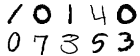
Today we will classify handwritten digits from the MNIST database with a neural network. Previously we used random forests to categorize the digits. Let us see how the neural network model compares to the random forest model. Below are 10 rendered sample digit images from the MNIST 28 x 28 pixel data.


Instead of using
neuralnet as in the previous neural network post, we will be using the more versatile neural network package, RSNNS. Lastly, we evaluate the model with confusion matrices, an iterative error plot, regression error plot, and ROC curve plots.


MNIST Data


Ah, we return to the famous MNIST handwritten digits data set (available here). Each digit is represented by pixels 28 in width and 28 in height, for a total of 784 pixels. The pixels measure the darkness in grey scale from blank white 0 to 255 being black. With a label denoting which numeric from 0 to 9 the pixels describe, there are 785 variables. It is quite a large data set considering the 785 variables from 42,000 rows of image data.


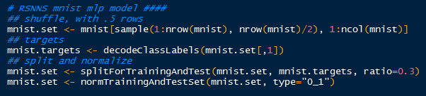
I made it easier to manage, and faster to model by sampling 21,000 rows from the data set (half). Later, I might let the model run overnight for the entire 42,000 rows, from which I will update the results in this post. Recall that the random forest model took over 3 hours to crunch in R.


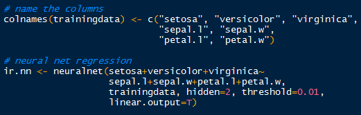
After I randomly sampled 21,000 rows, I began to create the targets inputs for which to train the input data. Afterwards with splitForTrainingAndTest(), the targets and inputs are separated into- you guessed it, training and test data according to ratio I set at 0.3. Because the grey scale values proceed from 0 to 255, I normalized them from 0 to 1, which is easier for the neural model.


Tidying Up the Data

Now the data is ready for the neural network training with the mlp() function. It creates and trains a multi-layered perceptron- our neural network. 


Training the Neural Network

And after some time, it will complete and we can see the results! Also evaluate and predict the test data with the model.


Results and Graphs


With 784 variables, calling summary() on the model would inundate the R console, since it would print the inputs, weights, connects, etc. So we need to describe the model in different ways. 

 Confusion Matrix
How about looking at some numbers? Specifically, at the confusion matrix of the results for the training and test data using the function
confusionMatrix(). (Note that R will mask the confusionMatrix() function from the caret package if you load RSNNS after caret- access it using caret::confusionMatrix()).   

We pass the targets for the training data, and the fitted values (predicted) from the model to compare how the model classified the targets with the actual targets. Also, I changed the dimension names to 0:9 to mirror the target numerals they represent.


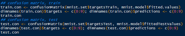
Creating Training and Test Confusion Matrices

Regard the confusion matrix from the training data below. Ideally, we would like to see a diagonal matrix, indicating that all the predicted targets matched the actual targets. However, that is hardly realistic in the real world, and even the best models get 1 or 2 misclassifications. 


Despite that, we do see the majority of predictions to be on target. Looking at target 4 (row 5), we see that 2 were classified as 0, 5 as 2 and as 3, 1,394 correctly as 4, 20 as 5, 2 as 6, and so on. It appears as the model best predicted target 1, as there were only 8 misclassifications for a true positive rate of 99.51% (1636/(3+1636+3+2)).


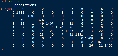
Training Confusion Matrix

Next we move to the test set targets and predictions. Again, target 1 has the highest sensitivity in predicting true target 1's at 97.7% (673/(6+673+10)). We will visualize the sensitivities using ROC curves in the post.


Test Confusion Matrix

Now that we have seen how the neural network model predicted the image targets, how well did they perform? To measure the errors and the measure of model fit we turn to our plots, beginning with iterative error.

 Iterative Error
For our first visualization, we can plot the sum of squared errors for each iteration of the model for both the training and test sets. RSNNS has a function called plotIterativeError() which will allow us to see the progression of the neural network training.


Plotting Iterative Error 

As we look at the iterative error plot below, note how SSE declines drastically through the first 20 iterations and then slowly plateaus. This is true for both the training and test values, while the test values (red) do not decrease as much as the fitted training values (black).


 Regression Error
Next, we evaluate the regression error for a particular target, say column 2, which for the numeric target 1 with the
plotRegressionError() function. Recall that the numeral targets proceed from 0 to 9.


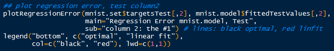
Observe the targets are categorical, taking values either 0 or 1,while the fitted values from the
mlp() model range from 0 to 1. The red linear fit is close to the optimal y=x fit, indicating an overall good fit. Most of the fitted values lie close to 0 when predicting the target value 0, and close to 1 when the target value is 1. Hence the close approximation of  the linear fit to the optimal fit. However, note the residuals on the fitted values, as some vary to 1 when the target is 0 and vice versa. Therefore, the model is not perfect, and we should expect some fitted values to be misclassifications- as seen in the confusion matrices.


 Receiver Operating Characteristic (ROC)
Now we turn to assessment of a binary classifier, the receiver operating characteristic (ROC) curve. From the basic 2 by 2 contingency table, we can classify the observed and predicted values for the targets. Thus we can plot the false positive rate (FPR) with the recall, or sensitivity (true positive rate- TPR). 

Remember that the FPR is the proportion of positive predictions which are actually negative (or 1-specificity), and the TPR is the proportion of positive prediction which are actually positive. With plotROC() we can plot the classification results of the training and test data for target column 3, for the numeral 2.


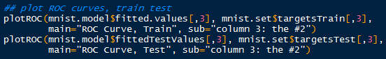
Plotting ROC Curves for Training and Test Sets

Points above the line of no discrimination (y=x) in a ROC curve are considered better than random classification results. A perfect classification would result in a point (0 , 1), where the false positive rate is 0 and the sensitivity is 1 (no misclassification). 


So when we look at the ROC curve for the training data, we see that the model did pretty well in classifying the target column 3, the image of 2's. The top-left corner approaches a sensitivity of 1, while the false positive rate is close to 0. The majority of 2's were classified correctly, with a few 2's being misclassified as other numbers.


For the test data, we see a slight difference in the ROC curve. There was a small difference in the model classifying 2's correctly, as the test data sensitivity does not approach the high levels as the training sensitivity until it reaches a higher false positive rate. That is to be expected, as the model was fitted to the training data, and not all possible variations were accounted.


Remember that we, established that target column 2, or 1's have the highest sensitivity. We can plot the ROC curve for the test set for the 1's to compare it to the ROC curve of test 2's.


The ROC curve for 1's does reflect our calculations from the test set confusion matrix. The sensitivity is much higher, as more true positive 1's were classified than the 2's. As you can see, the ROC curve for 1's achieve a higher sensitivity for similar values of low false positives, and reaches closer to the top left 'ideal' corner of the plot.

And here is the end of another lengthy post. We covered predicting MNIST handwritten digits using a neural network via the RSNNS package in R. Then we evaluated the model with confusion matrices, an iterative error plot, a regression error plot, and ROC plots.

There is much more analysis we can accomplish with neural networks with different data sets, so stay tuned for more posts!


Thanks for reading,

Wayne
@beyondvalence
LinkedIn


Extra Aside:
Do not be confused by a confusion matrix.

Tuesday, March 25, 2014

R: Neural Network Modeling Part 1


Hello Readers,


Today we will model data with neural networks in R. We will explore the package neuralnet, and a familiar dataset, iris. This post will cover neural networks in R, while future posts will cover the computational model behind the neurons and modeling other data sets with neural networks. Predicting handwritten digits (MNIST) with multi-layer perceptrons is covered in this post.


The Trained Neural Network Nodes and Weights

So far in this blog we have covered various types of regression (ordinary, robust, partial least squares, logistic) and classification (k-means, hierarchical, random forest) analysis. We turn to neural networks for a new paradigm inspired by imitating biological neurons and their networks. The neurons are simplified as nodes to an input layer, a hidden layer(s), and output nodes.


Let us start R and begin modeling iris data using a neural network.


Organizing the Input Data


First, we require the
nnet and neuralnet packages to be loaded in R. Next, we print the first six rows of iris, to familiarize ourselves with the structure. Iris is composed of 5 columns with the first 4 being independent variables and the last being our target variable- the species.


Libraries and Iris

After determining the species variable as the one we want to predict, we can go ahead and create our data subset. Additionally, we notice that there are 3 species grouped together in 50 rows each. Therefore, to create our targets, or class indicators, we can using the repeat function, rep(), three times to generate indicators for setosa, versicolor, and virginica species.


Subset and Target Indicators

Naturally, we will split the data into a training portion and a testing portion to evaluate how well the neural net model fits training data and predicts new data. Below, we generate 3 sets of 25 sample indexes from the 3 species groups of 50 rows- essentially half the data with stratified sampling. Afterwards, we column bind the target indicators with the training indexes to the iris data set we created, again only selecting by training indexes. A sample of 10 random rows are printed below, and note how the species indicator includes a 1 denoting the species type:


Iris Training Data


Training the Neural Network


Now that we have the targets and inputs in our training data we can run the neural network. Just to make sure, verify the column names in the training data for accurate model specification, modifying them as appropriate. 

Using the neuralnet() function, we can specify the model starting with the target indicators: setosa+veriscolor+virginica~. Those three outputs are separated by a hidden layer with 2 nodes (hidden=2), which are fed data from the input nodes: sepal.l+sepal.w+petal.l+petal.w. The threshold is set by default at 0.01, so when the derivative of the sum of squares error-like term with respect to the weights drops below 0.01, the process stops (so weights are optimal).


Neuralnet Training


Plotting the Neural Network


Now that we have run the neural network, what does it look like? We can plot the nodes and weights for a specific covariate like so: 


Visualizing the Neural Network

Hopefully I am not the only one who thinks the plot is visually appealing. Towards the bottom of the plot, an Error of 0.0544 is displayed along with the number of steps, 12122. This Error number is similar to the sum of squares.

Iris Neural Network Nodes

By default, the gwplot() plots the first covariate response with the first output, or target indicator. So below, we see species setosa with sepal length weights. The target indicator and covariate can be changed from default.


Validation with Test Data


How did the neural network model the iris training data? We can create a validation table with the target species and the predicted species, and see how they compare. The compute() function allows us to obtain the outputs for a particular data set. To see how well the model fit the training data, use compute() with the iris.nn data with training indexes. The list component $net.result from the compute object gives us the desired output from the overall neural network.


A Good Fit

Observe in the table above that all 75 cases were predicted successfully in the model. While it may seem like a good result, over-fitting can encumber predictions with unknown data, since the model was trained on the training data. No hurrahs yet. Let us take a look at the other half of the iris data we separated earlier into the test set.


Test Results

Simply take the inverse (-sample.i) of the sample indexes to obtain the mirrored test data set. And look, we did not achieve a perfect fit! Two in group 2 (versicolor) were predicted to belong in group 3 (virginica), and vice versa. Oh no, what happened? Well, the covariates in the training set cannot account for all known and unknown variations in the test covariates. There is likely something the neural network has not seen in the test set, so that it would mislabel the output species. 

This highlights a particular problem with neural networks. Even though the network model can fit the training data superbly well, when encountering unknown data, the weights on the nodes and bias nodes are geared towards modeling the known training data, and will not reflect any patterns in the unknown data. This can be countered by using very large data sets to train the neural network, and by adjusting the threshold so that the model will not over-fit the training data.

And as a final comment, I calculated the root mean square error (RMSE) for the predicted test results and the observed results. The RMSE from this neural network for the test data is approximately 0.23.


RMSE of Test Data

The results are not too bad, considering we only trained it with 75 cases. In the future I will post another neural network, revisiting the MNIST handwritten digits data, which we model earlier with Random Forests.

Stay tuned for more R posts!


Thanks for reading,

Wayne
@beyondvalence


For further reading:

Neuralnet

Thursday, March 20, 2014

How Fast is Fast? Comparing U.S. and South Korea Broadband Speeds in R


Hello Readers,


You might have heard about Google Fiber, where you browse and stream in the world of blindingly fast internet speed. How fast exactly? 100 times as fast, at 1,000 mbits/s (megabits per second). The rest of us in the United States have to trudge along with an average of 20 mbits/s while downloading, where actual speeds lag in around ~8 mbits/s. Such is the power of the clauses like "speeds up to __".

Unfortunately Google Fiber is only available in select cities (Kansas City, Austin TX, and Provo UT). So if you do not live there or any of these places, you probably will still be streaming Netflix and YouTube at average speed. Bummer. Here is a YouTube video demonstrating Google fiber speeds.

Internationally, the United States is beginning to lag behind other countries in broadband speed (download and upload). Take South Korea for instance. Entering into this millennium, South Korea has built significant networking infrastructure, and South Korean brands such as Samsung and LG have permeated the world electronic stage with high quality products. What Japan accomplished with innovating cars, right now South Korea is doing with electronics. And you guessed it, they also upgraded their broadband infrastructure as their economy focused on high tech in the 1990s. Their download and upload speeds are more than twice that of US counterparts (we generate the below plot in the post). 


S.K. Download Speeds in 2009 > U.S. Download Speeds in 2014

Also, two of South Korea's largest mobile carriers, SK Telecom and LG Uplus Corp, are rolling out a new LTE broadband network in 2014 at 300 megabits per second. Compare that speed to 8 megabits per second here in the U.S. There are many factors involved to make this possible in South Korea, such as high population density of 1,200 people per square mile, and government regulation to bolster competition among service providers. In the U.S., providers have their own closed-network system, so by switching to/from Comcast or Verizon, you would have to install new cables. This infrastructure dilemma acts as a cost barrier for new companies looking to enter into the broadband market.

Enough of the Fiber talk. We are here to discuss average internet broadband speeds for average people. And just because our internet is slower here in the U.S., does not mean that it does not work. Lucky us, there is open data available at Data Market. Let us start R and crunch the data!


Broadband Data


Start here for the exact data set from Data Market. This data is provided by Ookla, an internet metrics company. You most likely have used their speed test utility to measure your internet speed. The data set has many countries from which to select the download and upload speeds including the World average speed in kilobits per second. Make sure the United States and South Korea variables are selected with download and upload speeds before clicking the Export tab and downloading the CSV file.


Data Market- Broadband Speeds CSV

Now that we have downloaded the CSV file, we can import it into R:


Reading in the Broadband CSV Data

Note the columns and their data. There are 5 columns designating the year-month, South Korean download speed, South Korean upload speed, U.S. download speed, and U.S. upload speed, all in kilobits per second. We will be splitting the the last four into individual time series and appending them to a list due to their different lengths (South Korea has less data points). 


Remember to remove the last row in all columns, since it contains just a descriptor of the variables and null values. The creation will result in 4 time series: download and upload speeds for the U.S., and download and upload speeds for South Korea. Take notice that we divide each time series by 1000 to obtain megabits per second from kilobits per second.


Creating Time Series Data.frames and a List Class

The bb (broadband) list allows us to use a shorter input method, and aggregates all the time series into one list object. We could not create a data.frame with all four time series because the South Korea and U.S. series have different number of data points. South Korea data start at September 2008, whereas U.S. data start in January 2008. The bb list contents are shown below:


Time Series in List Contents
Check that the time series are in megabits by comparing the values. They should be three orders of magnitude less.


Plotting Broadband Speeds


Since we have two countries with two time series each, we will prudently use color coding for visual purposes. First we plot the download speed for South Korea in dark green using plot(), making sure to specify custom y and x axis to fit the data for U.S. as well. Next we add the remaining three time series with lines() with upload speed for South Korea in green, and the download and upload speeds for the U.S. in dark orange and orange, respectively.


Broadband Time Series Plot Code

Lastly we add a legend with the label and colors to yield our plot below:


Broadband Plot

And look at those colors! We can observe the South Korean green lines after mid 2011 are much higher than the orange yellow lines of the U.S. broadband speeds. In fact, we can see that download speeds in South Korea in 2009 were higher than our download speeds in the U.S. now in 2014


The Future of Broadband?


Of course we would want to know the forecasts of the time series. With our current technologies, how fast would our broadband speeds be in 2 years? Specifically, we want to ballpark our download speeds in the U.S. compared to South Korea. In previous time series posts, we used regression and ARIMA methods to forecast future values for wheat production and Amazon stock prices respectively. To create a prediction, or forecast, we will turn to exponential smoothing for these broadband data.

Exponential smoothing estimates the next time series value using the weighted sums of the past observations. Naturally we want to weight more recent observations more than previous observations. We can use '
a' to set the weight 'lamba':

lambda = a(1-a)^i, where 0 < a < 1
such that xt = a*xt + a(1-a)*xt-1 + a(1-a)^2 * xt-2 + ...

This procedure is called the Holt-Winters procedure, which in R manifests as the HoltWinters() function. This function includes two other smoothing parameters B for trend, and gamma for seasonal variation. In our case, we would simply specify the data and R will use determine the parameters by minimizing the mean squared prediction error, one step at a time.

Let us consider the exponential smoothing over the download speeds of the U.S. and South Korea. The U.S. output is shown below:

Holt-Winters Exponential Smoothing

We can see the
HoltWinters() function determined the three parameters, alpha, beta, and gamma. Next we overlay the fitted values from the HoltWinters() function to the real download speed time series to visualize how they approximate the actual values. The plot code is shown below, with different line colors for visual contrast:


Holt-Winters Plot Code

The resulting plot is displayed below:


Okay, the Holt-Winters procedure did a good job of approximating the the observed time series values, as seen by the red and yellow lines above for estimated U.S. and South Korea download speeds.


Now that we have confirmed the model, we will go ahead and predict the next 2 years of broadband download speeds using the
predict() function passing through the Holt-Winters objects. The predicted values are shown below:


Predicted 2 Years Values from Holt-Winters
We can see the U.S. predicted download speeds approach 28 mbits/s by 2016. For South Korea in 2016, the estimated download speed exceeds 60 mbits/s. Next we plot these predicted values with the download speeds time series with a dashed line type to differentiate the observed and predicted values with lty=2.


Plotting Predicted 2 Year Values

The prediction plot is depicted below.


Observe the U.S. download speeds with 2 year forecast in orange, and the South Korea download speeds in green. Note the forecasts as dashed lines. We see that the exponential smoothing predicted increases in U.S. and South Korea download speeds, with South Korea download speeds over 60 mbits/s and 28 mbits/s in the U.S.

In case you were curious, I also predicted the future upload speeds 2 years ahead to 2016 as well. U.S. upload speeds predicted by the Holt-Winters procedure barely exceeds 5 mbits/s, while upload speeds in South Korea rises above 55 mbits/s. Both predicted download and upload speeds in South Korea in 2016 are well beyond the broadband speeds in the U.S. The upload speeds plot is shown below:


Hopefully this post gives you guys a better idea of the state of broadband speeds now and after here in the U.S., and what could be possible, namely in South Korea. It is humbling to reiterate again that download speeds in the U.S. now in 2014 have not yet exceeded South Korean download speeds back in 2009. 

We would have to keep an eye out on this Comcast merger with Time Warner Cable. Merged, Comcast would control 40% of broadband market and have 30 million TV subscribers. And if New York allows it, I suspect lukewarm increases in broadband speeds, if at all. Google Fiber, where are you?

Stay tuned for more R posts!


Thanks for reading,

Wayne
@beyondvalence
LinkedIn

Saturday, March 15, 2014

Up, Up, And Away: Amazon Stock Prices in R


Hello Readers,


Today we turn to the world of finance as we look into stock prices, specifically that of Amazon, Inc (AMZN). AMZN has been traded on the NASDAQ stock exchange since their IPO on May 15th, 1997  at 18.00 per share. Nowadays in 2014, AMZN trades around 369 dollars a share. Quite a long ways from a simple book selling company in Jeff Bezo's garage. I am sure Jeff Bezos is smiling. A lot.


Jeff Bezos, Founder and CEO/Chairman/President of Amazon


At the Yahoo Finance site, we can download AMZN stock price data, such as the opening price, the high and low of the day, closing price, and the volume (number of stocks bought and sold). Check the beginning date is March 3, 2008, the end date is March 12, 2014 (when I retrieved the data), and prices are set to monthly. Then at the bottom of the chart, there is a 'Download to Spreadsheet' CSV link (or just click the link).

Download AMZN Prices from Yahoo Finance

Now that we have the stock prices data, let us start number crunching to predict future Amazon stock prices in R.


AMZN in R


We need to import the CSV file into R. Locate the AMZN CSV file in your computer directory and write a
read.csv() function pointing along the directory, making sure header=True. We will be using the closing prices.


Reading in CSV and AMZN Data

We see from the first six rows in amzn, that the closing prices are in 5th column, and the prices are ordered from most recent to previous prices. When creating the time series, we need to reverse the 5th column, and specify the starting month and year with start=c(2008, 3). There are 12 monthly prices in a year so freq=12.


Creating AMZN Time Series and Data.frame

In addition to the single time series, we can manipulate the data by taking the log of the values and placing both into an accessible data.frame.

Next we plot the AMZN stock prices to get an idea of any trends in the prices over the 6 years.


Plotting Both AMZN and log AMZN Prices

Below we have the two plots, the AMZN stock price and the log of the AMZN stock price. We can see the obvious rise over the 6 years from 71.3 in March 2008 to 370.64 in March of 2014.


Observe the same upwards trend for the log of the stock prices. Note that fluctuations at lower values  (around 2009) tend to produce greater effect when log transformed, since the values are the exponents of base e.


Decomposition


There is a function, stl(), which decomposes the amazon time series into seasonal, trend, and remainder components. stl() finds the seasonal component through loess smoothing (or taking the mean if s.window="periodic"). The seasonal component is removed from the data and the remainder is smoothed to find the trend. The residual component is calculated from seasonal plus trend fit residuals. Use the stl() function to decompose the closing prices in amazon, and plot the result.


amazon Decomposition

See how variable the seasonal component is through the extreme values ranging from -5 to 10. There are also definitive peaks and valleys at specific times during the year. For example, in the 4th quarter (Q4- October, November, and December) this is a dramatic rise and fall in price by about 15 points.


Overall, the trend shown above depicts the expected upwards trend in stock price, besides the prices from 2008 into 2009, coinciding with the great financial collapse. Next we will use this output to forecast the price of AMZN stock in 2 years- March 2016.


Forecasting with stl()


Load the
forecast package with the library() function. It enables us to forecast different time series models and linear models with the forecast() function. We specify our decomposed time series, amazon.stl, and determine our prediction method as "arima". Next we want to predict 24 periods into the future (or 24 months- 2 years), with a 95% confidence interval specified with level=95. Then we visualize our results by passing our forecast object through plot().


stl() ARIMA Forecasting AMZN

We see the resulting (wonderful) plot below. Observe the forecast prices modeled and determined by
auto.arima as the blue line, shadowed by the 95% confidence interval in grey. (ARIMA was cover in this post.) The model forecasts a likely increase of the AMZN stock price over 400 through year 2016.


The forecast values for AMZN through 2016 are shown below. The forecast for AMZN in March 2016 is 470.42, with a 95% confidence interval of the actual value lying between 333.96 and 606.88.


Forecast AMZN Values

From that forecast, I would buy some AMZN stock! Especially after Amazon announced on March 14th that they would raise Amazon Prime membership by $20 to $99 a year for free two-day shipping, video streaming, and other features. Many analysts concluded this move would increase profits by millions and AMZN stock rose 1% (about 3.5 points). I am sure Jeff Bezos is smiling even more.


OK folks, hopefully now you have a better understanding of decomposition and forecasting time series! Check back for more analytic posts!


Thanks for reading,

Wayne
@beyondvalence