Loading...

Saturday, April 12, 2014

Visualizing Google Flu Trends in R


Hello Readers,


Today we will visualize influenza trends in the United States, captured from Google.org Flu Trends. By combining flu symptom search queries with CDC flu data, Google was able to estimate how many of those searching for flu symptoms actually had the flu, or had influenza like illness (ILI). Locations are determined from IP addresses via their server logs.


Above is a plot of the average percentage of influenza like illness among the 50 states. We will look at weekly time series data for each 50 states from Google Flu Trends from June of 2003 to October of 2013. Click here for the text file

Load the ggplot2, scales libraries in R, and let us get started.


Flu Data


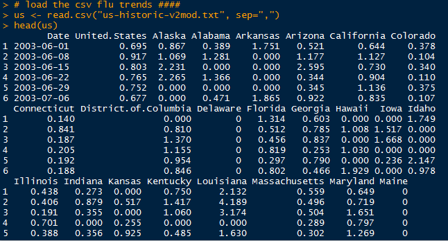
After reading in the "us-historic-v2mod.txt" as a CSV file, we call
head() and check what we have:

Raw Data

Our data set contains 541 observations in time with 160 variables of U.S. average, states, cities, and regions. We isolate the state variables along with the date into a new data.frame, and convert the Date column into a "year-month-day" date format.


New Data.Frame with States

Because we want to use ggplot() to display the flu trend for each of the 50 states, we have to create a new data.frame will all flu trend data in one column and the state in another. Essentially, we have to row bind all data from 50 states together.


Data.Frame Conversion

After we generated a Date, Flu, and State columns, we can column bind them together. However, make sure to use cbind.data.frame() instead of regular cbind() to preserve the date format.


Converted Data.Frame

Now we are ready for plotting the flu data.


Visualization of the Flu Data


Earlier I mentioned to load the ggplot2 and scales libraries. Next, we use the ggplot() function to begin our plot. The key to plotting 50 trends lies in the facet_wrap() function, where we stratify or 'facet' the State variable, and specify the number of columns and rows to display. Note that the State variable is a factor. The scale_x_date() function allows us to customize the x axis display to show the last 2 digits of every year ("%y").
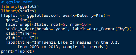

Plot Code

Pass the fluplot through print() and we obtain the plot below:


That is quite a lot of data to process visually at one time. After scanning the plot, we observe that the fluctuation in some states, such as Wyoming, Utah, or Florida, are not as prominent as other states- New Mexico, Arkansas, or Oklahoma. Some of these differences could be attributed to state population. 


However, almost every state at the start of a new year has a peak or increase in influenza like illness. The majority of states have higher peaks in 2003-2004, and 2009-2010. Recall the H1N1 incident from 2009-2010, where influenza of swine origin with novel viral genes threatened a pandemic. Due to the vigilance of the CDC, state and local health departments, hospitals, and healthcare personnel, quick vaccine creation and high vaccination levels prevented H1N1 from reaching pandemic distribution.

Yes, these  flu data are time series, so we will be able to decompose them and predict future ILI percentages! So stay tuned for more posts!


Thanks for reading,

Wayne
@beyondvalence
LinkedIn

Monday, April 7, 2014

Python: Accessing GIS Data With URL and FTP Modules


Hello Readers,


One of the most utilized methods in obtaining GIS data in Python is through URL and FTP connections. This post will demonstrate reading file data from the U.S. Geological Survey (USGS) and the National Oceanic and Atmospheric Administration (NOAA).


URL


The Uniform Resource Locator enables web browsers and programs to locate resources. We will use the urllib module to access the file, "hancock.zip", from the Google code website. After opening the Python Interpreter, or writing a script, import the urllib module, and assign the URL and file name to variables. After retrieving the file, Python will print out confirmation:


Retrieving hancock.zip

Now we turn to the USGS, and we want to read in US earthquake data from the past hour into Python. We use the urlopen() method to establish the connection. Using readline() to parse and print each line in the CSV file, we can see the first line includes the column headers, and the second line describes an earthquake near The Geysers in California. It appears to be small in magnitude at 0.7.


Reading Earthquake Data

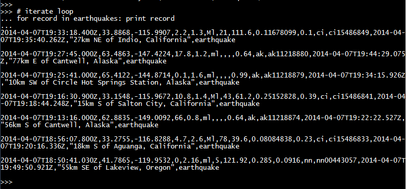
Of course we can loop through the rest of the lines with a for loop:


More Earthquake Data

As we can see, the recently reported earthquakes all happened in the Western U.S.- Alaska, California, and Oregon.


FTP


The File Transfer Protocol allows file transfers between hosts over a TCP network. We can access NOAA's ftp server using the ftplib module to retrieve a specific file about tidal data. After specifying the server, we can connect to it, which requires no login information (anonymous). We change the directory and write the file in binary ("wb").

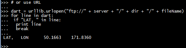
We look for a specific line concerning the location in latitude and longitude of this particular tidal buoy in the for loop. (It is located off the coast of Alaska- 50N, 171.8W)


Retrieving Tides Data via FTP

Likewise, we can approach this retrieval process using the
urllib module as well. Since we can locate the tidal text file on the NOAA ftp server, we simply use "ftp://" as the URL protocol.


Retrieving Tides Data via URL

After running the same loop, we arrive with the same latitude and longitude.


And there we have it, folks! Two ways of retrieving and reading data from online resources through Python- yes, pure Python. Here we retrieved shapefiles from hancock.zip, earthquake data from USGS, and tidal buoy data from NOAA. Stay tuned for more posts!


Thanks for reading,

Wayne
@beyondvalence

Code:
# Python GIS URL FTP


# URL
import urllib

# access hancock shapefiles
url = "https://geospatialpython.googlecode.com/files/hancock.zip"
fileName = "hancock.zip"
urllib.urlretrieve(url, fileName)
print("\n Saved Hancock file \n")
# hancock.zip is saved to current working directory

# access earthquake data from USGS
url = "http://earthquake.usgs.gov/earthquakes/feed/v1.0/summary/all_hour.csv"
earthquakes = urllib.urlopen(url)
print("reading earthquake lines \n")
print(earthquakes.readline() + "\n")

# iterate loop
print("looping earthquake data \n")
for record in earthquakes: print record

# FTP
import ftplib

server = "ftp.ngdc.noaa.gov"
dir = "hazards/DART/20070815_peru"
fileName = "21415_from_20070727_08_55_15_tides.txt"
ftp = ftplib.FTP(server)
ftp.login()
ftp.cwd(dir)
out = open(fileName, "wb")
ftp.retrbinary("RETR " + fileName, out.write)
out.close()
dart = open(fileName)
print("dart \n")
for line in dart:
    if "LAT, " in line:
        print line
        break

print ("dart URL \n")
# or use URL        
dart = urllib.urlopen("ftp://" + server + "/" + dir + "/" + fileName)
for line in dart:
    if "LAT, " in line:
        print line
        break
        
#
print("done")

Sunday, April 6, 2014

Python: A Simple GIS Model of Colorado


Hello Readers,


Since I have not posted with Python in awhile, this is a great opportunity to explore geographic information systems (GIS) with Python! We shall start mapping with a simple graphic of the Colorado state with a few cities using turtle graphics.

Though we do not use fancy graphics here, the resulting map below introduces the GIS capability of pure Python. For further GIS work with a variety of data formats such as raster and vector data, we will use the geospatial data abstraction library (GDAL). However, with the simple turtle graphics, we can create the map showing the 3 cities in Colorado and their populations:


In addition to the city names and their populations, we also print the largest city and the western most city by longitude from querying the population and coordinates for the maximum and minimum, respectively. The largest city has the largest population, and the western most city has the lowest longitude, being negative in the western hemisphere.


The code is displayed below as a reference:


 # GIS in Python Part 1
 
import turtle as t
 
## Section 1: Data Model
NAME = 0
POINTS = 1
POP = 2
state = ["COLORADO", [[-109, 37],[-109, 41],[-102,41],[-102,37]], 5187582]
cities = []
cities.append(["DENVER", [-104.98, 39.74], 634265])
cities.append(["BOULDER", [-105.27, 40.02], 98889])
cities.append(["DURANGO", [-107.88, 37.28], 17069])
map_width = 400
map_height = 300
 
 # bounding box for COLORADO
minx = 180
maxx = -180
miny = 90
maxy = -90
for x,y in state[POINTS]:
    if x < minx: minx = x
    elif x > maxx: maxx = x
    if y < miny: miny = y
    elif y > maxy: maxy = y
dis_x = maxx - minx
dis_y = maxy - miny
x_ratio = map_width / dis_x
y_ratio = map_height / dis_y
 
def convert(point):
    lon = point[0]
    lat = point[1]
    x = map_width - ((maxx-lon) * x_ratio)
    y = map_height - ((maxy-lat) * y_ratio)
    # python turtle graphics start in middel of screen
    # must offset points to center
    x = x - (map_width/2)
    y = y - (map_height/2)
    return [x,y]
 
## Section 2: Map Renderer
# COLORADO
t.up()
first_pixel = None
for point in state[POINTS]:
    pixel = convert(point)
    if not first_pixel:
        first_pixel = pixel
    t.goto(pixel)
    t.down()
t.goto(first_pixel)
t.up()
t.goto([0,0])
t.write(state[NAME], align="center", font=("Arial", 16, "bold"))

# CITIES
for city in cities:
    pixel = convert(city[POINTS])
    t.up()
    t.goto(pixel)
    # place a point for the city
    t.dot(10)
    # label the city
    t.write(city[NAME] + ", Pop.: " + str(city[POP]), align="left")
    t.up

# attribute query, use keyword lambda
biggest_city = max(cities, key=lambda city:city[POP])
t.goto(0,-200)
t.write("The biggest city is: " + biggest_city[NAME])
western_city = min(cities, key=lambda city:city[POINTS])
t.goto(0,-220)
t.write("The western-most city is: " + western_city[NAME])
t.goto(0, 200)
t.write("MAP OF COLORADO", align="center", font=("Arial", 20, "bold"))
t.pen(shown=False)
t.done()


There will be more python posts with GDAL and colorful visualizations! Stay tuned, and in the meantime, take a look at 'greatest ever' infographic :


Thanks for reading,


Wayne

@beyondvalence

Saturday, March 29, 2014

Neural Network Prediction of Handwritten Digits (MNIST) in R


Hello Readers,


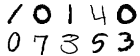
Today we will classify handwritten digits from the MNIST database with a neural network. Previously we used random forests to categorize the digits. Let us see how the neural network model compares to the random forest model. Below are 10 rendered sample digit images from the MNIST 28 x 28 pixel data.


Instead of using
neuralnet as in the previous neural network post, we will be using the more versatile neural network package, RSNNS. Lastly, we evaluate the model with confusion matrices, an iterative error plot, regression error plot, and ROC curve plots.


MNIST Data


Ah, we return to the famous MNIST handwritten digits data set (available here). Each digit is represented by pixels 28 in width and 28 in height, for a total of 784 pixels. The pixels measure the darkness in grey scale from blank white 0 to 255 being black. With a label denoting which numeric from 0 to 9 the pixels describe, there are 785 variables. It is quite a large data set considering the 785 variables from 42,000 rows of image data.


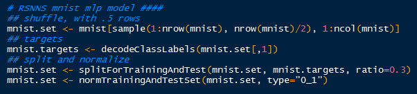
I made it easier to manage, and faster to model by sampling 21,000 rows from the data set (half). Later, I might let the model run overnight for the entire 42,000 rows, from which I will update the results in this post. Recall that the random forest model took over 3 hours to crunch in R.


After I randomly sampled 21,000 rows, I began to create the targets inputs for which to train the input data. Afterwards with splitForTrainingAndTest(), the targets and inputs are separated into- you guessed it, training and test data according to ratio I set at 0.3. Because the grey scale values proceed from 0 to 255, I normalized them from 0 to 1, which is easier for the neural model.


Tidying Up the Data

Now the data is ready for the neural network training with the mlp() function. It creates and trains a multi-layered perceptron- our neural network. 


Training the Neural Network

And after some time, it will complete and we can see the results! Also evaluate and predict the test data with the model.


Results and Graphs


With 784 variables, calling summary() on the model would inundate the R console, since it would print the inputs, weights, connects, etc. So we need to describe the model in different ways. 

 Confusion Matrix
How about looking at some numbers? Specifically, at the confusion matrix of the results for the training and test data using the function
confusionMatrix(). (Note that R will mask the confusionMatrix() function from the caret package if you load RSNNS after caret- access it using caret::confusionMatrix()).   

We pass the targets for the training data, and the fitted values (predicted) from the model to compare how the model classified the targets with the actual targets. Also, I changed the dimension names to 0:9 to mirror the target numerals they represent.


Creating Training and Test Confusion Matrices

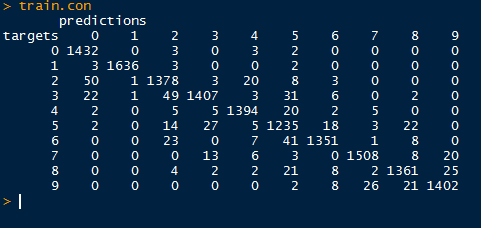
Regard the confusion matrix from the training data below. Ideally, we would like to see a diagonal matrix, indicating that all the predicted targets matched the actual targets. However, that is hardly realistic in the real world, and even the best models get 1 or 2 misclassifications. 


Despite that, we do see the majority of predictions to be on target. Looking at target 4 (row 5), we see that 2 were classified as 0, 5 as 2 and as 3, 1,394 correctly as 4, 20 as 5, 2 as 6, and so on. It appears as the model best predicted target 1, as there were only 8 misclassifications for a true positive rate of 99.51% (1636/(3+1636+3+2)).


Training Confusion Matrix

Next we move to the test set targets and predictions. Again, target 1 has the highest sensitivity in predicting true target 1's at 97.7% (673/(6+673+10)). We will visualize the sensitivities using ROC curves in the post.


Test Confusion Matrix

Now that we have seen how the neural network model predicted the image targets, how well did they perform? To measure the errors and the measure of model fit we turn to our plots, beginning with iterative error.

 Iterative Error
For our first visualization, we can plot the sum of squared errors for each iteration of the model for both the training and test sets. RSNNS has a function called plotIterativeError() which will allow us to see the progression of the neural network training.


Plotting Iterative Error 

As we look at the iterative error plot below, note how SSE declines drastically through the first 20 iterations and then slowly plateaus. This is true for both the training and test values, while the test values (red) do not decrease as much as the fitted training values (black).


 Regression Error
Next, we evaluate the regression error for a particular target, say column 2, which for the numeric target 1 with the
plotRegressionError() function. Recall that the numeral targets proceed from 0 to 9.


Observe the targets are categorical, taking values either 0 or 1,while the fitted values from the
mlp() model range from 0 to 1. The red linear fit is close to the optimal y=x fit, indicating an overall good fit. Most of the fitted values lie close to 0 when predicting the target value 0, and close to 1 when the target value is 1. Hence the close approximation of  the linear fit to the optimal fit. However, note the residuals on the fitted values, as some vary to 1 when the target is 0 and vice versa. Therefore, the model is not perfect, and we should expect some fitted values to be misclassifications- as seen in the confusion matrices.


 Receiver Operating Characteristic (ROC)
Now we turn to assessment of a binary classifier, the receiver operating characteristic (ROC) curve. From the basic 2 by 2 contingency table, we can classify the observed and predicted values for the targets. Thus we can plot the false positive rate (FPR) with the recall, or sensitivity (true positive rate- TPR). 

Remember that the FPR is the proportion of positive predictions which are actually negative (or 1-specificity), and the TPR is the proportion of positive prediction which are actually positive. With plotROC() we can plot the classification results of the training and test data for target column 3, for the numeral 2.


Plotting ROC Curves for Training and Test Sets

Points above the line of no discrimination (y=x) in a ROC curve are considered better than random classification results. A perfect classification would result in a point (0 , 1), where the false positive rate is 0 and the sensitivity is 1 (no misclassification). 


So when we look at the ROC curve for the training data, we see that the model did pretty well in classifying the target column 3, the image of 2's. The top-left corner approaches a sensitivity of 1, while the false positive rate is close to 0. The majority of 2's were classified correctly, with a few 2's being misclassified as other numbers.


For the test data, we see a slight difference in the ROC curve. There was a small difference in the model classifying 2's correctly, as the test data sensitivity does not approach the high levels as the training sensitivity until it reaches a higher false positive rate. That is to be expected, as the model was fitted to the training data, and not all possible variations were accounted.


Remember that we, established that target column 2, or 1's have the highest sensitivity. We can plot the ROC curve for the test set for the 1's to compare it to the ROC curve of test 2's.


The ROC curve for 1's does reflect our calculations from the test set confusion matrix. The sensitivity is much higher, as more true positive 1's were classified than the 2's. As you can see, the ROC curve for 1's achieve a higher sensitivity for similar values of low false positives, and reaches closer to the top left 'ideal' corner of the plot.

And here is the end of another lengthy post. We covered predicting MNIST handwritten digits using a neural network via the RSNNS package in R. Then we evaluated the model with confusion matrices, an iterative error plot, a regression error plot, and ROC plots.

There is much more analysis we can accomplish with neural networks with different data sets, so stay tuned for more posts!


Thanks for reading,

Wayne
@beyondvalence
LinkedIn


Extra Aside:
Do not be confused by a confusion matrix.

Tuesday, March 25, 2014

R: Neural Network Modeling Part 1


Hello Readers,


Today we will model data with neural networks in R. We will explore the package neuralnet, and a familiar dataset, iris. This post will cover neural networks in R, while future posts will cover the computational model behind the neurons and modeling other data sets with neural networks. Predicting handwritten digits (MNIST) with multi-layer perceptrons is covered in this post.


The Trained Neural Network Nodes and Weights

So far in this blog we have covered various types of regression (ordinary, robust, partial least squares, logistic) and classification (k-means, hierarchical, random forest) analysis. We turn to neural networks for a new paradigm inspired by imitating biological neurons and their networks. The neurons are simplified as nodes to an input layer, a hidden layer(s), and output nodes.


Let us start R and begin modeling iris data using a neural network.


Organizing the Input Data


First, we require the
nnet and neuralnet packages to be loaded in R. Next, we print the first six rows of iris, to familiarize ourselves with the structure. Iris is composed of 5 columns with the first 4 being independent variables and the last being our target variable- the species.


Libraries and Iris

After determining the species variable as the one we want to predict, we can go ahead and create our data subset. Additionally, we notice that there are 3 species grouped together in 50 rows each. Therefore, to create our targets, or class indicators, we can using the repeat function, rep(), three times to generate indicators for setosa, versicolor, and virginica species.


Subset and Target Indicators

Naturally, we will split the data into a training portion and a testing portion to evaluate how well the neural net model fits training data and predicts new data. Below, we generate 3 sets of 25 sample indexes from the 3 species groups of 50 rows- essentially half the data with stratified sampling. Afterwards, we column bind the target indicators with the training indexes to the iris data set we created, again only selecting by training indexes. A sample of 10 random rows are printed below, and note how the species indicator includes a 1 denoting the species type:


Iris Training Data


Training the Neural Network


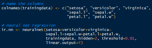
Now that we have the targets and inputs in our training data we can run the neural network. Just to make sure, verify the column names in the training data for accurate model specification, modifying them as appropriate. 

Using the neuralnet() function, we can specify the model starting with the target indicators: setosa+veriscolor+virginica~. Those three outputs are separated by a hidden layer with 2 nodes (hidden=2), which are fed data from the input nodes: sepal.l+sepal.w+petal.l+petal.w. The threshold is set by default at 0.01, so when the derivative of the sum of squares error-like term with respect to the weights drops below 0.01, the process stops (so weights are optimal).


Neuralnet Training


Plotting the Neural Network


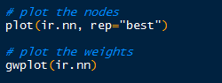
Now that we have run the neural network, what does it look like? We can plot the nodes and weights for a specific covariate like so: 


Visualizing the Neural Network

Hopefully I am not the only one who thinks the plot is visually appealing. Towards the bottom of the plot, an Error of 0.0544 is displayed along with the number of steps, 12122. This Error number is similar to the sum of squares.

Iris Neural Network Nodes

By default, the gwplot() plots the first covariate response with the first output, or target indicator. So below, we see species setosa with sepal length weights. The target indicator and covariate can be changed from default.


Validation with Test Data


How did the neural network model the iris training data? We can create a validation table with the target species and the predicted species, and see how they compare. The compute() function allows us to obtain the outputs for a particular data set. To see how well the model fit the training data, use compute() with the iris.nn data with training indexes. The list component $net.result from the compute object gives us the desired output from the overall neural network.


A Good Fit

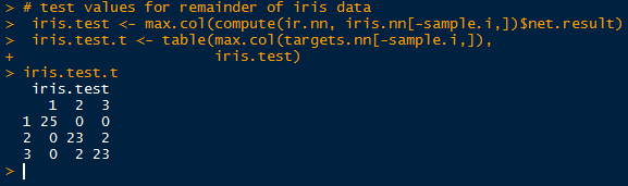
Observe in the table above that all 75 cases were predicted successfully in the model. While it may seem like a good result, over-fitting can encumber predictions with unknown data, since the model was trained on the training data. No hurrahs yet. Let us take a look at the other half of the iris data we separated earlier into the test set.


Test Results

Simply take the inverse (-sample.i) of the sample indexes to obtain the mirrored test data set. And look, we did not achieve a perfect fit! Two in group 2 (versicolor) were predicted to belong in group 3 (virginica), and vice versa. Oh no, what happened? Well, the covariates in the training set cannot account for all known and unknown variations in the test covariates. There is likely something the neural network has not seen in the test set, so that it would mislabel the output species. 

This highlights a particular problem with neural networks. Even though the network model can fit the training data superbly well, when encountering unknown data, the weights on the nodes and bias nodes are geared towards modeling the known training data, and will not reflect any patterns in the unknown data. This can be countered by using very large data sets to train the neural network, and by adjusting the threshold so that the model will not over-fit the training data.

And as a final comment, I calculated the root mean square error (RMSE) for the predicted test results and the observed results. The RMSE from this neural network for the test data is approximately 0.23.


RMSE of Test Data

The results are not too bad, considering we only trained it with 75 cases. In the future I will post another neural network, revisiting the MNIST handwritten digits data, which we model earlier with Random Forests.

Stay tuned for more R posts!


Thanks for reading,

Wayne
@beyondvalence

For further reading:

Neuralnet