Loading...

Monday, January 27, 2014

Querying Twitter API using Python: Part 2, Tweets


Hello Readers,


Here we will continue where we left off from querying US and World Twitter trends in Python. After we obtained the trends what else can we do? Using current international and US trends, we can create sets and perform intersections of the two trending sources to see which are in common. Then we will search for tweets based on a common popular trend!

Just a quick note, remember to recheck your Twitter OAuth tokens to ensure that they still are the same. Update them if they have changed, or else your previous script will not work presently. Also, I am running the python code as script from the command prompt, which is why the results have a black background.


Let us get started.


Twitter Trends as Sets


From the last post I demonstrated how to obtain the OAuth keys from Twitter by creating an app. Using the keys, we were able to access Twitter API using the twitter module. Afterwards we queried world and US trending topics and for this post, I queried the topics again to obtain recent trends. Here are some recent (as of the writing of this post) US trends shown in json format:


US Trends- json format

Yes, the '#Grammys' were on, and 'Smokey the Bear' was a trending item too, apparently. Next we will use the world and US trends and determine if there are any similar items by using the intersection of sets.


Finding Similar Trends

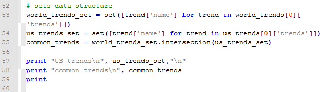
Below we have the results for the US trends as well as the intersection of the US and world trends. Note that the similar trending topics were: '#BeyonceAtGrammys', '#TheBachelorWedding', and 'Bey and Jay'.


US Trends and Popular Trends


Searching Tweets


Now that we have trending topics, we can search for tweets with a specific trending topic, say '#TheBachelorWedding'. We use the twitter_api.search.tweets() to query for tweets. However, we will take this one step further and query for more results with a for loop. Inside the search_results metadata there is a heading for 'next_results', which we will keep querying 5 times and add them to the statuses (tweets). Additionally, we will using '+= ' to modify statuses in place with new search_results.


One notion we must be aware is cursoring, as Twitter does not use pagination in the search results. Instead, we are given an integer signifying our location among the search results broken into pages. There is both a next and previous cursor given as we move along in the search results. The default cursor value is -1, and when we hit 0, there are no more results pages left.

Here are the results for the first status-tweet. It is quite extensive for a 140 character tweet,  with 5kb of metadata. The tweet was: 


"Catherine and Sean are perf. Bye.  \square \square#TheBachelorWedding"


Tweet Data!

It is so lengthy that I had to truncate the results to capture it! I circled the tweeter's handle: @ImSouthernClass.


More Tweet Data!


Fantastic, we were ab
le to query tweets based on the popular trends we obtained from Twitter. Next we will analyze the metadata behind multiple tweets and trends! So stay tuned!


Thanks for reading,


Wayne
@beyondvalence

Saturday, January 25, 2014

Python: Regression with AdaBoost


Hello Readers,


Today we will discuss regression with AdaBoost, a part of scikit module for Python. We shall compare how this boosting technique can allow the regressor to fit with less prediction error than a single decision tree.

We aim to create the graphic on the right showing the fits of a decision tree and one with AdaBoost.


Start Python (I am using 2.7.5) and let us get started!


The Modules


We require a few modules to run the script: numpy, pylab, sklearn.tree, and sklearn.ensemble. Specifically from sklearn.tree and sklearn.ensemble, we will use the DecisionTreeRegressor, and AdaBoostRegressor classes respectively.


Creating the Data


So we will create sinusoidal dataset with cosine using the cos() function and some Gaussian noise with the normal() function on the random number.


Data Creation
After we have the x and y, we can create the regression models from DecisionTreeRegressor and AdaBoostRegressor. Note that we have 300 estimators for the AdaBoost regression for 299 boosts, for 299 additional fits on the same data set but with different weights adjusted to the error of the prediction. Next we fit them to X and y, using fit(). Afterwards we predict() on the X values to obtain the predicted y values.


Regression Modeling, Fitting, and Predicting


Plotting the Predicted Values


Naturally, to visualize the two predicted y values, we plot them over the original y data. Using the pylab module, we can plot the original y values as scatter(), and the predicted y values with plot().

After adding x and y labels, a title, and a legend, we display the plot using show().


Plotting the Actual and Predicted Values

Which yields the graphic below.


Note how the green line (the single decision tree) has a rough fit, while trying to regress along the modified cos() points. See how the red AdaBoost regression with 299 boosts can better fit the cosine sinusoidal data, from altering the instance weights from the error of current prediction with each boost.  Increasing the number of boosts further enables, the regression fit. For more about AdaBoost from scikit, click here.


Thanks for reading,


Wayne
@beyondvalence


Monday, January 20, 2014

Python: Face Image Completion With Multi-Output Estimators


Hello Readers,


Today we will take a break from R and use Python (I use 2.7.5) to complete images of faces using training images. I shall demonstrate various methods for pixel prediction and compare the results from the derived image matrix of faces. As a teaser, the result is shown to the right:


To begin, start the scripting tool (such as Notepad++), as the code will be too text intensive for the IDLE interpreter. We can run the .py script from the command line when we complete the code. 

Let us start coding.


The Data


We obtain the data from scikit-learn dependencies available here. The Olivetti data itself contains a set of face images taken from 1992 to 1994 at AT&T Laboratories Cambridge. There are 10 different images of 40 distinct subjects- so the target is the identity of the individual in the image ranging from 0 to 39.


Here we seek to train the estimators to predict the lower half of the images. Let us see how well they construct the lower half of people's faces with:

  • Decision trees
  • K-nearest-neighbors
  • Linear regression
  • Ridge regression


The Code


Importing Data and Modules

We require both numpy and matplotlib.pyplot. From sklearn class there are the various data and functions we need to import. As you can see, we will be predicting using decision trees, k-nearest-neighbor, linear regression, and ridge regression where the Tikhonov matrix is supplemented to the usual minimization of ordinary least squares.


Training and Test Data

Since we need to separate the training and test data, we can use the targets variable (0 to 39) to divide them.


Subsetting Data

Then we need to modify the subset we are going to test after we train the estimators. We will use 5 targets out of the 10 we have as test targets. Using the np.ceil and np.floor functions we designate the upper and lower portions of the image.


Looping the Estimators

Next we have to fit the four estimators by first specifying attributes in the ESTIMATORS object. In the for loop we will cycle through each estimator in the object and train the data we created and create a prediction with the corresponding estimator name in y_test_predict. Then we plot the image matrix.


The Plotting


We have to specify the dimensions of the images to 64 pixels square, and the number of columns to be 1+4=5. After scaling the images, and adding a title, we begin the for loop which plots the faces each row at a time (i)- range of the number of faces, and from left to right (j)- the estimators in ESTIMATORS.


We can run the script by right clicking it and selecting IDLE. Another method is through the command prompt where we can run the python script after we navigate to the proper directory. And there we have the results below (like we saw at the very beginning)!


We can observe how well the decision trees, k-nearest-neighbor, linear regression, and ridge regression predicted the lower half of the faces. Linear regression was the least 'smooth' of the four and ridge regression improved upon it immensely. I thought ridge regression and decision trees worked best in predicting the lower half of the images.


This post was guided via scikit's documentation here.


Thanks for reading,


Wayne
@beyondvalence


Thursday, January 16, 2014

R: Classifying Handwritten Digits (MNIST) using Random Forests


Hello Readers,


The last time we used random forests was to predict iris species from their various characteristics. Here we will revisit random forests and train the data with the famous MNIST handwritten digits data set provided by Yann LeCun. The data can also be found on Kaggle.

We will require the training and test data sets along with the randomForest package in R. Let us get started. (Click here for the post that classifies MNIST data with a neural network.)


Scribbles on Paper


Hand writing is unique to each person, and specifically the numbers we write have unique characteristics (mine are difficult to read). Yet when we read numbers written by other people, we can very quickly decipher which symbols are what digits. 


Since there is increasing demand to automate reading handwritten text, such as ATMs and checks, computers must be able to recognize digits. So how can we accurately and consistently predict numbers from hand written digits? The data set provided by Yann LeCun was originally a subset of the data set from NIST (National Institute of Standards and Technology) sought to tackle this problem. Using various classifier methods LeCun was able to achieve test error rates of below 5% in 10,000 test images.

The data set itself consists of training and test data describing grey-scale images sized 28 by 28 pixels. The columns are the pixel number, ranging from pixel 0 to pixel 783 (786 total pixels), which have elements taking values from 0 to 255. The training set has an additional labels column denoting the actual number the image represents, so this what we desire from the output vector from the test set.

As we can see, the image numbers are in no particular order. The first row is for the number 1, the second for 0, and third for 1 again, and fourth for 4, etc.


MNIST Training Data

Before we create the random forest, I would like to show you the images of the digits themselves. The first 10 digits represented by the first 10 rows of written numbers from the training data are shown below.


Handwritten Numbers

How did we obtain those PNG images? I formed a 28 x 28 pixel matrix from the training data rows and passed it to the writePNG() function from the png library to output numerical images. Since the values range from 0 to 255, we had to normalize them from 0 to 1 by dividing them by 256.


Creating a PNG of First Row


The above code will create a png file for the first row (digit) in the training set. And it will give us this:  , a one. The below code stacks the rows 1 to 5 on top of the rows 6 through 10.

Creating a Stacked PNG for 10 Digits

And the image resulting from the above code we saw already, as the first series of handwritten numbers above.


Random Forests


Now that we know how the image was mapped onto the data set, we can use random forests to train and predict the digits in the test set. With the randomForest package loaded, we can create the random forest:


Creating RandomForest
After taking out the labels in the training set, we can use train.var, with corresponding training output as labels, and the test data as test. We will use 1,000 trees (bootstrap sampling) to train our random forest. Note that the creation of this random forest will take some time- over an hour on most computers. I left R running overnight to ensure that it would be completed by morning. Timed with proc.time(), it took about 3 hours on my (slow) computer.


RandomForest

Above, we have the default output of the random forest, containing the out-of-bag error rate (3.14%), and a confusion matrix informing us how well the random forest classified the 0-9 labels with the actual labels. We see large numbers down the diagonal, but we should not stop there.

Then we can call plot() on rf.bench to visualize the error rates as the number of trees increase:


plot(rf.bench)

We see that the aggregate OOB errors decrease and approach 0.0315, as in the output. The OOB error rate describes the error of each bootstrapped sampled tree with 2/3rds of the data and uses the "out of bag" remaining 1/3rd, non-sampled data to obtain a classification using that tree. The error from the classification using that particular tree is the OOB error.

Next we can observe which variables were most important in classifying the correct labels by using the varImpPlot() function.


Important Pixels

We can see the most important pixels from the top down- #378, 350, 461, etc. There is another step where we can rerun the random forest using the most important variables only.


Predicting Digits


Lastly, we need to predict the digits of the test set from our random forest. As always, we use the predict() function. However, since we already specified the test data in our randomForest() function, all we need to do is call the proper elements in the object. By using rf.bench$test$predicted we can view the predicted values. The first 15 are down below:


First 15 Predicted Digits

After using the write() function to write a csv file, we can submit it to Kaggle (assuming you used the Kaggle data) to obtain the score out of 1 for the proportion of test cases our random forest successfully classifies. We did relatively well at 0.96757.


Kaggle Submission

And there we have it, folks! We used random forests to create a classifier for handwritten digits represented by grey-scale values in a pixel matrix. And we successfully were able to classify 96.8% of the test digits. 

Stay tuned for predicting more complex images in later posts!


Thanks for reading,

Wayne

@beyondvalence
LinkedIn

Friday, January 10, 2014

Text Mining: 5. Hierarchical Clustering for Frequent Terms in R


Hello Readers,


Today we will discuss clustering the terms with methods we utilized from the previous posts in the Text Mining Series to analyze recent tweets from @TheEconomist. Therefore, I shall post the code for retrieving, transforming, and converting the list data to a data.frame, to a text corpus, and to a term document (TD) matrix. This post shall mainly concentrate on clustering frequent terms from the TD matrix. 

The code can be found on my GitHub! Here

Check out Text Mining: 6 for K-Medoids clustering.


The Economist Twitter Page

Start R, and let us get started!


From Tweets to a Term Document Matrix


This quick introduction will retrieve 400 tweets from @TheEconomist and transform the tweet list into a data.frame, text corpus, and then to a term document matrix. The code is shown so that you can follow along if desired.

First, the code for connecting to the Twitter API and retrieving the tweets with the twitteR and ROAuth packages is shown below. This step was covered in this post about retrieving text from Twitter. **Update: Creating a Twitter OAuth Object is more reliable than using getTwitterOAuth(), covered in link above.**


Retrieving Tweets

Next we shall convert the tweets into a data.frame and then a text corpus using the tm package, which was discussed here.


Data.frame and Text Corpus Transformations

After we have the text corpus, we can start stemming the words for frequency counting, covered here. Remember, requires the SnowballC package. After stemming, we can convert the corpus into a term document matrix.


Stemming and Term Document Conversion

Not to leave out any visualizations, we shall include building a word cloud, found here in a previous post. This requires the wordcloud package.


Creating a Word Cloud

And the result I obtained is shown below:


@TheEconomist Word Cloud

We see that the most frequent terms are "economist", "new", "weeks", "america", "recent", "mandela", and "year", among others.


Hierarchical Clustering


The hierarchical clustering process was introduced in this post. With the tm library loaded, we will work with the econ.tdm term document matrix. 

First we need to eliminate the sparse terms, using the removeSparseTerms() function, ranging from 0 to 1. This sparse percentage denotes the proportion of empty elements. A sparse parameter of 0.7 means that we select from those terms which are less than 70% empty. We set the sparsity at 0.95 so that terms with at least that sparse percentage will be removed. So the terms we accept can be very empty- at most 95% empty. Then we can coerce the TD matrix into a regular matrix.

Removing Sparse Terms

Now we compute the distance matrix for the hclust() function.

Hierarchical Clustering

Naturally we plot the dendrogram, for the cluster tree.


Plotting a Dendrogram

By cutting the dendrogram into 5 clusters, we obtain the plot below. You can cut the dendrogram into a variety of cluster numbers, depending on the vertical distance- the differences between the terms.


Dendrogram

We can evaluate the terms in the clusters by using the cutree() function.


Term Groups

Observe that "economist" and "new" are both in their own clusters. We have many terms for cluster 2, "china", "dailychart", "now", "recent", "todays", "view", "weeks", and "world". That makes sense because the @TheEconomist regularly tweets infographic "dailychart[s]" describing "recent" information about the world, or about "todays" news, or hot issues on debate "now".

And there we have it! The other posts used @nbastats, and this post we transitioned to @TheEconomist because tweets from @nbastats included many numbers which were eliminated from the text corpus transformation.

Thanks for reading,


Wayne

@beyondvalence
LinkedIn

Wednesday, January 8, 2014

Predictive Modeling: Creating Random Forests in R


Hello Readers,

Welcome back to the blog. This Predictive Modeling Series post will cover the use of Random Forests in R. Before we covered decision trees and now we will progress a step further in using multiple trees.

Click here to read Leo Breiman's paper for random forests.


Load the randomForest library package in R, and let us begin!

Iris Data


We will use the familiar iris data set found in previous posts as well. To remind us what we are working with, call head() on iris


Load randomForest and iris data

We are looking at four variables of the flowering iris plant and the fifth variable indicates the species of the flower. Now we can separate the data into a training set for the random forest and a testing set to determine how well the random forest predicts the species variable.

First sample 1 and 2 from the row number of the data set. We set the probability of 1 at 0.7 and 2 at 0.3 so that we get a larger training set. Then we assign the respective subsets of iris to their training and testing sets.


Creating Training and Test Data

Now that we have our data sets, we can perform the random forest analysis.


Random Forest


The Random Forest algorithm was developed by Leo Breiman and Adele Cutler. Random Forests are a combination of tree predictors, such that each tree depends on a random vector sampled from all the trees in the forest. This incorporates the "bagging" concept, or bootstrap aggregating sample variables with replacement. It reduces variance and overfitting. Each tree is a different bootstrap sample from the original data. After the entire ensemble of trees are created, they vote for the most popular class.

With the randomForest package loaded, we can predict the species variable with the other variables in the training data set with 'Species ~ .' as shown below. We are going to create 100 trees and proximity will be true, so the proximity of the rows values will be measured.


iris Random Forest

See that we have results of the random forest above as well. The 'out of bag' estimate is about 4.59%, and we have the confusion matrix below that in the output. A confusion matrix, otherwise known as a contingency table, allows us to visualize the performance of the random forest. The rows in the matrix are the actual values while the columns represent the predicted values.

We observe that only the species setosa has no classification error- all of the 37 setosa flowers were correctly classified. However, the versicolor and virginica flowers had errors of 0.057 and 0.081 respectively. 2 versicolors were classified as virginica and 3 virginicas were classified as versicolor flowers.

Call attributes() on the random forest to see what elements are in the list.


Attributes of iris Random Forest


Visualizing Results


Next we can visualize the error rates with the various number of trees, with a simple plot() function.


plot(rf)

Though the initial errors were higher, as the number of trees increased, the errors slowly dropped somewhat over all. The black line is the OOB "out of bag" error rate for each tree. The proportion of times of the top voted class is not equal to the actual class is the OOB error.

We observe which predictors were more important with the importance() function. As we can see, the most important variable was Petal.Length.


Important Predictors

Using the varImpPlot() function, we can plot the importance of these predictors:


For our most important variables for classification are Petal.Length and Petal.Width, which have a large gap between the last two sepal variables. Below we have the species predictions for the iris test data, obtained by using the prediction() function.


Iris Test Contingency Table

We see again that the setosa species performed relatively better than the versicolor and virginica. With the prop.table() function nested outside of the table() function, we can create a table for the proportions. Versicolor performed second best with 94% correct and virginica with 86%.


Proportion Table with Plot Code

We can go ahead a create a plot of the margin of error. The margin for a particular data point is the proportion of votes for the correct class minus the maximum proportion of votes of the other classes. Generally, a positive margin means correct classification.


Margin of Error Plot

We can see that as the most of the 100 trees were able to classify correctly the species of iris, although the few at the beginning were below 0. They had incorrectly classified the species.

Overall, the random forests method of classification fit the iris data very well, and is a very power method of classifier to use in R. Random forests do not overfit the data, and we can implement as many trees as we would like. It also helps in evaluating the variables and telling us which ones where most important in the model.

Thanks for reading,


Wayne
@beyondvalence