Hello Readers,
In order to promote alternative public transportation, many major cities in the U.S. have established bike sharing programs. These systems use a network of kiosks for users to rent and return bikes on an as-need basis. Users can rent a bike at one kiosk and return it to another kiosk across town. The automated kiosks gather all sorts of bike usage data, including duration of rent, departure and arrival locations. These data points act as proxy measures for analysts to estimate city mobility. (Check out the YouTube video in the middle of the post.)
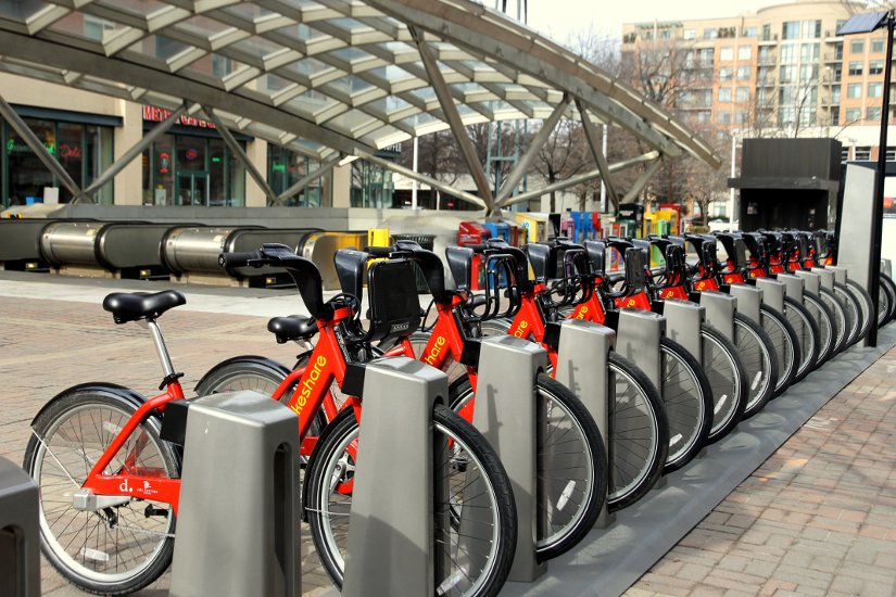 |
| Capital Bikeshare Station |
This "Bike Sharing" R series involves the prediction of bike rentals over 2011 and 2012 for the Capital Bikeshare program in Washington D.C. The CSV data for forecasting can be obtained from the Kaggle Knowledge Competition.
Capital Bikeshare Data
The training data are the first 19 days of each month from January 2011 to December 2012, and the test data from which we aim to predict the bike rental numbers, are the remaining days in each month. The variables include the "datetime", seasonal data, temperature, humidity, and wind speed measures. Because Kaggle gave us this information along with the time stamps, we will have to evaluate whether a model with the weather data, or a time series model without the weather data can better predict the bike rental counts.
Before we get ahead of ourselves and start modeling, we need to understand the data first. Remember to point your working directory in R to the proper location. Load the training data with "read.csv", and get a glimpse of the data with "head" and "summary":
First Look Code:
1 2 3 4 5 6 7 8 9 10 11 12 13 14 15 16 17 18 19 20 21 22 23 24 25 26 27 28 29 30 31 32 33 34 35 36 37 38 39 40 41 42 43 44 45 46 47 | > # set working directory > setwd("~/Documents/Kaggle/BikeSharing") > > # load libraries #### > library(xts) > library(gbm) > > # load train csv > train <- read.csv("train.csv", stringsAsFactors=FALSE) > head(train) datetime season holiday workingday weather temp atemp 1 2011-01-01 00:00:00 1 0 0 1 9.84 14.395 2 2011-01-01 01:00:00 1 0 0 1 9.02 13.635 3 2011-01-01 02:00:00 1 0 0 1 9.02 13.635 4 2011-01-01 03:00:00 1 0 0 1 9.84 14.395 5 2011-01-01 04:00:00 1 0 0 1 9.84 14.395 6 2011-01-01 05:00:00 1 0 0 2 9.84 12.880 humidity windspeed casual registered count 1 81 0.0000 3 13 16 2 80 0.0000 8 32 40 3 80 0.0000 5 27 32 4 75 0.0000 3 10 13 5 75 0.0000 0 1 1 6 75 6.0032 0 1 1 > > summary(train) datetime season holiday workingday Length:10886 Min. :1.000 Min. :0.00000 Min. :0.0000 Class :character 1st Qu.:2.000 1st Qu.:0.00000 1st Qu.:0.0000 Mode :character Median :3.000 Median :0.00000 Median :1.0000 Mean :2.507 Mean :0.02857 Mean :0.6809 3rd Qu.:4.000 3rd Qu.:0.00000 3rd Qu.:1.0000 Max. :4.000 Max. :1.00000 Max. :1.0000 weather temp atemp humidity Min. :1.000 Min. : 0.82 Min. : 0.76 Min. : 0.00 1st Qu.:1.000 1st Qu.:13.94 1st Qu.:16.66 1st Qu.: 47.00 Median :1.000 Median :20.50 Median :24.24 Median : 62.00 Mean :1.418 Mean :20.23 Mean :23.66 Mean : 61.89 3rd Qu.:2.000 3rd Qu.:26.24 3rd Qu.:31.06 3rd Qu.: 77.00 Max. :4.000 Max. :41.00 Max. :45.45 Max. :100.00 windspeed casual registered count Min. : 0.000 Min. : 0.00 Min. : 0.0 Min. : 1.0 1st Qu.: 7.002 1st Qu.: 4.00 1st Qu.: 36.0 1st Qu.: 42.0 Median :12.998 Median : 17.00 Median :118.0 Median :145.0 Mean :12.799 Mean : 36.02 Mean :155.6 Mean :191.6 3rd Qu.:16.998 3rd Qu.: 49.00 3rd Qu.:222.0 3rd Qu.:284.0 Max. :56.997 Max. :367.00 Max. :886.0 Max. :977.0 |
With our initial look at the data, we can make a few observations:
1. The "datetime" variable is formatted "year-month-day_hour:minute:second",
2. "season", "holiday", "workingday", and "weather" are categorical variables,
3. our target variable, "count", is composed of "causal" and "registered" users,
4. and each row entry increments by the hour for 10,886 observations.
Now we need to change "datetime" into a date type, and "season", "holiday", "workingday", and "weather" into factor variables. Keep in mind for our prediction model, we need not include all the variables.
Variable Reformatting Code:
1 2 3 4 5 6 7 8 9 10 11 12 13 14 15 16 17 18 19 20 21 22 | > # set categorical variables #### > # season, holiday, workingday, weather > train$season <- factor(train$season, c(1,2,3,4), ordered=FALSE) > train$holiday <- factor(train$holiday, c(0,1), ordered=FALSE) > train$workingday <- factor(train$workingday, c(0,1), ordered=FALSE) > train$weather <- factor(train$weather, c(4,3,2,1), ordered=TRUE) > # set datetime #### > train$datetime <- as.POSIXct(train$datetime, format="%Y-%m-%d %H:%M:%S") > str(train) 'data.frame': 10886 obs. of 12 variables: $ datetime : POSIXct, format: "2011-01-01 00:00:00" "2011-01-01 01:00:00" ... $ season : Factor w/ 4 levels "1","2","3","4": 1 1 1 1 1 1 1 1 1 1 ... $ holiday : Factor w/ 2 levels "0","1": 1 1 1 1 1 1 1 1 1 1 ... $ workingday: Factor w/ 2 levels "0","1": 1 1 1 1 1 1 1 1 1 1 ... $ weather : Ord.factor w/ 4 levels "4"<"3"<"2"<"1": 1 1 1 1 1 2 1 1 1 1 ... $ temp : num 9.84 9.02 9.02 9.84 9.84 ... $ atemp : num 14.4 13.6 13.6 14.4 14.4 ... $ humidity : int 81 80 80 75 75 75 80 86 75 76 ... $ windspeed : num 0 0 0 0 0 ... $ casual : int 3 8 5 3 0 0 2 1 1 8 ... $ registered: int 13 32 27 10 1 1 0 2 7 6 ... $ count : int 16 40 32 13 1 1 2 3 8 14 ... |
In our training data.frame, we have 12 reformatted variables, and from the "str" function, we see the changes reflected in the variable types. I set the "weather" variable as a ordinal factor, where order matters, instead of a regular factor variable. Looking at the data dictionary, you can see the categorical "weather" variable describing the severity of the weather conditions, with 1 being clear or partly cloudy, and 4 indicating thunderstorm, heavy rain, sleet, etc. So 1 is the best weather condition, with 4 being the worst.
Now let us examine the distribution of our bike sharing data.
Exploring Count Data
Since we aim to predict the bike share demand, the obvious place to begin is with our target variable, "count". We can stratify the "count" distribution as boxplots for the categorical variables, and draw the "count" and numeric variables in another plot. We group the two sets of plots together, and designate their plotting order with "layout".
Count Distribution Code:
1 2 3 4 5 6 7 8 9 10 11 12 13 14 15 16 | > # count is our target variable > # plot count distribution > # by categorical var > layout(matrix(c(1,1,2,3,4,5),2,3,byrow=FALSE)) > boxplot(train$count, main="count") > boxplot(train$count ~ train$weather, main="weather") > boxplot(train$count ~ train$season, main="season") > boxplot(train$count ~ train$holiday, main="holiday") > boxplot(train$count ~ train$workingday, main="workingday") > > # by numeric var > layout(matrix(c(1,2,3,4),2,2,byrow=TRUE)) > plot(train$temp, train$count, main="temp") > plot(train$atemp, train$count, main="feelslike temp") > plot(train$windspeed, train$count, main="windspeed") > plot(train$humidity, train$count, main="humidity") |
The R code above will yield the two "count" distribution graphics below:
 |
| Count Distribution by Categorical Variables |
Observe the five "count" boxplots above, with the larger plot being the overall "count" distribution. We see the median count hover around 150 units, and we see many outlier counts above 600. The range of counts is from 0 to under 1000 units. When stratified by "weather", besides extreme weather (==4), the median count increases, with higher usage count the better the weather. There is not much difference other than the outliers for non-"holiday" days, and also for days which are designated a "workingday". We see increases in median counts for "season" 2 and 3, summer and fall, respectively.
 |
| Count Distribution by Numeric Variables |
Now we move to the numeric variables. Looking at the distributions, we see a general trend of higher "count" values for temperatures from 25 to low 30's (in Celsius). Not surprisingly, there were more "count" values for lower "windspeed" values. There was not much difference for the "humidity" variable, as "humidity" values from 30 to 70 had similar "count" values.
Take a Break- How the Capital Bikeshare Program Works:
Examining All Variables
Since we looked at the relationship between the "count" variable and the other covariates, what about the relationship between the covariates? An obvious guess would support correlation between temperature, season, and between weather and wind speed. To visualize their relationships, we create a pairwise plot with the size of the correlation font relative to their correlation strength in the upper panel of the plot. A best fit regression line is also added to give an idea of trend.
Pairwise Plot Code:
1 2 3 4 5 6 7 8 9 10 11 12 13 14 15 16 17 18 19 | > # pairwise plot > ## put (absolute) correlations on the upper panels, > ## with size proportional to the correlations. > panel.cor <- function(x, y, digits = 2, prefix = "", cex.cor, ...) > { > usr <- par("usr"); on.exit(par(usr)) > par(usr = c(0, 1, 0, 1)) > r <- abs(cor(x, y)) > txt <- format(c(r, 0.123456789), digits = digits)[1] > txt <- paste0(prefix, txt) > if(missing(cex.cor)) cex.cor <- 0.8/strwidth(txt) > text(0.5, 0.5, txt, cex = cex.cor * r) > } > pairs(~count+season+holiday+workingday+weather+temp+humidity+windspeed, > data=train, > main="Bike Sharing", > lower.panel=panel.smooth, > upper.panel=panel.cor) > |
Below we have the resulting pairwise plot with correlations:
 |
| Pairwise Plot |
I suggest enlarging the plot to view the graphic in all its complexity.
Yes, we do see the seasonal temperature variation, however we do not see too much variation in wind speed other than with humidity. We so see higher humidity with increased weather severity, which makes sense since it requires precipitation to rain/fog/sleet/snow. And yes, if it is a holiday, then it probably is not a working day (not all non-working days are holidays though).
Good. Our pairwise plot revealed no unexpected surprises.
A Closer Look at Count
Let's go back and analyze "count" again, but this time with the "datetime" variable to incorporate a temporal aspect. Recall that we reformatted the variable so now it is recognized as a date type (POSIXct), by year-month-day hour:minute:second format.
So let us visualize the counts over the time of our data. Additionally, since we have the breakdown of casual and registered users, we can examine the percentage of registered users using the Capital Bikeshare each hour over the two years.
Count and Percentage Plot Code:
1 2 3 4 5 6 7 8 9 10 11 12 13 | > # plot > # count of bike rentals by datetime > plot(train$datetime, train$count, type="l", lwd=0.7, > main="Count of Bike Rentals") > > # percentage of registered users > percentage <- train$registered/train$count*100 > plot(train$datetime, percentage, type="l", > main="Percentage of Registered Users") > > summary(percentage) Min. 1st Qu. Median Mean 3rd Qu. Max. 0.00 74.66 85.53 82.90 93.83 100.00 |
Immediately we see differences within and between year 2011 and 2012. Observe the seasonal spike in the summer and fall in each year, and also the general elevated counts in 2012 compared to 2011. It appears that the Capital Bikeshare program became more popular in 2012 relative to 2011! We see our maximum count is located in 2012.
Note the gaps in between the months- they are the days after the 19th of each month. They are the entries we aim to predict with our model from the first 19 days.

Next we have the percentage of registered users from the count. We see drops in the summer and fall, which could be attributed to tourists who are only visiting Washington D.C. to see the sights and have no need to register with Capital Bikeshare.
From our summary of "percentage" in the code, we notice that our median percentage of registered users hovers around 85.53%.

So while there are casual users of Capital Bikeshare, the majority of users are registered. Also, there was an decrease in number of occasions where the majority of users were casual users from 2011 to 2012.
OK folks, in this R post we have explored the Capital Bikeshare data from Kaggle, while to prepare to predict the bike share demand with various weather and type of day variables. So stay tuned for Part 2, where we start using regression to examine how well each covariate predicts the bike count.
Thanks for reading,
Wayne
@beyondvalence
ReplyDeleteInformasi Khusus Untuk Kamu Pecinta Sabung Ayam Indonesia !
Agen Bolavita memberikan Bonus sampai dengan Rp 1.000.000,- Khusus Merayakan Natal & Tahun Baru !
Untuk Informasi Selengkapnya langsung saja hubungi cs kami yang bertugas :
WA : +62812-2222-995
BBM : BOLAVITA
Situs : www.bolavits.site
Aplikasi Live Chat Playstore / App Store : BOLAVITA Sabung Ayam
Baca Artikel Sepak bola terbaru di bolavitasport.news !
Prediksi Angka Togel Online Terupdate di angkamistik.net!
Great article! We're doing some predictive modeling for a new pilot research program initiated from Georgia Tech for a community nearby here in Atlanta, GA. I may reach out to share some further thoughts on this.
ReplyDelete