Loading...

Monday, January 6, 2014

Text Mining: 4. Performing Term Associations and Creating Word Clouds in R


Hello Readers,


Welcome back to my blog. Today we will discuss analysis of a term document matrix that we created in the last post of the Text Mining Series. 

We will perform frequent term searches, and terms associations with visualizations. Then we finish the post by creating a visual word cloud (to the right) to 'display' the content of the terms in the tweets from @nbastats. Read Part 5 here.


Start R and let us begin programming!


Plotting Word Frequencies


Here we continue from where we left off last time. Begin by loading the
twitteR, tm, and ggplot2 packages in R. Using the findFreqTerms() function in the tm library to find the most frequent terms. We can specify the lower and upper bounds of the frequency values using lowfreq and highfreq. Here we return terms with 20 or more occurrences.


High Frequency Terms

Next we take the 17 terms and create a bar graph of the frequencies using
ggplot2. We can obtain the term counts by using rowSums() and we subset the sums to return values 20 or greater. Then we can plot the graph using qplot(), and the geom="bar" argument will create the bar graph, the coord_flip() flips the x and y axis.


Bar Graph Code

The neat result is shown below:


Term Frequencies

We can see that "games", "last", and "amp" are the top three terms by frequency.


Finding Word Associations


Using word associations, we can find the correlation between certain terms and how they appear in tweets (documents). We can perform word associations with the findAssocs() function. Let us find the word associations for "ppg" (points per game) and return the word terms with correlations higher than 0.25.


Associated Terms for "ppg"

We see that "ppg" has a high 0.65 correlation with "rpg", or rebounds per game. This makes sense as a tweet which contacts statistics about the points per game would also include other statistics like rebounds as well as "apg"- assists per game and "fg" field goals.


What about a team, say the Heat which has LeBron James? We can find the word associations for "heat":


Word Associations for "heat"

The top correlated terms are "adjusts", "fts" (free throws), "rockets", "thunder", and "value". Both the Houston Rockets and the Oklahoma City Thunder at top teams so it makes sense that there would be mentions of top teams in the same tweet, especially if they play against each other. LeBron is having a record year in player efficiency which might be why "trueshooting" is an associated term with 0.49 correlation for true shooting percentage.


We can plot the word associations for "heat". The code, similar to the previous plot, is shown below.


Plotting "heat" Word Associations

Which yields:


"heat" Word Associations

And there we have the word associations for the term "heat". I think that is a nice looking visual.


Creating a Word Cloud


We are going to continue the visual creation spree, and this time we will create a word cloud. Load the
wordcloud package in R and convert the tweet term document into a regular matrix. 
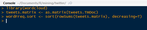

wordcloud, Matrix Conversion, and Sorted Word Frequencies

After we created a word count of all the terms and sorted them in descending order, we can proceed to making the word cloud. We will set a set seed (at 1234) so that the work is reproducible. We need to create a gradient of colors (this time in gray) ranging from 0 to 1 for the cloud, based on the frequency of the word. More frequent terms will have darker font in the word cloud.

With the wordcloud() function, we can create the word cloud. We need to specify the words, their frequencies, a minimum frequency of a term for inclusion, and the color of the words in the cloud.


Word Cloud Plot Code

The word cloud is shown below!


Word Cloud for @nbastats

So in this post we have performed word associations for high frequency terms in our tweet term document matrix. We have also created a visualizations for the word associations and a word cloud to visualize the top occurring terms in the term document matrix for tweets from @nbastats.


Stay tuned for more analysis for hierarchical clustering of the terms!


Thanks for reading,

Wayne

@beyondvalence
LinkedIn

Sunday, January 5, 2014

Text Mining: 3. Stemming Text and Building a Term Document Matrix in R


Hello Readers,


In our last post in the Text Mining Series, we talked about converting a Titter tweet list object into a text corpus- a collection of text documents, and we transformed the tweet text to prepare it for analysis. 

However, the tweets corpus is not quite done. We are going to stem the tweets and build a document matrix which will enable us to perform frequent term searches and word associations. So now we will continue where we left off from Text Mining 2. Read Text Mining 4 here.

Start R and let us begin!


Stemming Text


Here we have one more step before we start with the basics of counting word frequencies. Since we are looking at the @nbastats handle, consider the word score. It can exist in many other forms, such as scoring, scored, or scores and so on. When we want to count the number of score terms, we would like all the variations to be counted.

So stemming score and other words will allow us to count different variations as the same term. How is this possible? Stemming will truncate words to their radical form so that score, scoring, scored, or scores will turn into 'scor'. Think of stemming as linguistic normalization. That way different spelling occurrences will appear as the same term, and will be counted towards the term frequency.

In R, load the SnowballC package, along with twitteR, and tm. The SnowballC package will allow us to stem our text of tweets. The tweets corpus data was created in the previous post. 

Load Packages and Tweets Corpus

After creating a copy of the tweets corpus for a reference prior to the stemming changes, we can proceed with the stemming. With the tm_map() function, use the stemDocument transformation. Inspect the documents in the text corpus with the inspect() function.


Stemming and Inspecting the Document

Check the pre-stemmed tweet:


Copy of Tweet 4

See how the 'leaders' and 'entering' in the copy corpus were stemmed to 'leader' and 'enter' in the transformed corpus. Like the function we created with string wrapping for printing tweets from the tweets list in Retrieving Twitter Tweets. Here is the one for printing tweets from a stemmed text corpus:


Print Tweets from Corpus Function

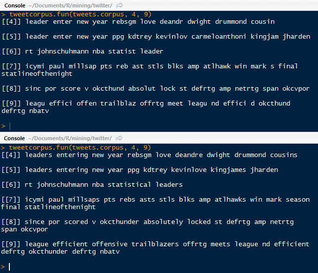
The output for tweets 4 through 9 are shown below.


Tweet Corpus Documents 4 to 9

Next instead of stemming, we will have to implement stem completion. 


Stem Completion


We complete the stems with the objective to reverse the stemming process so that the text looks more 'normal' and readable. By passing the tm_map() the stemCompletion() function, we can complete the stems of the documents in tweets.corpus, with the tweets.corpus.copy as the dictionary. The default option is set to complete the match with the highest frequency term.


Stem Completion Function

Then we can call the function to print out the tweets for 4 through 9 again, and the output for before and after stem completion are stacked below:


Text Corpus Stem Completion Comparison

There are several things to note. Starting at the beginning of tweet 4, we can see that 'leader' was replaced with 'leaders', 'enter' with 'entering', 'deandr' with 'deandre' (DeAndre Jordan the center for the Los Angeles Clippers), 'cousin' with 'cousins' (DeMarcus Cousins, the center for the Sacramento Kings).

However, there are some major differences, such as 'carmeloanthoni' being completely omitted after the stem completion (sorry Melo)- although 'kingjam' was replaced with 'kingjames' (congrats LeBron James). 'statist' was completed to 'statistical'. 'millsap' was incorrectly completed to 'millsaps' (correct as Millsap- sorry Paul). Some shorthand was completed as well- 'reb' was completed to 'rebs' for rebounds. Looking at 'effici' it was completed to 'efficient'.

From the last tweet (9), we see that 'd' was completed to 'defrtg' (short for defensive rating), although that it was just a regular 'd' to begin with. The 'okcthund' was completed to a more familiar 'okcthunder' (Oklahoma City Thunder).

So not all completions did a phenomenal job. That is to be expected when we use the default of completing the stemmed matches with the highest frequency in the dictionary, the copy of the corpus.


Building a Term-Document Matrix


Now that we have stemmed and completed our text corpus, we can proceed to build a term-document matrix. Load the
tm and twitteR packages, and continue using the stem completed corpus.


Loading Packages and Text Corpus

In a term document matrix, the terms are the rows and the documents are in the columns. We can also create a document term matrix, and that would simply be the transpose of the term document matrix- the documents are represented by the rows and the terms by the columns. With the
TermDocumentMatrix() function, we can create the term document matrix from our tweet text corpus. See in the output below, that there are 606 terms and 186 documents (tweets).


Using the TermDocumentMatrix() Function

There is also a 98% sparsity, which means that 98% of the entries are 0, so the row term does not exist in a particular document column. We can display the terms by calling the term dimension names. It is quite extensive a only a fraction of the 606 terms is show below.


Terms

Observe some (basketball) recognizable terms such as "careerhigh", " blakegriffin", or "chicagobulls"- but which term had the most occurrences in all the tweet documents? We can figure that out using the apply() function and summing across the rows of the term document.

Most Occurring Term: games, 79 times

We can also tweak the function to show the terms with more than 20 occurrences by passing it through the which() function.


Terms With 20 + Occurrences

See that some of the top terms are "asts" assists, "fg" field goals, "games", "okcthunder" Oklahoma City Thunder, and "ppg" points per game among the various terms.

Let us visualize the term document matrix for specific terms and documents. We can assign the occurrences of the most frequent term, "games" in an index, and the following few terms for specific tweet documents. Again, we will use the
inspect() function to gain snippets of the term document matrix.


Term Frequencies in Tweet Documents 60 to 70

Note that the sparsity is 87%, so like the rest of the matrix, this sub-matrix is mostly comprised of zero entries. Looking at the frequent "games" term, we do see that particular term appearing in the documents quite often, and even twice in tweet document 64. The abbreviation "gms" is also shown as well.


At the beginning we started with a corpus of tweet text, and we stemmed it, completed the stems, and converted it into a term document matrix. From the TD matrix we were able to count the frequencies of the terms in each document, bringing the data a final step closer to analysis-ready. 

In the next post we will begin to analyze the text data, and we shall demonstrate term frequencies, term associations, and word clouds. Stay tuned!


Thanks for reading,


Wayne
@beyondvalence
LinkedIn

Friday, January 3, 2014

Text Mining: 2. Converting Tweet Text List into a Document Corpus with Transformations Using R


Welcome Back Readers,


Last time in the Text Mining Series we discussed how to retrieve tweets from the Twitter API with the twitteR package in R. Now that we have the text data to work with, we can now transform the text from their raw format into a corpus, which is a collection of text documents.

This post continues from where we left off in Text Mining 1. Read Text Mining 3 here. We require the packages: tm for text mining and SnowballC for word stemming to collapse words.

Now is a good time to download and load them in R- so let us get started! 


Data.Frame to Corpus


As we saw from last time, the raw text in the tweet list object was far from polished and would take some formatting to clean. We start with converting the tweet list object into a data.frame after we load the packages and set the working directory:


Tweet List Object into Data.Frame Object

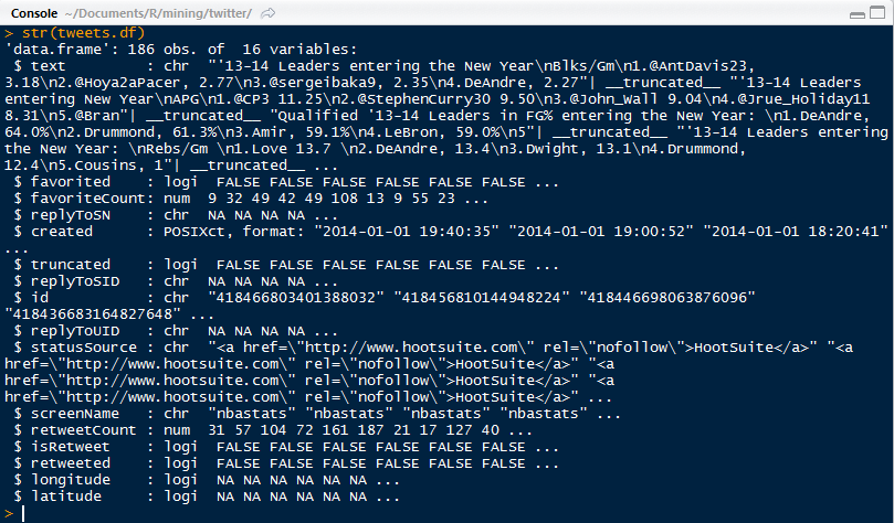
As we can see, the dimensions of the tweets data.frame has 186 rows and 16 columns. The descriptions for each column are shown below:


Tweet Data.Frame Column Structure

We have columns for the tweet text, whether the tweet is favorited by the user (my account since my app accessed it), how many favorites if any, tweet ID, and so on. Note at the bottom, there are yes/no for longitude and latitude coordinates- so we can track the location where the tweet was sent.

Now that the data exists as a data.frame, we can convert it into a corpus using the Corpus() function from the tm package (the link opens to a pdf of the tm package).


Tweets into Corpus

Observe that the corpus list has 186 text documents, which means that the conversion process converted each tweet into a text document. 


Next, we will transform the tweet corpus and the getTransformations() function displays the text transformations available for the tm_map() function in the text mining package. We have various transformations at our disposal, such as removing punctuation and removing numbers, words, and white space.


Transforming Text


First we will perform the following modifications using the tm_map() function: lowering character case, removing punctuation, removing numbers, and removing URLs. These are completed using the respective commands: tolower, removePunctuation, removeNumbers, and a regular expression substitution using gsub().


Removing Case, Punctuation, Numbers and URLs

The gsub() function allows us to replace the regular expression for an URL link, "http[[:alum:]]*" with "", a non-space for removal. Then we pass that function to the tm_map().


Adding and Removing Stopwords

Next we add stopwords. They are words that are ignored from searches with specific relevant topics and keyword combinations, increase the 'content' of the the tweet, and efficiency of analysis. They include, a, the, for, from, who, about, what, when, where, and more, depending on the analysis. Common stopwords, some even from Google Search filters out can be found here.


We can observe the changes of the text transformation, when we look at a random tweet. Say tweet #4 below. Note how all the punctuation was removed, as with the numbers, and newline escapes "\n", and that all characters are lowercase.


Tweet 4 Before and After

Next time around we shall discuss stemming the documents in the corpus we created and transformed in this post. Stemming involves cutting words shorter to retrieve their radicals. That way we can count their frequency despite the word being spelled differently or being used in a different tense. For example- updated, updating, update are 'stemmed' to updat.

And that is for next time! So stay tuned!


Thanks for reading,


Wayne
@beyondvalence
LinkedIn

Wednesday, January 1, 2014

Text Mining: 1. Retrieving Text from Twitter in R Using the twitteR Package *Updated*

## Updated 2014/3/20 ##
# Twitter API Changed #

Hello Readers,


Happy 2014

As a micro-blogging site, Twitter has a wealth of text data to analyze. However, the text data is not in a usable form initially. So it requires extraction from the Twitter API, transformation into a document-matrix, and finally we can perform word associations or counts. Lastly, we can cluster words and tweets into groups to discover the group composition of the words and tweets. We will begin to cover these topics one by one in the Text Mining Series. Read Text Mining 2 here.


A few posts ago we discussed accessing the Twitter API to mine trending data in Python. Today we will discuss Twitter text retrieval in R. Note that readers will require a Twitter account to access the Twitter API.

Let us begin!


Accessing Twitter


To mine Twitter data, we first need to retrieve the text data from the Twitter API. The package twitteR will allow us access Twitter feeds.  A large portion of text data come in the form of tweets. We will choose last 200 tweets from the @nbastats handle to analyze, which features daily basketball statistics. Here is what the Twitter page looks like:


@nbastats Page

The tweets by users are located on the bottom right hand corner of the page. To access the Tweets from other applications, we need a user account to create an application in the developer's page. This way we obtain the proper credentials to access the Twitter API through the twitteR package in R.


In the application page, we will have the OAuth keys which are unique to the application. They will allow applications to authenticate with the Twitter API and access the tweets. Keep the keys secret!


OAuth Keys

Now that we have the keys, start R and load the twitteR package (library(twitteR)).  Configure the RCurl options as shown below. The cacert.pem certificate file is required and can be downloaded here to the local working directory in R. 


RCurl Options

Then assign the consumer key and consumer secret key to those variables. 
SEE UPDATE BELOW- TWITTER API CHANGED.


Keys and the getTwitterOAuth() Function

In the getTwitterOAuth() function, provide the consumer key and the consumer secret key. It will direct us to the Twitter API website with a link and once we click Accept, we are given the verification code.

And once we provide the PIN code, we are given the Access tokens and a verification of the completed handshake.


Handshake Completed

Now that we are verified and connected, let us start querying tweets!


API Access Update:


Instead of using the getTwitterOauth() function, we need to setup manually an OAuth object. Make sure the internet addresses begin with https://, and you have loaded the twitteR, ROAuth, and XML packages. The RCurlOptions need to be set as well.


After you initiate the handshake() function, you will be prompted to enter a code from the dev.twitter page into R. To verify the completion of the handshake, simply call cred.

Retrieving Tweets


One thing to note: the cacert.pem specification is required for every tweet query. So when we use the
userTimeline() function, we need to assign the certificate to the cainfo argument, in addition to the user handle and number of tweets. Again, we will be using @nbastats. We will try to retrieve up to 200 tweets from that timeline. Here is what the tweets look like at the beginning of the new year:


Tweets from @nbastats

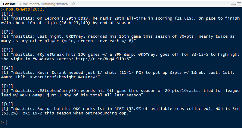
We can save the nba.tweets file to preserve the data and be able to work with it later. Each tweet is a single line, and the number of tweets are quite burdensome to work with. We can access specific tweets by using brackets "[ ]". Let us access tweets 20 to 25.


Selected Tweets Numbers 20 to 25


Formatting Tweets


We can use text wrapping to make the text output more readable. Create a function that will take arguments for the tweet object name, lower tweet number, and higher tweet number. My version looks something like this:


Tweet Printing Function

Observe that there are 3 arguments and a for loop in the function. I start the output with double brackets indicating the number tweet. We saw before in the output, that even the tweets were from 20 to 25, the brackets still showed from 1 to 6 given the order they were printed. We would like the actual tweet number to be shown. 

The strwrap() function wraps a string by breaking lines at word boundaries. The specification was 73 columns in width. The output for the initialized function is shown below for tweets 20 to 25 from nba.tweets. Note how the tweet numbers are printed in brackets and the nbastats prefix was removed from each tweet.


Printed Tweets from @nbastats, Numbers 20 to 25

Now we can explore other Twitter users and what they tweet. Next we will transform the text and create a corpus to build a document-matrix. So stay tuned!

Thanks for reading and have a great New Year,

Wayne

@beyondvalence
LinkedIn

Sunday, December 29, 2013

Cluster Analysis: Hierarchical Modeling in R


Hello Readers,


This post will cover another method on data clusters. Last time we talked about k-means clustering and here we will discuss hierarchical clustering.

We will use the cars data set available here. It describes a set of cars from 1978-1979. 

Start R and let us get started!


Hierarchical Clustering


A large difference in hierarchical clustering and k-means clustering lies in the selection of clusters. K-means (covered here) requires that we specify the number of clusters first to begin the clustering process. In hierarchical clustering, the process requires a distance matrix, and the processes creates a cluster with the two closest points after evaluating all the points and re-evaluates the distance with the rest of the points and the new cluster. There are multiple distances we can use, with different results. Therefore, we can get a solution with a trivial case, where each observation is a separate cluster, to the opposite trivial solution where all the observations are in one cluster.

The hclust function in R will enable us to perform hierarchical clustering on our data.


Cars Data


Read the tab delimited file, 'cars.tab' with the read.delim() function in R. To get an idea of what we are working with, pass cars through head() and observe the data.


cars Data and cars1

We see cars has 2 character variables (Country and Car model) and 6 numerical (MPG, Weight, Drive_Ratio) and integer (Horsepower, Displacement, Cylinders) variables. In a new data set cars1, we can keep all the variables we can analyze numerically, and not pass the first two.

Next we need to standardize the various variables so that a variable with high magnitude compared to others will not overwhelm the clustering. Essentially we create a 'z-score' for each variable by computing the median and the median average deviation. We take the difference between the variable and the median and divide it by the median absolute deviation, like a z-score. This is shown below with the apply() and scale() functions. Remember, the "2" represents the columns for apply.


Scale Standardization of cars1 Variables

Now that the variables are centered, we can calculate the distance between each observation for each variable by using the
dist() function. We will obtain a distance matrix will be a lower diagonal matrix with all the distances between the i and j observations.


dist() and hclust() Functions

Next we pass the
hclust() function the cars.dist distance matrix to get the cluster object, cars.hc. Then we visualize the results.


Plotting the Dendrogram


Using the car types in the original cars data as the labels, we can create a dendrogram to visualize the cars1 data.


Dendrogram Plot Code

The plot() function yields the tree diagram below. The cex argument allows us to scale back the size of the label text for readability.


Cars1 Dendrogram

At a given height in the plot, there are vertical lines each representing a group with objects when they were grouped together into a cluster. If we cross the y-axis at 6, we will encounter 2 lines, so there are 2 groups there. The y-axis represents how close together observations were when they were merged in groups, so if the height was small, like those in heights 0 to 1, then those clusters are not too reliable. However, if the height was higher between the last cluster and the current one, then the clusters do a good job at showing the structure of the data.

So by looking at the diagram, we see that at a high height, there seems to be two distinct groups which first emerge. The right hand group has two groups in itself, while the left hand group appears to have similar clusters, as their heights are smaller. Therefore, we can make an argument for 2 or 3 clusters. But as you can see, the hierarchical clustering considers both trivial conclusions- 1 cluster for all observations or 38 clusters for each individual observation from top to bottom.

Using the rect.hclust() we can visualize which branches are in which cluster- when we specify the cluster number. Let us choose k=3.


rect.hclust() Function

Which outlines the clusters in the plot and yields:


Clusters in the Plot

Just like we predicted earlier, we thought that the left and right clusters would be groups, and the right cluster would be split further into two for a total of three clusters, as outlined above.


Cluster Groupings


Now that we have the clusters, we can analyze the clusters and the observations in each cluster. We can start by seeing now many observations are in each cluster by using the cutree() function and specifying the number of clusters.


Counts for 3 Clusters

We see that all three groups have 8 in cluster 1, 20 in cluster 2, and 10 in cluster 3. There are over half of the observations in the second cluster. Is this because we need more clusters? Let us see what happens when we look at the counts for 2 clusters up to 6. We can use the sapply() function for efficiency.


Counts for Clusters 2 to 6

From the 4 cluster count, the difference is negligible as another cluster was created of size 3 only. By 5 clusters, we see the counts becoming more similar.

Next, we can see which cars are in the 3 clusters. Again, we use sapply() and we get the car types in a list.


Car Types in 3 Clusters

Also, we can see what happens when there are 4 clusters:


Car Types in 4 Clusters

Observe that the 'Audi 5000', 'Saab 99 GLE' and 'BMW 320i' are now in new cluster # 3 with the 4 cluster model.


Cluster Grouping Analysis


Remember that we removed the Car and Country variables from the data set that we used because they were character variables. Some of the times we take out variables to see if the clusters from the analysis naturally group themselves with those removed variables.

Let us see if the origin country of the cars, given by Country are reflected in the clusters. Create a table with the group index and Country name to see any patterns.


Group Country Count

In cluster 1, we see that all the cars were produced in the United States. This is obvious if we remember the car names in the first cluster- they were Buick, Chevy, Mercury, Ford, Chrysler, and Dodge, all American car manufacturers. For cars in cluster 2, most of the cars were produced in the United States, Japan, and Germany. In cluster 3, the United States also produced the most cars at 7 models.

A useful method for characterizing clusters is by using summary statistics. Here we can use the median to evaluate the averages of each variable in the clusters with the aggregate() function.


Median Variable Values of 3 Clusters

But these numbers are not the same because we standardized them at the beginning. To get a better idea of what we are looking at, we can use the original numbers, as in a3. Instead of using cars1, we use the original cars data set.


Median Variable Values of 3 Clusters, Unadjusted

In a3.df we created a data.frame to encompass the cluster number, the frequency of observations in each cluster, and then the un-standardized median values for the variables. From the readable data.frame, we can see cars in 

  • Cluster 1 have lower gas mileage (MPG), higher Weight, more Horsepower, larger Displacement, and more Cylinders;
  • 20 very light Weight cars in cluster 2 have the highest MPG, a higher Drive_Ratio, the lowest Horsepower and the least number of Cylinders;
  • Cars in cluster 3 are average compared to the cars in the other two clusters, but more similar to cluster 1.


Likewise, we performed the same procedure for 4 clusters as well:


Median Variable Values of 4 Clusters, Unadjusted

We can see that the new cluster, #3, was created from a grouping in cluster #2 in a3.df with cars having lower MPG, more Weight, higher Drive_Ratio, more Horsepower, and increased Displacement.


And that is it! As you can see, hierarchical clustering had an advantage of being able to analyze results from different cluster numbers more quickly than k-means clustering. It also allows us to see the groupings in the plot visual from one trivial cluster to all observations into their own cluster.

Next up in the Cluster Analysis Series will be PAM- partitioning around medoids. So stay tuned! 


Thanks for reading and Happy New Year!


Wayne

@beyondvalence