Hello Readers,
This post continues the visualization of flu trends from Google. Last time we plotted the flu time series for 50 states from 2003 to 2013. Here we will visualize the flu trends through 10 regions set by the Department of Health and Human Services (HHS). We shall enlist the aid of the melt() function from the reshape2 library.

So load ggplot2, scales, and reshape2 in R, and let us get started!
10 HHS Regions
Recall from the previous flu trends post, that the data was obtained from the Google Flu Trends site. The CSV file includes influenza like illness percentages from doctor visits for 50 states, District of Columbia, 97 major cities and 10 HHS regions. Since we already visualized the 50 states, we turn to the 10 HHS regions.
 |
| Flu Data in U.S. Regions |
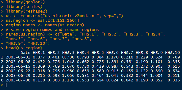
Last time we used a custom function to pull data from each column into 1 column. Then we bound a respective column with the 50 state names. Likewise, the date values were repeated 50 times, for a total of 3 columns. The original saved region names are shown below, along with the states they contain.
 |
| Original Region Names with States |
However, there is (almost always) a more efficient way. In the reshape2 library, there exists a function which will arrange all the desired values into one column from multiple columns. Simply specify which variable to keep constant, and the melt() function will create variable column identifying the value column.
 |
| Melted Flu Trends in U.S. Regions |
Now we are ready to visualize the flu data by region.
Creating the Visuals
Using ggplot(), we specify the Date on the x axis, and the value on the y axis. Furthermore, we use facet_wrap() to stratify by variable (HHS regions) into 10 plots, 2 columns of 5.
 |
| Plot Code |
This yields the plot below:

Like we confirmed in the last post, here we also see dramatic peaks in all regions from 2003-2004, and 2009-2010. HHS region 6, which includes Arkansas, Louisiana, New Mexico, Oklahoma, and Texas has higher consistent peaks than the other 9 regions.
We could have plotted the 10 regions in one plot, however, the lines would be difficult to differentiate:
 |
| Plot Code |
Looking at the plot below, we observe multiple colors, each a region, and peaks in each region occur within a similar time window. All the lines in one plot makes it difficult to evaluate each time series individually, but allows relative comparison between regions.

Again we encounter an alternative method to writing a custom function. The melt() function rearranges a data.frame for us. And that concludes this post. Stay tuned for more data analysis!
Thanks for reading,
Wayne
@beyondvalence
Dapatkan Pasaran Bola Terbaik di Situs Agen Resmi BOLAVITA !
ReplyDeletewww.bolavita.site Agen Taruhan Bola Online yang sudah di percaya dan sudah berdiri sangat lama di dunia perrjudiian Indonesia !
Aman dan Terpercaya !
Hubungi Cs kami yang bertugas 24 jam Online :
BBM: BOLAVITA
WA: +6281377055002
Atau bisa langsung download Aplikasi Resmi BOLAVITA :
Aplikasi Playstore : Bolavita Sabung Ayam