Hello Readers,

Welcome to the second post in the 'Time Series' series! Last time we discussed decomposing the data to obtain the decomponent factors of the time series.
Here we will continue from the previous post into forecasting, using the same data set, AirPassengers to forecast future data points.
Let us get started!
Forecasting
As you may recall, in the last post, we plotted the additive decomposition model of AirPassengers, as shown below.
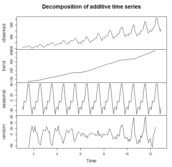
We observe in the trend component that the number of passengers are generally increasing over the 1950s into the early 1960s. How about in 1961? Or 1962? That is where forecasting comes into play. We can use the different components we have to predict the components and therefore, the data, in the subsequent years.
ARIMA (p, d, q) Model
ARIMA is short for auto-regressive (p) integrated (d) moving averages (q). The arima() function has 3 parameters: p, d, and q in the order argument, which describe the terms of auto-regressive, integrated, and moving average parts of the model.
The p number of auto-regressive terms allows us to include p number of previous terms in the model. An order of 1 p gives us simply:
Xt = u + ϕ1X(t-1)
and order of 2 p gives us:
Xt = u + ϕ1X(t-1) + ϕ2X(t-2)
d is the number of differences if the time series is not stationary when looking at the correlogram representing the autocorrelation function of the time series, AirPassengers. The correlogram will show if there are periodicities in the data via the autocorrrelation and partial autocorrelation functions.
 |
| ACF and PACF Code |
Which plots the correlogram:
 |
| ACF and PACF |
So the ACF shows a possible need for differencing because the trend from left to right does not approach 0. Using the diff() function, we can compute the differences in AirPassengers.
 |
| diff() Function |
After differencing, we observe the autocorrelation function does narrow in range and approach 0. It appears if first order differencing is enough. Note the peak at lag = 1.0. This suggests a cyclical spike every 6 years.
 |
| ACF and PACF Differenced |
Beware of over-differencing as it can push the lag-1 and lag-2 values far negative. A good sign to stop is when the standard deviation increases, and take the order differencing prior to obtain the lowest standard deviation.
The q is for exponential smoothing, which places an exponentially weighted moving average of the previous values to filter out the noise (like present in random walk models) better to estimate the local mean. With a constant and exponential smoothing, we can model Xt by:
Xt = u + ϕ1X(t-1) + θe(t-1)
But we will not use this for forecasting AirPassengers for now. With this knowledge of the data, we can use the (p, d, q) parameters to fit the ARIMA model.
Fitting ARIMA
Here, we will use one auto-regressive term (p = 1) in forecasting AirPassengers for now, so the p, d, q, will be (1, 0, 0). We assume a seasonality autocorrelation as well, but with two terms and 1st order differencing and no exponential smoothing.
 |
| Fitting by ARIMA |
Using the predict() function, we can specify the unit number beyond the data, and in this case, 24 months so 2 years. Then we calculate the 95% confidence interval bounds by multiplying the standard errors by 1.96 and adding and subtracting the result from the predicted value for upper and lower bounds
 |
| 95% CI Bounds |
Now we will take into account what we saw in the ACF and PACF plots showing that the time series was not stationary. Afterwards, we plotted a better looking plot for the ACF and PACF for the differenced data and now we will fit a model with that first order difference in mind. Instead of the order=c(1,0,0), we will include a first order differencing term in the d place.
 |
| Forecast with AR and 1st Order Differencing |
Note that we have 3 coefficients, one for the auto-regression, and two for the seasonality, along with their standard errors. The AIC (1019.24) is included as well for comparison to other fitted models.
Plotting the Forecasts
Next we plot the 24 month forecast, the upper and lower 95% confidence intervals, along with the differenced forecast on the time series graph extrapolating the predicted data with parameters from ARIMA.
 |
| Plot Forecasts and Legend Code |
This yields the forecast visual below. Note the red forecast line oscillates similar to the previous years, and lies between the blue error bound lines. The blue error bound lines are important in a forecast graph, because they indicate the reasonable area between the two blue lines where 95% of the forecast values might lie. Notice that the error bounds progressively widen as the forecast months increase, as it becomes more uncertain the farther we forecast.
|
| Forecasts Plot |
The green line is the differenced forecast and is similar to the only auto-regressive forecasted red line. There is a certain art to fitting time series data to an ARIMA model, and many tweaks and modifications can be explored.
And there we have it, folks. R actually makes the forecasting processing relatively simple using arima() and visualizing the result is a straightforward in a ts.plot() function.
There is also time series clustering and classification techniques, which I might cover in later posts, given demand. For now, I would like to discuss more prediction modeling techniques in future posts.
Thanks for reading,
Wayne
@beyondvalence
It's the best time to make some plans for the long run and it is time
ReplyDeleteto be happy.
appvn