Loading...
Showing posts with label html. Show all posts

Wednesday, June 18, 2014

Visualization with D3.js: Part 1


Hello Readers,

Plots, graphs, and visualizations. They are ways we interpret data, allowing us to examine patterns in the numbers, and to form analyses from our understanding of the data. Some might say graphics capture the big picture or represent a thousand words, exemplified by the famous infographic describing Napoleon and his fate at Waterloo drawn by Charles Joseph Minard in 1869: 
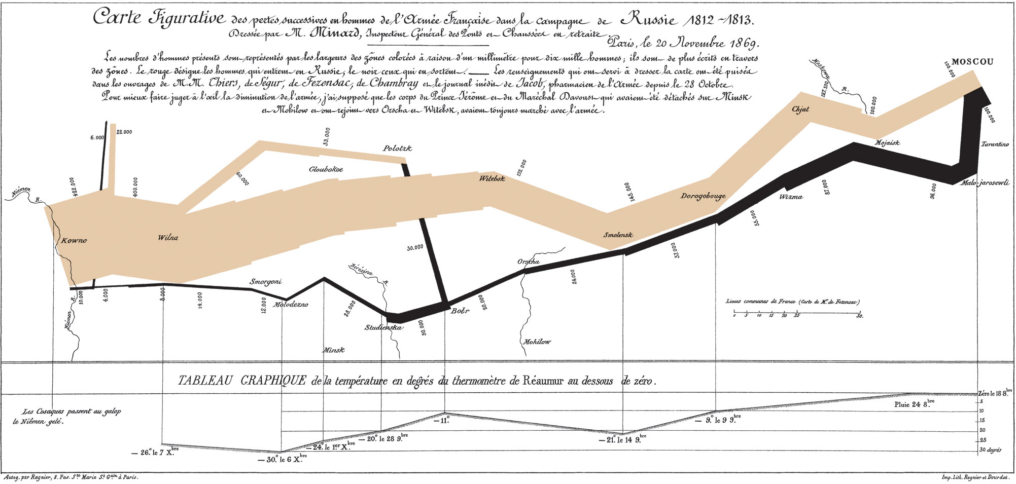

'The Greatest Infographic

While I have been using R mainly for creating visuals (other than the time where I used Photoshop to fine tune a palladium price plot), here exists libraries outside of R for visualization, namely, D3.js. Created by Mike Bostock, Data Driven Documents (D3) operates under the Document Object Model (DOM), and provides an efficient, functional method to code visualizations in Javascript.


Here I will demonstrate how to setup an simple environment for tinkering with D3, and to create a bar chart of when Github users commit (submit) code. I assume you have a basic understanding of HTML and Javascript to begin. The data is available here. Start your favorite text editor (I use Notepad++), and the console (I use Cygwin bash).


Environment Setup


Before we begin working with D3, we need to setup the environment to view the results. D3 combines HTML (hypertext markup language), CSS (cascading style sheets), and SVG (scalable vector graphics) to display graphics. In your designated working directory, create an "index.html" file to house the HTML, and a "code.js" Javascript file to store the D3 script. Using Notepad++ I created two files and named them such. 

Here is the link to Swizec Teller's Github repository for the code for you to download if you do not want to type or copy the code. However, I find that typing the code reinforces your learning of a language's syntax.

Using the basic structure of HTML, we set up a <div> element with "id=graph", and as "class=span12" nested inside <div> class "row" and "container". For the <style>, we use CSS to specify the font size at 11, and the color of the bars as "steelblue". The <script> we designate the D3 javascript file at "http://d3js.org/d3.v3.min.js", and our graph code in "code.js". At the top, spot the <link> tag. Download that CSS bootstrap package which makes the resulting webpage visually appealing, or here at Github in the top under "bootstrap".

HTML and CSS Code:
 1
 2
 3
 4
 5
 6
 7
 8
 9
10
11
12
13
14
15
16
17
18
19
20
21
22
23
24
25
26
27
<!DOCTYPE html>
<title>testing</title>
<link href="bootstrap/css/bootstrap.min.css" rel="stylesheet">

<style>
 .axis path,
 .axis line {
  fill: none;
  stroke: #eee;
  shape-rendering: crispEdges;
 }
 .axis text {
  font-size: 11px;
 }
 .bar {
  fill: steelblue;
 }
</style>

<div class="container">
 <div class="row">
  <div id="graph" class="span12"></div>
 </div>
</div>

<script src="http://d3js.org/d3.v3.min.js"></script>
<script type="text/javascript" src="code.js"></script>

Note that we reference the D3 script at the end of the "index.html" as "code.js". Make sure to name the file that particular name.


D3 Code


After we establish the HTML, we can move on to scripting the graphic. The JSON file is available here. First we specify the size of the plot, and scale, and x-y axis locations from lines 1 to 10.

Following in line 12 to 15, we use the crucial "d3.select" to select the graph element from the HTML file, and ".append" or add a Scalable Vector Graphic (SVG) object with width and height attributes.

Beginning in line 17, we parse the "histogram-hours.json" file using "d3.json", and in lines 19 to 22 map the json elements to a "bucket" as an index and a "N" with the value. We rescale and set the plot boundaries with the "bucket" and "N" in lines 24-25.

An important D3 concept is the origin of the plot: the x starts at the left and the y starts at the top. So adding the x and y axes in lines 27 to 35, we take that into account.

Now we can use the "svg.selectAll" method to start adding the "rect" rectangles to the plot starting at line 37. Associate the data with ".data", and add or ".append" the data as a "bar class". We add a ".transition" to demonstrate animation to force the bars to appear from left to right. We specify the 'x' and 'y' values from the "bucket" and "N" values we mapped. The "width" and "height" of the bars take into account the areas of the plot, and the white-space padding. D3 Code:
 1
 2
 3
 4
 5
 6
 7
 8
 9
10
11
12
13
14
15
16
17
18
19
20
21
22
23
24
25
26
27
28
29
30
31
32
33
34
35
36
37
38
39
40
41
42
43
44
45
46
47
48
49
50
var width=900, 
 height=400, 
 pad=20, 
 left_pad=100;

var x = d3.scale.ordinal().rangeRoundBands([left_pad, width-pad], 0.1);
var y = d3.scale.linear().range([height-pad, pad]);

var xAxis = d3.svg.axis().scale(x).orient("bottom");
var yAxis = d3.svg.axis().scale(y).orient("left");

var svg = d3.select("#graph")
   .append("svg")
   .attr("width", width)
   .attr("height", height);

d3.json('histogram-hours.json', function (data) {
 
 data = d3.keys(data).map(function (key) {
 return {bucket: Number(key),
  N: data[key]};
 });
 
 x.domain(data.map(function (d) {return d.bucket; }));
 y.domain([0, d3.max(data, function (d) {return d.N; })]);
 
 svg.append("g")
  .attr("class", "axis")
  .attr("transform", "translate(0, "+(height-pad)+")")
  .call(xAxis);
  
 svg.append("g")
  .attr("class", "axis")
  .attr("transform", "translate("+(left_pad-pad)+", 0)")
  .call(yAxis);
  
 svg.selectAll('rect')
  .data(data)
  .enter()
  .append('rect')
  .attr('class', 'bar')
  .attr('x', function (d) {return x(d.bucket);})
  .attr('width', x.rangeBand())
  .attr('y', height-pad)
  .transition()
  .delay(function (d) {return d.bucket*20; })
  .duration(800)
  .attr('y', function (d) {return y(d.N); })
  .attr('height', function (d) {return height-pad-y(d.N); });
});

The majority of the code is nested in the "d3.json" callback function (the part in between the curly braces {...}). Next we need to open the "index.html" file in Chrome to see it in action. Make sure all the files are together in the same working directory.


Chrome Developer Tools


Since the HTML code calls for local files, we start a simple HTTP Server with Python to avoid the security issues. In your console, type "
python -m SimpleHTTPServer", and the Python will create a server on port 8000. Remember to start the Python server in the same directory as the HTML and Javascript files.


Starting Python Host via Console

In Chrome, point the address bar to "localhost:8000" and the graphic will appear. If not, there is either a typo in the code, no server opened, or the files are not present in that directory. Below is a screenshot of the "steelblue" colored graphic. We see an expected elevation of activity during daylight hours ~9AM to 6 PM.


Code Submissions by Day Hours


To make use of Chrome's Developer Tools, press <CTRL+SHIFT+J>. A similar window should appear with the Javascript content shown below. Examine the tabs at the top, "Elements", "Network", "Source", and etc. The Chrome Developer Tools (or DevTools) is quite a powerful website and debugging suite, and you can read more about it here. In the "Source" tab, we can select our code files hosted by Python.


"code.js" in DevTools
As an added bonus, we can use the "Console" tab on the far right to interact with the content. That way we can see the changes live as we type them into Chrome.

I hope you enjoyed this post introducing the capabilities of D3.js, and how it thrives creating graphics in the HTML environment. Although we just created a bar graph, there are many other visualizations created by others at its main website. Stay tune for more visualizations and analysis. 


Let me know if you want to see more of D3.js.


Thanks for reading,

Wayne
@beyondvalence
LinkedIn

Sunday, April 20, 2014

Python: Writing a Data Scraping Script


Hello Readers,


Today we will discuss data scraping, from a website's page source in HTML. Most of the times when we analyze data, we are provided the data, or are able to find the data through an online database. When we do, the data are usually arranged in a CSV/TSV format or as a convenient database waiting to be queried. Those types of data are known as structured data, and comprise only a fraction of the data available on the web.

To retrieve unstructured data  is usually a time consuming process if processed manually, since the data are not organized, or are large sections of text, such a server logs or Twitter tweets. They could even be spread over a number of web pages, for example, the maximum daily temperature in Fahrenheit for Buffalo, New York, starting from 2009. A screenshot highlighting the maximum temperature is shown below.


Weather History for Buffalo, NY

At 26 degrees, it was a cold New Years day in Buffalo. From the drop down options we can select January second to view that day's maximum temperature. You can imagine the time required to obtain the maximum temperature for each day in 2009. However, we can automate this process and skip the copy and paste/manual entry of the temperature through a Python script. We will use Python scrape temperature data from Weather Underground's website [1- Nathan Yau Flowing Data].


HTML Source


One thing to notice is the Buffalo historical weather page URL:

http://www.wunderground.com/history/airport/KBUF/2009/1/1/DailyHistory.html?req_city=NA&req_state=NA&req_statename=NA&MR=1

Even if we delete the URL after ".html", the page still loads. Also, we can spot the date in the URL, "/2009/1/1/". Remember this URL component, because it will be important when we automate the scraping with loops. Now we have discovered the range of URLs for daily weather in Buffalo in 2009.

http://www.wunderground.com/history/airport/KBUF/2009/1/1/DailyHistory.html
to ->
http://www.wunderground.com/history/airport/KBUF/2009/12/31/DailyHistory.html

In order for the Python script to scrape the data from the Weather Underground sites, we need to access the page source and see how the maximum temperature is coded. In Chrome, you can right click the page to view the page source in HTML.


HTML Page Source

Either through scrolling through the page or pressing Ctrl+F to find the text "Max Temperature", we can locate the desired temperature and the HTML tags around it. We spot the Max Temperature values enclosed by span class="wx-value" tags. Note that our target value is the third value enclosed by the span tag. The first two temperatures are the Mean Temperatures.


Python Script


We will use 2 libraries access the website and parse the HTML: urllib2 and BeautifulSoup. The first module provides standard functions for opening websites, and the second module is the crucial one. Created by Leonard Richardson, Beautiful Soup gives Python the power to navigate, search, parse, and extract parts of code we need.

After we import the two modules, we need to create the text file "wunder-data.txt" to which we will write the maximum temperatures.


Import and Open Text File

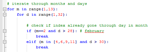
To automate the scraping process, we use loops to cover the months and the days in each month. Keeping in mind of the different days in each month, we use
if and elif statements to check February, April, June, September, and November.


Looping

Inside the loops, we will print out the current date we are retrieving, and access the url with the current month (m) and day (d) using method
urllib2.urlopen().


Print Current Date and Open Respective URL

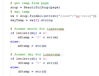
After we opened the page, we pass it through
BeautifulSoup(), and then use the soup.findAll() method to locate the tag "class: wx-value". Then we take the third value, [2], since the python index starts at 0, and bind it to our dayTemp variable. Next we format the month and day to be 2 characters by adding a "0" if required.


Using BeautifulSoup and Date Formatting

Now that we have the temperature in dayTemp, and proper date formatting, we create a timestamp with which we will write the dayTemp. This way, we can see the date of the retrieved maximum temperature.


Timestamp and Writing

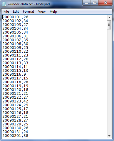
Outside of the loops, we close the finished text file and print out a finished indicator. Below we have the output of the wunder-data.txt file. Observe the time stamp with 8 characters (4 for year, 2 for month, and 2 for day) followed by a comma and the temperature.


File Output

This post illustrates the basic concepts to data scraping:

1. Identifying the pattern (in URL / HTML source)
2. Iteration (script)
3. Storing the data (writing to file)

There are many other measures we could have included, such as the minimum temperature, or even a moving average of the maximum temperature in the script. The important thing is, do not let yourself be confined to using structured data in forms of CSV, TSV, or Excel files! Unstructured data are out there in large quantities, and it is up to you to retrieve, and clean them to be fit for analysis.


Thanks for reading,

Wayne
@beyondvalnence

Monday, October 21, 2013

R: Using Regular Expressions to Analyze Baltimore Homicides in HTML, Part 1

Hello Readers!

Today we will be looking at homicide html data in Baltimore from the Baltimore Sun's very own Sun Data Desk. I will demonstrate the power of regular expressions in extracting data, especially from structured data sets, like html through R.


Text, Lots of Text


Text is everywhere around us, especially on the internet. With new social media outlets such as Facebook and Twitter, being able to analyze the posts and tweets by users will provide an informative source of data. So we turn to the Baltimore Sun. Pulling the html from the Baltimore Sun site with each homicide since 2007, we see a massive wall of text:


Fig. 1: Homicide html text
How can anyone discern any information encoded in this raw html? Luckily, there is an easier way to read the data: using regular expressions to pull out specific segments of text into an organized template, whether it be a table, data.frame, etc. Regular expression syntax designates and finds the the desired text segments in the html so that we can manipulate the data more coherently.

Let us begin with some examples in R to demonstrate how we can use regular expressions to clean and analyze the raw data.


1. Causes of each Homicide


With all this data about homicides in Baltimore since 2007, it would useful to start with the causes of each homicide, as exploratory analysis. So I will now create a table with counts for each cause.

The information for each homicide case is on its own line. I read in the data using the readLines function into a data.frame d, and use head of d to print the first six cases.


Fig. 2: Reading in the Data using readLines
We can see that the cause is surrounded by html tags '<dd>' and '</dd>', with 'Cause:' preceding the actual cause. This information will be useful for the regular expression. For the crucial part, I use the regexec function to pull out the position of the specific string segment in each line that is required.


Fig. 3: regexec Function
The brackets in [C|c]ause allows either upper or lower case matching of the word. The actual cause is denoted by (.*?), which pulls any character ".", any number of times "*". However, the * has greedy behavior so it will extract the longest possible match- the last </dd> that it can find, but we only want it to match the </dd> immediately following the actual cause so ? restricts *. So the output of regexec is a list of positions matched by the regular expression. the first set is the beginning position of the entire <dd>[C|c]ause: (.*?)</dd> (246 for the first member of all), whereas the second number (257) is the starting point of the string in the parenthesis. 

The second member of all represents the match length of the string from the starting point. It is 24 for the first element and 8 for the second match, and it is logical that the second is shorter because it was inside the larger matched string segment (just the actual cause, and not the Cause: from <dd> to </dd>.) Confusing? (Take a look at Figure 4.) This is verified below with the regmatches function.


Fig. 4: regmatches Function
Using the indexes from list all, the regmatches function will match and extract the strings with the information on the starting position and length of the match. We see in Figure 4 that we get a list, match. The regular expression we used in regexec matched the strings found in Figure 4 (the first six shown.) There are two strings: first the entire match enclosed by the html tags <dd> and </dd>, then the actual cause in the parenthesis.

Now this match list can be used to count the number of each type of homicide. However, we just want to extract the strings in the second set of each member in the match list, which contain just the actual cause (blunt force, shooting, etc.), and not the entire matched string with html tags. So we use sapply to slice only the second list member (x[2]) into the causes vector.


Fig. 5: sapply Function

Here we have the causes character vector with all the strings of the causes of homicides. We could now do table(causes), but there are some actual causes which were input capitalized so we need to include them as the same cause even if they are spelled differently, using the tolower function.


Fig. 6: tolower Function and Table of Causes
So now we can count the number of each cause of homicide, as shown in Figure 6. Shooting was the highest cause of homicide death, at 1,263 counts, and asphyxiation was the lowest specific cause at 31, with 13 unknown counts.


2. Age Distribution of Victims


Next, we can analyze the age distribution of victims to see how old the victims were at the time of homicide. After reading in the data from analyzing causes in the above example, we look at age, specifically the number before "years old", as shown below (Figure 7) for the first line.


Fig. 7:  First Line, Age 17 years old
Though the age is usually 2 digits, it could be one digit in a child homicide, for which we need to account. So our regular expression would be:


Fig. 8: Indexes from the regexec Function for age
The "0-9" in the bracket designates any digit in that range, repeated at least once "+", in parenthesis. Then the years could be spelled either year or year, given by the "|", and the whole expression is bound by the <dd> and </dd> html tags. 

The output of years first gives the start position of the match (160) then the corresponding match length (17), followed by the segments in parenthesis. So the digits match begin at 160, and continue for 2 characters, then the spellings of the years follows at position 163 for 5 units.

These positions are matched with the data with regmatches to return the strings shown in Figure 9.


Fig. 9: String Matches with the regmatches Function
This confirms that the regular expression retrieved and matched the desired strings in the data. We specifically want the data in the second member, the age in numbers ("17" in Figure 9.) So again, we use sapply to extract the ages from the age list. The ifelse function ensures that the match we are extracting is present and not blank (length > 0.)


Fig. 10: Using sapply function to extract desired string
Next we need to coerce the age list to a numeric vector with as.numeric. To confirm, the first six age numbers of the new age vector are shown above in Figure 10, with the first age as the expected 17.

Now we can create a histogram to plot the age distributions from the age vector with:


Fig. 11: Creating a Histogram
Which outputs the histogram below:

Fig. 11: Age Distribution of Homicide Victims
Note that the victims were predominately younger than 40 (median age was 27), especially from 20 to 30 years old. I will post more analysis using this Baltimore Homicide data extracted from the html later.


Thanks for reading,

Wayne