Loading...
Showing posts with label powerpivot. Show all posts

Monday, December 9, 2013

P4.4: Data Modeling in PowerPivot: Relationship JOIN Types

Hello Readers,

In this post we will continue our discussion (from P4.3) on the types of JOINS we can use when creating relationships, especially through SQL queries. As usual, we will be using the AdventureWorks dataset from the Ferrari book. Let us begin.


JOINS


When we join two tables together, we have to determine what we want in the resulting table. Whether we need all of the rows in a specific table or just the matches in both, specific joins enable us to manipulate the merging of two tables in different ways. Subsequently, the left and right tables we choose have positional distinctions when we select a specific type of join method. 


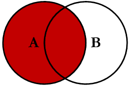
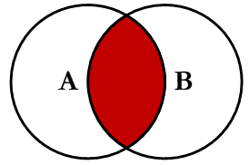
Detailed below are the different types of joins. (Diagrams from stackoverflow.)


INNER JOIN


When two tables are joined using an inner join, only the rows in table A which match the related rows in table B will be included in the resulting table. This is why in the previous post, P4.4, the joining of DimProduct with 606 entries and DimProductSubcategory tables yielded only 397 entries. There were only 397 product rows which had both an EnglishProductCategoryName and EnglishProductSubcategoryName.


LEFT OUTER JOIN


The left join is similar, but includes the all the entries in table A, and records NULL for entries in table A with no corresponding entries in table B.


RIGHT OUTER JOIN


The right outer join is the mirror image of the left outer join. All entries in Table B will be included, and those rows without a corresponding row in Table A will show NULL.


FULL OUTER JOIN


Next is the full outer join where both Tables A and B are preserved, with entries in Table A with none in B, and entries in Table B without entries in A will show as NULL.


LEFT EXCLUDING JOIN


Using left exclusion join we can modify the join to yield only entries in Table A which do not match in the right Table B.


RIGHT EXCLUDING JOIN


Likewise with a right excluding join, the all entries in Table will be included except for those which have corresponding entries relative to entries in Table A.


Here is a helpful link!


Thanks for reading,


Wayne Liu

Thursday, November 14, 2013

P4.3: Data Modeling in PowerPivot: SQL Query Denormalization

Hello Readers,

This post is a continuation from the last post of understanding normalization in data modeling using PowerPivot. As usual, we will be using the AdventureWorks companion material from the Ferrari book. Let us get started.


SQL Querying in PowerPivot


In the previous post I demonstrated how to denormalize a table in PowerPivot by creating calculated columns using the RELATED command. The RELATED command is an easy tool to understand denormalization. However, with SQL queries we can normalize with ease in a large database. Here we will query in SQL the necessary columns and tables to denormalize a data model. The denormalization process will be shifted outside of PowerPivot versus the previous method of denormalizing within PowerPivot using the RELATED command.


A SQL query is a statement written in SQL language used in many modern relational databases. PowerPivot has a built-in SQL query designer, of which we will discuss further.


Begin by adding AdventureWorks data from SQL Server. In the Home tab of PowerPivot, click from Database and From SQL Server option.


Fig. 1: Add External Data from SQL Server in PowerPivot
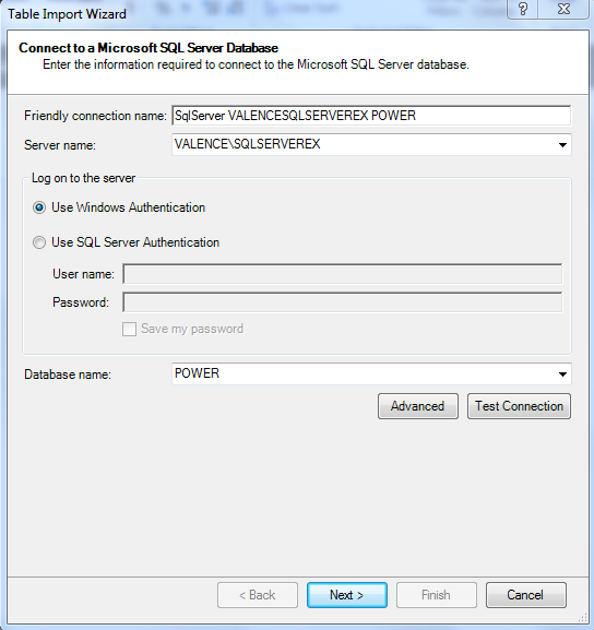
The Table Import Wizard will appear. Type in the Server name and select the Database name from the drop-down menu. In this case, the AdventureWorks tables are located in the POWER Database.


Fig. 2: Connecting to SQL Server Database
After a connection is established, select Write a query because we will demonstrate how to use SQL queries to denormalize a data model.


Fig. 3: Use Query Method
Next we are given the option to enter the SQL query. Knowing SQL, we can type in:

SELECT
  DimProduct.ProductKey
  ,DimProductCategory.EnglishProductCategoryName
  ,DimProductSubcategory.EnglishProductSubcategoryName
FROM
  DimProductSubcategory
  INNER JOIN DimProductCategory
  ON DimProductSubcategory.ProductCategoryKey = DimProductCategory.ProductCategoryKey
  INNER JOIN DimProduct
  ON DimProductSubcategory.ProductSubcategoryKey = DimProduct.ProductSubcategoryKey

But for now, click the Design button as show below in Figure 4 to use the SQL query designer.


Fig. 4: Select PowerPivot Query Designer
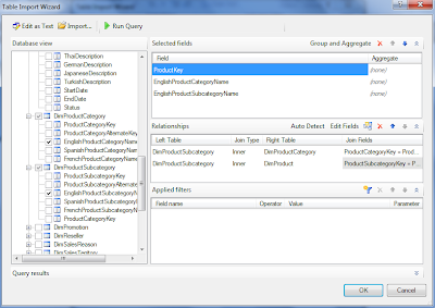
With the SQL query Designer open, select the ProductKey from DimProductEnglishProductCategoryName from DimProductCategory, and EnglishProductSubcategoryName from DimProductSubcategory.


Fig. 5:  SQL Query Designer
In the Relationships section, the DimProductSubcategory has the Primary Keys to the categories and subcategories to the DimProduct and DimProductCategory tables. This illustrates the one-to-many relationship, indicated by the left and right tables. The Join Fields are shown in Figure 5 as well. Now click OK, and we get SQL query statement designed by the point and click SQL query designer (Figure 6.)


Fig. 6: SQL Query Statement from SQL Query Designer
Hitting Finish, the Table Import Wizard implements the query statement and imports the specified table into the PowerPivot database.


Fig. 7: Query Table
Now we have denormalized a data model by using SQL queries to retrieve columns from different tables into one table. Note that 397 rows were imported. This is less than the 606 rows in the DimProduct. Where did the other 209 rows go? The 397 rows from the query is a result of the type of relationship between the tables, in this case is an INNER JOIN, which only returns rows with matching values in both tables. The next post will discuss the different types of JOINS.


Thanks for reading,


Wayne

Thursday, November 7, 2013

P4.2: Data Modeling in PowerPivot: Normalization and Denormalization

Hi Readers, 
Today we will discuss normalization and denormalization of tables in data models. As usual, we will being using the companion material from the Ferrari book. We will be continuing on the data model from the previous post. Let us get started.

Normalization


In the previous post we discussed relationships between tables in the data model with products, product categories, and product subcategories. That particular data model is considered to be normalized. What does it mean to be normalized? Instead of having one detailed table with all the category and subcategory information for each product, the category and subcategory information is referenced in their own tables. This way, the categories and subcategories are not repeated multiple times with each product and allow for efficient data storage. Normalization increases the number of tables, but decreases the overall size of the database by removing redundancies.


Fig. 1: Normalized Product Data Model

Inside the DimProduct table, instead of a product subcategory column listing the subcategories, it has numbers referencing the DimProductSubcategory table. Below in Figure 2, we see that the subcategories are only listed once (which is why the ProductSubcategoryKey column must be an unique Primary Key.) This reduces redundancy of listing the each subcategory multiple times for the products in the DimProduct table.

Fig. 2: DimProductSubcategory Table

Although another table (DimProductSubcategory) was created by normalizing, it occupies less overall physical hard drive space. However, viewing the product data model information as a set of normalized tables from the user perspective is difficult and not logical. Once a database is normalized for storage, the required data must be denormalized for readability when retrieved to be analyzed.

Denormalizing (Reducing Normalization)


For this product data model, we can easily create calculated columns for the product categories and subcategories in the product table and hide the product category and subcategory tables in the model. This would reduce the normalization, thus increasing the complexity and physical storage size of the product table.

In the DimProduct table in PowerPivot, create a calculated column for the ProductCategory using the DAX expression:

  =RELATED(DimProductCategory[EnglishProductName])

as shown below:

Fig. 3: RELATED DAX Expression for ProductCategory
And again for the ProductSubcategory column with the DAX expression:

  =RELATED(DimProductSubcategory[EnglishProductSubcategoryName])

again, shown below:

Fig. 4: RELATED DAX Expression for ProductSubcategory

Now the DimProduct table has decreased normalization and more redundancy, with product categories and subcategories being repeated multiple times, but is more readable for the user. To finish, we can hide the other two tables which are now not required since the relevant data is in our desired product table.

To hide the DimProductCategory and DimProductSubcategory tables, in the PowerPivot Diagram View, right-click the table and select Hide from Client Tools. Normalized tables which are needed for the data model, but can be safely hidden are called technical tables

Fig. 5: Hide from Client Tools, Table

Additionally, the ProductSubcategoryKey, as the Foreign Key in the DimProduct table, is now not required because the table has been denormalized with the actual subcategory column in the table. Yes, it can be hidden too (along with ProductKey and ProductAlternateKey.)

Fig. 6: Hide from Client Tools, Column

Hiding technical tables and technical columns, as well as removing normalization are important steps to improving the usability of a data model. Though relational databases use normalization,  denormalized tables offer ease for analysis and querying, while a normalized data model removes redundancy, occupies less disk space, and improves database operational performance.

Either option can be right or wrong depending on the scenario, and the operations we would like to perform on it. In the next post, I will discuss denormalizing with SQL queries.


Thanks for reading,


Wayne

Tuesday, November 5, 2013

P4.1: Data Modeling in PowerPivot: Relationships

When we wanted to merge two table together, an option would be to use the VLOOKUP function. To analyze the many tables in a data model, VLOOKUP is inefficient and is replaced with relationships, an 'automatic VLOOKUP', which allows us to link entire tables at a time instead of referencing single columns.

As usual, we will be using the Adventure Works companion material (Chapter 4) from the Ferrari book.


Creating the Data Model


Instead of using VLOOKUP multiple times to add columns into the DimProduct table, we will use relationships to merge all three tables together. Opening the PowerPivot window in Diagram View from the workbook we see that the relationships between the tables have already been formed, because PowerPivot detected existing relationships (will be elaborated in further posts.)


Fig. 1: PowerPivot Diagram View
The arrow lines are representations of relationships in Figure 1. The arrow starts at DimProduct, the source table and points to DimProductSubcategory, the target table, and the connection is finished as DimProductSubcategory is linked to the DimProductCategory table. In the measure field towards the bottom half in grid view of the DimProduct table, we can add a calculated field for the number of products, NumOfProducts


Fig. 2: Creating NumOfProducts Calculated Field
Now we can create a PivotTable tabulating the number of products for each ProductCategory from the DimProduct table. The ProductCategory is actually the EnglishProductCategoryName field in the DimProductCategory table, two relationships away, connected by the ProductSubcategoryKey and the ProductCategoryKey.


Fig. 3: ProductCategory PivotTable
Data models are much more efficient in performance compared to VLOOKUP, especially when dealing with large data sets for computational power, and in multiple tables for a chain of relationships. Also, the NumOfProduct field calculation is available for any PivotTable using the data model, so we do not have to create a new definition every time.

So a data model is a set a tables connected by relationships, sometimes with calculated fields or columns. Simple yet powerful.


Notes on Relationships


Though these relationships will not help much in your love life, the following details on PowerPivot relationships will make your life easier when creating and understanding data models.

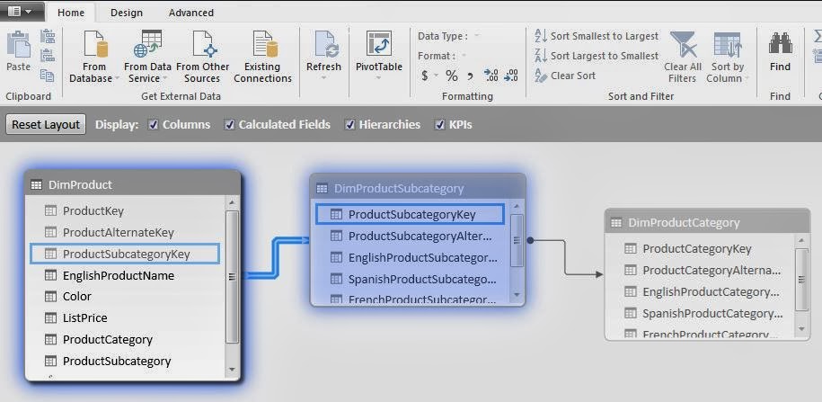
Looking at the Diagram View of the tables and relationships, we focus on the relationship arrow from DimProduct to DimProductSubcategory.

  • DimProduct is the source table (the beginning of the relationship)
  • DimProductSubcategory is the target table (where the values relate to source table)
  • ProductSubcategoryKey column is the Foreign Key in source table (contains values which is searched in target table for related row)
  • ProductSubcategoryKey column is the Primary Key in the target table (needs to have unique values in each row)

These are shown highlighted in blue below:


Fig. 4: DimProduct and DimProductSubcategory Relationship
A specific product can only have one subcategory, whereas a subcategory may have many products. That is why the target table (DimProductSubcategory) must have an unique Primary Key (ProductSubcategory) for the products in the DimProduct table. This type of relationship is called "one-to-many", with the target table being "one side", and the source table being the "many side" of the relationship.

We can test the relationship by recreating it. Click the arrow and press Delete. Then in the Design tab, click Create Relationship.


Fig. 5: Creating a Relationship
In the drop-down boxes, we would want to specify the DimProduct and DimProductSubcategory as tables, with the ProductSubcategoryKey as columns from both. However, if we accidentally flip the tables, and confuse the "one-to-many" to "many-to-one" tables, PowerPivot automatically detects the columns in the tables and lets us know it will create the relationship in the opposite direction.

So now you know the inner workings of relationships in data models. Some DAX functions work only when invoked on the correct side of a relationship, so sides do matter. Stay tuned for more on data modeling!


Thanks for reading,

Wayne

Friday, August 23, 2013

P3.2: Beginning DAX 2

And we are back again for more DAX! This post is a continuation in the understanding DAX series (link to P3.1.) Here we will gain a deeper understanding of calculated columns and fields (introduced in P2.2) from a DAX perspective.


Understanding Calculated Columns & Fields

Calculated columns and calculated fields are actually quite different despite initial similarities. Here we will explore the differences of columns of fields, while gaining DAX concepts and syntax.


Calculated Columns

Before in P2.2, we touched upon the notion of creating a calculated column and a calculated field. By clicking the Add Column button on the Design tab, we can create a calculated column in PowerPivot. It is versatile in PivotTables; also the DAX expression for the column applies to the current row of the table. When we reference a column, it returns the value of that particular column in that specific row.


Fig. 1: Add Column Button
Note:
There are DAX functions which aggregate the values of a column for a whole table. To evaluate a subset of rows, we use DAX to specify a range of rows or a single value from another row and operate on that subset table. Essentially we can restrict rows and apply filters so the desired rows are selected for computation.


Calculated Fields

Now for something a little different. While calculated fields use the same DAX syntax as calculated columns, calculated fields evaluate the expression at the context of the cell of the PivotTable, not at the row level of the PowerPivot table like a calculated column.


Fig. 2: Calculated Fields Button
Which is why we arrived at a wrong result when we tried to calculate the gross margin as a percentage of the sales as a calculated column. In fact, PowerPivot calculated the gross margin percentage for each row using that method. What we wanted was to divide the gross margin by the sales within the context (column and row designation) of the PivotTable; we did not want each percentage in each row added, we required the gross margin percentage of the total (in say, Year 2006.)

So if we used the regular formula to calculate a field, we could get the following error:


Fig. 3: Calculated Field Error Using the Same DAX Expression as Calculating a Column
That is because the GrossMargin column has a different value in each row, and we would rather see the aggregate of the GrossMargin divided by the aggregate SalesAmount for each cell context in the PivotTable.

The correct method was to type in the sum of each:
=SUM(Sales[GrossMargin]) / SUM(Sales[SalesAmount])
and then divide them, as shown in Figure 4.


Fig. 4: Using the SUM for the Correct Calculated GrossMarginPct Field (See: No Errors!)
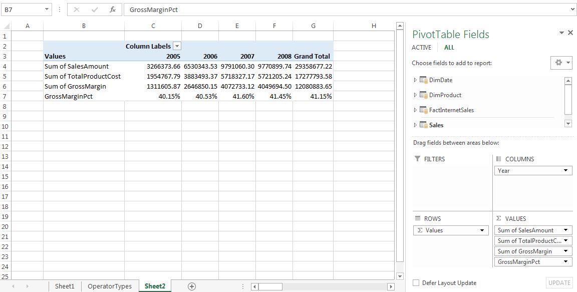
By using this approach, in the PivotTable, the column and row would have the labels as the context for the cells involved. So when it goes to take the SUM of the GrossMargin and the SUM of the SalesAmount, this specific PivotTable takes the SUM for a certain Year context, and summing values in the DAX expression, say for 2007. The PivotTable with GrossMarginPct added is shown below.


Fig. 5: PivotTable with GrossMarginPct


When to Use Calculated Columns and Measures (Fields)

So when do we use a calculated column and in other cases, a calculated field (or measure)? (When do we get to eat Jell-O?) In most situations, it would depend on the computation of choice. For example, there are several situations to use calculated columns:

  • When we want to evaluate an expression which is confined to the current row,
  • The results will be displayed in the columns or rows of the PivotTable, and not the values,
  • Or when we categorize text or numbers (categorical variables)

Situations where we would use calculated fields occur when we would like to display the results in the PivotTable Values section. Each cell in the Values section will change based on the context of the rows and columns in the PivotTable selections. If we changed the rows in Figure 5 to include the ModelName, then the calculationed field would reflect the change, and show the GrossMarginPct stratified by ModelName (Figure 6).


Fig. 6: PivotTable with ModelName Stratifying the Calculated Field


Cross-Referencing

We can use calculated columns in our DAX expressions when creating calculated fields. Also, the reverse can be done as well. However counter-intuitive, a calculated column can reference calculated fields, and this confines the calculated field to the context of the current row. Therefore, the calculated field transforms into a calculated column, and will not be influenced by user changes in context on the PivotTable.


Here we have explored the similarities and (for the most part) differences between calculated columns and fields through DAX. Understanding these concepts are important in becoming proficient at DAX, as well being able to manipulate data efficiently.


Thanks for reading,

Wayne

Saturday, August 17, 2013

P2.2: Creating Calculated Columns and Calculated Fields in PowerPivot

This post will explore calculated columns and fields in PowerPivot, using the sample database from the Ferrari PowerPivot book. We will continue to use the PivotTable and data model from the previous post.


Creating a Calculated Column

From the previous post, we created a PivotTable depicting the SalesAmount by Color, and CalendarYear


Fig. 1: SalesAmount by Color by CalendarYear PivotTable
To understand the profitability from the sales, we account at least for the product cost as well. So the TotalProductCost column needs to be added from the FactInternetSales table.


Fig. 2: SalesAmount with TotalProductCost PivotTable

The TotalProductCost column was added beside each SalesAmount column in the PivotTable shown in Figure 2. For certain reports arranging columns side by side is better, but for readability for this report, we could like to position the fields in rows resembling the subtraction to obtain the profit data. So drag the Î£ Values to the Rows area, as in Figure 3.

Fig. 3: Dragging the Î£ Values to Rows Area
The PivotTable is now easier to read and set up for the calculated column.

Fig. 4: Revised SalesAmount and TotalProductCost PivotTable
The FactInternetSales table has no gross margin column, which is the difference between SalesAmount and TotalProductCost. So we will add a column called GrossMargin in PowerPivot as a calculated column, which extends the content of a table and is stored in the data model. First, navigate to the FactInternetSales table in the PowerPivot window. In the Design tab, click the Add button which will add a new column to the end of the table.

Fig. 5: Add Column Button
Now we use simple DAX language to calculate the GrossMargin column. Though DAX syntax can be more intensive, the formula is very straight forward. Type in:
= FactInternetSales[SalesAmount] - FactInternetSales[TotalProductCost]
as shown in the Figure 6 below. It subtracts the TotalProductCost from the SalesAmount for the GrossMargin column, and it is now in the data model. The column can be renamed by right-clicking the column header and selecting Rename Column.

Fig. 6: GrossMargin Formula
Let us add the GrossMargin column to the Values area in the PivotTable. We can find it in the FactInternetSales table where we created it in PowerPivot. It would go in the Values area.

Fig. 7: PivotTable with GrossMargin
We can use DAX to solve more complex calculations, which we will explore in future posts. However with this simple DAX formula we have created a calculated column and displayed it on the PivotTable.


Creating a Calculated Field

A calculated field, also known as measures, are computed at an aggregate level, compared to calculated columns, which are computed for every row. For example, let us compute the gross margin as a percentage of the total sales amount.

Add a new column in PowerPivot to the FactInternetSales table which calculates the gross margin percentage. We might enter this as the formula for GrossMarginPct:
=FactInternetSales[GrossMargin] / FactInternetSales[SalesAmount]
Fig. 8: Formula for GrossMarginPct
Then display the resulting GrossMarginPct in the PivotTable under the Values area.

Fig. 9: PivotTable Including GrossMarginPct
Wait! The GrossMarginPct numbers look quite large and not right at all. In fact, the formula took the summation of all the percentages and displayed the sum, which is not what we wanted (this is the incorrect way to formulate this GrossMarginPct calculated field.) We can remove the GrossMarginPct from the PivotTable.

The correct way to obtain the GrossMargin percentage as a calculated field is to click on the Calculated Fields button in the PowerPivot tab.

Fig. 10: Calculated Fields Button
Name the new field GrossMargin%, and for the formula, type in:
=SUM(FactInternetSales[GrossMargin]) / SUM(FactInternetSales[SalesAmount])
as shown down below.

Fig. 11: Creating the GrossMargin% Field
The syntax for the calculated field is similar to the calculated column formula; it just has an additional SUM function. This will be explained in later posts describing the DAX language. In the window, we are given options at the bottom to format the output of the calculation, and since it is a percentage, select the Percentage format. After we click OK, the calculated field, GrossMargin%, is added to the data model and is available to complete the PivotTable. Select it and confirm that it is in the Values area.

Fig. 12: Revised PivotTable with GrossMargin%
Now these percentages look much more reasonable than the previous gross margin calculation, because it took the aggregate of the SalesAmount and the TotalProductionCost. We take a deeper look at calculated columns and fields later in P3.2.

Note:

The calculated field will be available to the PivotTable or report that we create using the data model. Think of it like this: we are building a data model, not just a report. The data model can be used for many other different reports or PivotTables, so as we transition into a good data modeler, we become better report creators.


Thanks for reading,
Wayne
Friday, August 16, 2013

P2.1: Loading Data from External Sources to PowerPivot

This post will describe how to load external data sources to PowerPivot, using examples from Chapter 2 of the Ferrari PowerPivot book.


Loading Data PowerPivot

In the previous posts, we have been adding tables to the data model from Excel. However this method is inefficient, as PowerPivot can load data directly into the data model, without going through Excel. By doing so, we only need to load the data once, and it loads as compressed data into memory. When loading, Excel does not compress data so the resulting size of the file is around 10 times larger at times when loaded through Excel rather than PowerPivot (sizes from previous posts). Also, Excel is limited to storing 1 million rows, and PowerPivot can handle hundreds of millions of rows in memory. So loading data into first into Excel then into PowerPivot can hit the limit of rows and curb efficiency.

However, the data in the data model cannot be edited in PowerPivot, and can be edited in Excel. This can help prevent unwanted modification to the data set in PowerPivot as it is read-only. If the data set is loaded into Excel, all Excel editing features are available. Despite being read-only in PowerPivot, it is possible to add new columns to the original tables by using DAX language, but the original tables stay the same.


Loading from the AdventureWorks Database

In the PowerPivot tab, click on the Manage button to open the PowerPivot window.


Fig. 1: Manage Data Model button
The PowerPivot window should appear, and to add data, click on the Get External Data button on the Home tab.


Fig. 2: Get External Data Button in PowerPivot
For this specific demo, we will use the database that was included in the companion material as a MS Access file. Choose the Access connection and the Table Import Wizard window will appear. Find the Access database file where it was saved by selecting Browse and click the Next button.


Fig. 3: Access Database Table Import Wizard
For accessing a database from Microsoft SQL Server, click the SQL Server button. Fill in the Server Name and use the proper Authentication. 


Fig. 4: Microsoft SQL Server Table Import Wizard
The next window appears allowing two options to import the data: select the desired tables from a list, or write a SQL query to specify the data. For simplicity, select the first option to select from a list.


Fig. 5: Choosing How to Import the Data Window
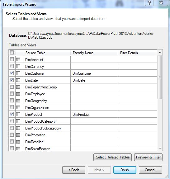
Now we can select the four tables required: DimCustomer, DimDate, DimProduct, and FactInternetSales from the Table Import Wizard.


Fig. 6: Selecting the Tables
After clicking Finish, the tables are loaded into the data model. Select Diagram View in the bottom right-hand corner of the PowerPivot window to see how the tables relate to another. Relationships were explained in P1.2. The FactInternetSales table contains many key fields, as diagrammed below.


Fig. 7: PowerPivot Diagram View

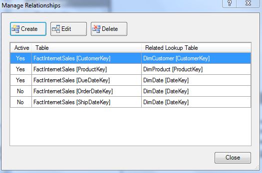
Under the Design tab, clicking Manage Relationships will allow us to modify relationships between tables. The current relationships between the four tables in our data model are shown below in Figure 8.


Fig. 8: Manage Relationships Window in the Data Model


Creating a PivotTable in PowerPivot

After we have loaded the data into PowerPivot, we can create a PivotTable from the data model. Select the PivotTable button under the Home tab, highlighted in Figure 9. 


Fig. 9: PivotTable Button in PowerPivot
A dialogue box will appear (Figure 10) asking where to insert the new PivotTable, and we will create it in a New Worksheet. Since we are adding the PivotTable from the data model in PowerPivot, we do not have to specify from which data model we would like to create.


Fig. 10: Determining the Location of the New PivotTable
Clicking OK will complete the PivotTable creation process.


Fig. 10: Blank PivotTable Created from PowerPivot
Now working within the blank PivotTable (Figure 11), we can select the fields from the tables and place them in a defined quadrant:

  • Color from the DimProduct table to Rows quadrant,
  • CalenderYear from the DimDate table to the Columns quadrant,
  • SalesAmount from the FactInternetSales table to the Values quadrant.

Fig. 11: SalesAmount by Color by CalendarYear PivotTable
This shows how easily we can aggregate and slice values from different tables in a report for the SalesAmount, thanks to relationships which link the tables together.

In the next post we will create calculated columns and calculated fields into the PivotTable we just realized.


Thanks for reading,
Wayne