Loading...
Showing posts with label google flu trends. Show all posts

Sunday, April 13, 2014

Visualizing Google Flu Trends Part 2


Hello Readers,


This post continues the visualization of flu trends from Google. Last time we plotted the flu time series for 50 states from 2003 to 2013. Here we will visualize the flu trends through 10 regions set by the Department of Health and Human Services (HHS). We shall enlist the aid of the melt() function from the reshape2 library.


So load ggplot2, scales, and reshape2 in R, and let us get started!


10 HHS Regions


Recall from the previous flu trends post, that the data was obtained from the Google Flu Trends site. The CSV file includes influenza like illness percentages from doctor visits for 50 states, District of Columbia, 97 major cities and 10 HHS regions. Since we already visualized the 50 states, we turn to the 10 HHS regions.

Flu Data in U.S. Regions

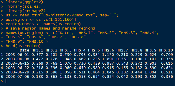
Last time we used a custom function to pull data from each column into 1 column. Then we bound a respective column with the 50 state names. Likewise, the date values were repeated 50 times, for a total of 3 columns. The original saved region names are shown below, along with the states they contain.


Original Region Names with States

However, there is (almost always) a more efficient way. In the reshape2 library, there exists a function which will arrange all the desired values into one column from multiple columns. Simply specify which variable to keep constant, and the melt() function will create variable column identifying the value column.


Melted Flu Trends in U.S. Regions

Now we are ready to visualize the flu data by region.


Creating the Visuals


Using ggplot(), we specify the Date on the x axis, and the value on the y axis. Furthermore, we use facet_wrap() to stratify by variable (HHS regions) into 10 plots, 2 columns of 5.


Plot Code

This yields the plot below:


Like we confirmed in the last post, here we also see dramatic peaks in all regions from 2003-2004, and 2009-2010. HHS region 6, which includes Arkansas, Louisiana, New Mexico, Oklahoma, and Texas has higher consistent peaks than the other 9 regions.

We could have plotted the 10 regions in one plot, however, the lines would be difficult to differentiate:


Plot Code

Looking at the plot below, we observe multiple colors, each a region, and peaks in each region occur within a similar time window. All the lines in one plot makes it difficult to evaluate each time series individually, but allows relative comparison between regions.


Again we encounter an alternative method to writing a custom function. The melt() function rearranges a data.frame for us. And that concludes this post. Stay tuned for more data analysis!


Thanks for reading,

Wayne
@beyondvalence
LinkedIn

Saturday, April 12, 2014

Visualizing Google Flu Trends in R


Hello Readers,


Today we will visualize influenza trends in the United States, captured from Google.org Flu Trends. By combining flu symptom search queries with CDC flu data, Google was able to estimate how many of those searching for flu symptoms actually had the flu, or had influenza like illness (ILI). Locations are determined from IP addresses via their server logs.


Above is a plot of the average percentage of influenza like illness among the 50 states. We will look at weekly time series data for each 50 states from Google Flu Trends from June of 2003 to October of 2013. Click here for the text file

Load the ggplot2, scales libraries in R, and let us get started.


Flu Data


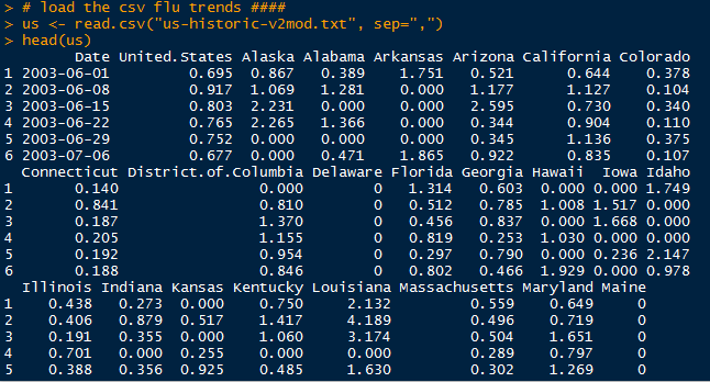
After reading in the "us-historic-v2mod.txt" as a CSV file, we call
head() and check what we have:


Raw Data

Our data set contains 541 observations in time with 160 variables of U.S. average, states, cities, and regions. We isolate the state variables along with the date into a new data.frame, and convert the Date column into a "year-month-day" date format.


New Data.Frame with States

Because we want to use ggplot() to display the flu trend for each of the 50 states, we have to create a new data.frame will all flu trend data in one column and the state in another. Essentially, we have to row bind all data from 50 states together.


Data.Frame Conversion

After we generated a Date, Flu, and State columns, we can column bind them together. However, make sure to use cbind.data.frame() instead of regular cbind() to preserve the date format.


Converted Data.Frame

Now we are ready for plotting the flu data.


Visualization of the Flu Data


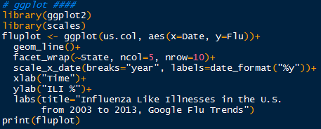
Earlier I mentioned to load the ggplot2 and scales libraries. Next, we use the ggplot() function to begin our plot. The key to plotting 50 trends lies in the facet_wrap() function, where we stratify or 'facet' the State variable, and specify the number of columns and rows to display. Note that the State variable is a factor. The scale_x_date() function allows us to customize the x axis display to show the last 2 digits of every year ("%y").


Plot Code

Pass the fluplot through print() and we obtain the plot below:


That is quite a lot of data to process visually at one time. After scanning the plot, we observe that the fluctuation in some states, such as Wyoming, Utah, or Florida, are not as prominent as other states- New Mexico, Arkansas, or Oklahoma. Some of these differences could be attributed to state population. 


However, almost every state at the start of a new year has a peak or increase in influenza like illness. The majority of states have higher peaks in 2003-2004, and 2009-2010. Recall the H1N1 incident from 2009-2010, where influenza of swine origin with novel viral genes threatened a pandemic. Due to the vigilance of the CDC, state and local health departments, hospitals, and healthcare personnel, quick vaccine creation and high vaccination levels prevented H1N1 from reaching pandemic distribution.

Yes, these  flu data are time series, so we will be able to decompose them and predict future ILI percentages! So stay tuned for more posts!


Thanks for reading,

Wayne
@beyondvalence
LinkedIn