Loading...
Showing posts with label forecasting. Show all posts

Thursday, March 20, 2014

How Fast is Fast? Comparing U.S. and South Korea Broadband Speeds in R


Hello Readers,


You might have heard about Google Fiber, where you browse and stream in the world of blindingly fast internet speed. How fast exactly? 100 times as fast, at 1,000 mbits/s (megabits per second). The rest of us in the United States have to trudge along with an average of 20 mbits/s while downloading, where actual speeds lag in around ~8 mbits/s. Such is the power of the clauses like "speeds up to __".

Unfortunately Google Fiber is only available in select cities (Kansas City, Austin TX, and Provo UT). So if you do not live there or any of these places, you probably will still be streaming Netflix and YouTube at average speed. Bummer. Here is a YouTube video demonstrating Google fiber speeds.

Internationally, the United States is beginning to lag behind other countries in broadband speed (download and upload). Take South Korea for instance. Entering into this millennium, South Korea has built significant networking infrastructure, and South Korean brands such as Samsung and LG have permeated the world electronic stage with high quality products. What Japan accomplished with innovating cars, right now South Korea is doing with electronics. And you guessed it, they also upgraded their broadband infrastructure as their economy focused on high tech in the 1990s. Their download and upload speeds are more than twice that of US counterparts (we generate the below plot in the post). 


S.K. Download Speeds in 2009 > U.S. Download Speeds in 2014

Also, two of South Korea's largest mobile carriers, SK Telecom and LG Uplus Corp, are rolling out a new LTE broadband network in 2014 at 300 megabits per second. Compare that speed to 8 megabits per second here in the U.S. There are many factors involved to make this possible in South Korea, such as high population density of 1,200 people per square mile, and government regulation to bolster competition among service providers. In the U.S., providers have their own closed-network system, so by switching to/from Comcast or Verizon, you would have to install new cables. This infrastructure dilemma acts as a cost barrier for new companies looking to enter into the broadband market.

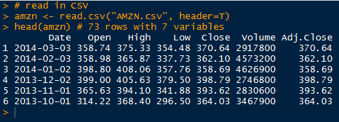
Enough of the Fiber talk. We are here to discuss average internet broadband speeds for average people. And just because our internet is slower here in the U.S., does not mean that it does not work. Lucky us, there is open data available at Data Market. Let us start R and crunch the data!


Broadband Data


Start here for the exact data set from Data Market. This data is provided by Ookla, an internet metrics company. You most likely have used their speed test utility to measure your internet speed. The data set has many countries from which to select the download and upload speeds including the World average speed in kilobits per second. Make sure the United States and South Korea variables are selected with download and upload speeds before clicking the Export tab and downloading the CSV file.


Data Market- Broadband Speeds CSV

Now that we have downloaded the CSV file, we can import it into R:


Reading in the Broadband CSV Data

Note the columns and their data. There are 5 columns designating the year-month, South Korean download speed, South Korean upload speed, U.S. download speed, and U.S. upload speed, all in kilobits per second. We will be splitting the the last four into individual time series and appending them to a list due to their different lengths (South Korea has less data points). 


Remember to remove the last row in all columns, since it contains just a descriptor of the variables and null values. The creation will result in 4 time series: download and upload speeds for the U.S., and download and upload speeds for South Korea. Take notice that we divide each time series by 1000 to obtain megabits per second from kilobits per second.


Creating Time Series Data.frames and a List Class

The bb (broadband) list allows us to use a shorter input method, and aggregates all the time series into one list object. We could not create a data.frame with all four time series because the South Korea and U.S. series have different number of data points. South Korea data start at September 2008, whereas U.S. data start in January 2008. The bb list contents are shown below:


Time Series in List Contents
Check that the time series are in megabits by comparing the values. They should be three orders of magnitude less.


Plotting Broadband Speeds


Since we have two countries with two time series each, we will prudently use color coding for visual purposes. First we plot the download speed for South Korea in dark green using plot(), making sure to specify custom y and x axis to fit the data for U.S. as well. Next we add the remaining three time series with lines() with upload speed for South Korea in green, and the download and upload speeds for the U.S. in dark orange and orange, respectively.


Broadband Time Series Plot Code

Lastly we add a legend with the label and colors to yield our plot below:


Broadband Plot

And look at those colors! We can observe the South Korean green lines after mid 2011 are much higher than the orange yellow lines of the U.S. broadband speeds. In fact, we can see that download speeds in South Korea in 2009 were higher than our download speeds in the U.S. now in 2014


The Future of Broadband?


Of course we would want to know the forecasts of the time series. With our current technologies, how fast would our broadband speeds be in 2 years? Specifically, we want to ballpark our download speeds in the U.S. compared to South Korea. In previous time series posts, we used regression and ARIMA methods to forecast future values for wheat production and Amazon stock prices respectively. To create a prediction, or forecast, we will turn to exponential smoothing for these broadband data.

Exponential smoothing estimates the next time series value using the weighted sums of the past observations. Naturally we want to weight more recent observations more than previous observations. We can use '
a' to set the weight 'lamba':

lambda = a(1-a)^i, where 0 < a < 1
such that xt = a*xt + a(1-a)*xt-1 + a(1-a)^2 * xt-2 + ...

This procedure is called the Holt-Winters procedure, which in R manifests as the HoltWinters() function. This function includes two other smoothing parameters B for trend, and gamma for seasonal variation. In our case, we would simply specify the data and R will use determine the parameters by minimizing the mean squared prediction error, one step at a time.

Let us consider the exponential smoothing over the download speeds of the U.S. and South Korea. The U.S. output is shown below:

Holt-Winters Exponential Smoothing

We can see the
HoltWinters() function determined the three parameters, alpha, beta, and gamma. Next we overlay the fitted values from the HoltWinters() function to the real download speed time series to visualize how they approximate the actual values. The plot code is shown below, with different line colors for visual contrast:


Holt-Winters Plot Code

The resulting plot is displayed below:


Okay, the Holt-Winters procedure did a good job of approximating the the observed time series values, as seen by the red and yellow lines above for estimated U.S. and South Korea download speeds.


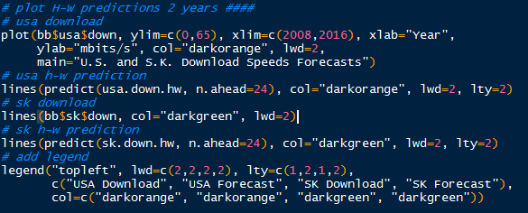
Now that we have confirmed the model, we will go ahead and predict the next 2 years of broadband download speeds using the
predict() function passing through the Holt-Winters objects. The predicted values are shown below:


Predicted 2 Years Values from Holt-Winters
We can see the U.S. predicted download speeds approach 28 mbits/s by 2016. For South Korea in 2016, the estimated download speed exceeds 60 mbits/s. Next we plot these predicted values with the download speeds time series with a dashed line type to differentiate the observed and predicted values with lty=2.


Plotting Predicted 2 Year Values

The prediction plot is depicted below.


Observe the U.S. download speeds with 2 year forecast in orange, and the South Korea download speeds in green. Note the forecasts as dashed lines. We see that the exponential smoothing predicted increases in U.S. and South Korea download speeds, with South Korea download speeds over 60 mbits/s and 28 mbits/s in the U.S.

In case you were curious, I also predicted the future upload speeds 2 years ahead to 2016 as well. U.S. upload speeds predicted by the Holt-Winters procedure barely exceeds 5 mbits/s, while upload speeds in South Korea rises above 55 mbits/s. Both predicted download and upload speeds in South Korea in 2016 are well beyond the broadband speeds in the U.S. The upload speeds plot is shown below:


Hopefully this post gives you guys a better idea of the state of broadband speeds now and after here in the U.S., and what could be possible, namely in South Korea. It is humbling to reiterate again that download speeds in the U.S. now in 2014 have not yet exceeded South Korean download speeds back in 2009. 

We would have to keep an eye out on this Comcast merger with Time Warner Cable. Merged, Comcast would control 40% of broadband market and have 30 million TV subscribers. And if New York allows it, I suspect lukewarm increases in broadband speeds, if at all. Google Fiber, where are you?

Stay tuned for more R posts!


Thanks for reading,

Wayne
@beyondvalence
LinkedIn

Saturday, March 15, 2014

Up, Up, And Away: Amazon Stock Prices in R


Hello Readers,


Today we turn to the world of finance as we look into stock prices, specifically that of Amazon, Inc (AMZN). AMZN has been traded on the NASDAQ stock exchange since their IPO on May 15th, 1997  at 18.00 per share. Nowadays in 2014, AMZN trades around 369 dollars a share. Quite a long ways from a simple book selling company in Jeff Bezo's garage. I am sure Jeff Bezos is smiling. A lot.


Jeff Bezos, Founder and CEO/Chairman/President of Amazon


At the Yahoo Finance site, we can download AMZN stock price data, such as the opening price, the high and low of the day, closing price, and the volume (number of stocks bought and sold). Check the beginning date is March 3, 2008, the end date is March 12, 2014 (when I retrieved the data), and prices are set to monthly. Then at the bottom of the chart, there is a 'Download to Spreadsheet' CSV link (or just click the link).

Download AMZN Prices from Yahoo Finance

Now that we have the stock prices data, let us start number crunching to predict future Amazon stock prices in R.


AMZN in R


We need to import the CSV file into R. Locate the AMZN CSV file in your computer directory and write a
read.csv() function pointing along the directory, making sure header=True. We will be using the closing prices.


Reading in CSV and AMZN Data

We see from the first six rows in amzn, that the closing prices are in 5th column, and the prices are ordered from most recent to previous prices. When creating the time series, we need to reverse the 5th column, and specify the starting month and year with start=c(2008, 3). There are 12 monthly prices in a year so freq=12.


Creating AMZN Time Series and Data.frame

In addition to the single time series, we can manipulate the data by taking the log of the values and placing both into an accessible data.frame.

Next we plot the AMZN stock prices to get an idea of any trends in the prices over the 6 years.


Plotting Both AMZN and log AMZN Prices

Below we have the two plots, the AMZN stock price and the log of the AMZN stock price. We can see the obvious rise over the 6 years from 71.3 in March 2008 to 370.64 in March of 2014.


Observe the same upwards trend for the log of the stock prices. Note that fluctuations at lower values  (around 2009) tend to produce greater effect when log transformed, since the values are the exponents of base e.


Decomposition


There is a function, stl(), which decomposes the amazon time series into seasonal, trend, and remainder components. stl() finds the seasonal component through loess smoothing (or taking the mean if s.window="periodic"). The seasonal component is removed from the data and the remainder is smoothed to find the trend. The residual component is calculated from seasonal plus trend fit residuals. Use the stl() function to decompose the closing prices in amazon, and plot the result.


amazon Decomposition

See how variable the seasonal component is through the extreme values ranging from -5 to 10. There are also definitive peaks and valleys at specific times during the year. For example, in the 4th quarter (Q4- October, November, and December) this is a dramatic rise and fall in price by about 15 points.


Overall, the trend shown above depicts the expected upwards trend in stock price, besides the prices from 2008 into 2009, coinciding with the great financial collapse. Next we will use this output to forecast the price of AMZN stock in 2 years- March 2016.


Forecasting with stl()


Load the
forecast package with the library() function. It enables us to forecast different time series models and linear models with the forecast() function. We specify our decomposed time series, amazon.stl, and determine our prediction method as "arima". Next we want to predict 24 periods into the future (or 24 months- 2 years), with a 95% confidence interval specified with level=95. Then we visualize our results by passing our forecast object through plot().


stl() ARIMA Forecasting AMZN

We see the resulting (wonderful) plot below. Observe the forecast prices modeled and determined by
auto.arima as the blue line, shadowed by the 95% confidence interval in grey. (ARIMA was cover in this post.) The model forecasts a likely increase of the AMZN stock price over 400 through year 2016.


The forecast values for AMZN through 2016 are shown below. The forecast for AMZN in March 2016 is 470.42, with a 95% confidence interval of the actual value lying between 333.96 and 606.88.


Forecast AMZN Values

From that forecast, I would buy some AMZN stock! Especially after Amazon announced on March 14th that they would raise Amazon Prime membership by $20 to $99 a year for free two-day shipping, video streaming, and other features. Many analysts concluded this move would increase profits by millions and AMZN stock rose 1% (about 3.5 points). I am sure Jeff Bezos is smiling even more.


OK folks, hopefully now you have a better understanding of decomposition and forecasting time series! Check back for more analytic posts!


Thanks for reading,

Wayne
@beyondvalence

Tuesday, December 24, 2013

Time Series: 2. Forecasting Using Auto-Regressive Integrated Moving Averages (ARIMA) in R


Hello Readers,


Welcome to the second post in the 'Time Series' series! Last time we discussed decomposing the data to obtain the decomponent factors of the time series. 

Here we will continue from the previous post into forecasting, using the same data set, AirPassengers to forecast future data points.


Let us get started!


Forecasting


As you may recall, in the last post, we plotted the additive decomposition model of AirPassengers, as shown below.


We observe in the trend component that the number of passengers are generally increasing over the 1950s into the early 1960s. How about in 1961? Or 1962? That is where forecasting comes into play. We can use the different components we have to predict the components and therefore, the data, in the subsequent years.


ARIMA (p, d, q) Model


ARIMA is short for auto-regressive (p) integrated (d) moving averages (q). The arima() function has 3 parameters: p, d, and q in the order argument, which describe the terms of auto-regressive, integrated, and moving average parts of the model. 

The p number of auto-regressive terms allows us to include p number of previous terms in the model. An order of 1 p gives us simply:

Xt = u + Ï•1X(t-1)

and order of 2 p gives us:

Xt = u + Ï•1X(t-1) + Ï•2X(t-2)

d is the number of differences if the time series is not stationary when looking at the correlogram representing the autocorrelation function of the time series, AirPassengers. The correlogram will show if there are periodicities in the data via the autocorrrelation and partial autocorrelation functions.


ACF and PACF Code

Which plots the correlogram:


ACF and PACF

So the ACF shows a possible need for differencing because the trend from left to right does not approach 0. Using the diff() function, we can compute the differences in AirPassengers.


diff() Function

After differencing, we observe the autocorrelation function does narrow in range and approach 0. It appears if first order differencing is enough. Note the peak at lag = 1.0. This suggests a cyclical spike every 6 years.


ACF and PACF Differenced

Beware of over-differencing as it can push the lag-1 and lag-2 values far negative. A good sign to stop is when the standard deviation increases, and take the order differencing prior to obtain the lowest standard deviation.

The q is for exponential smoothing, which places an exponentially weighted moving average of the previous values to filter out the noise (like present in random walk models) better to estimate the local mean. With a constant and exponential smoothing, we can model Xt by:

Xt = u + Ï•1X(t-1)θe(t-1)

But we will not use this for forecasting AirPassengers for now. With this knowledge of the data, we can use the (p, d, q) parameters to fit the ARIMA model.


Fitting ARIMA


Here, we will use one auto-regressive term (p = 1) in forecasting AirPassengers for now, so the p, d, q, will be (1, 0, 0). We assume a seasonality autocorrelation as well, but with two terms and 1st order differencing and no exponential smoothing.


Fitting by ARIMA

Using the predict() function, we can specify the unit number beyond the data, and in this case, 24 months so 2 years. Then we calculate the 95% confidence interval bounds by multiplying the standard errors by 1.96 and adding and subtracting the result from the predicted value for upper and lower bounds


95% CI Bounds

Now we will take into account what we saw in the ACF and PACF plots showing that the time series was not stationary. Afterwards, we plotted a better looking plot for the ACF and PACF for the differenced data and now we will fit a model with that first order difference in mind. Instead of the order=c(1,0,0), we will include a first order differencing term in the d place.


Forecast with AR and 1st Order Differencing

Note that we have 3 coefficients, one for the auto-regression, and two for the seasonality, along with their standard errors. The AIC (1019.24) is included as well for comparison to other fitted models.


Plotting the Forecasts


Next we plot the 24 month forecast, the upper and  lower 95% confidence intervals, along with the differenced forecast on the time series graph extrapolating the predicted data with parameters from ARIMA.


Plot Forecasts and Legend Code

This yields the forecast visual below. Note the red forecast line oscillates similar to the previous years, and lies between the blue error bound lines. The blue error bound lines are important in a forecast graph, because they indicate the reasonable area between the two blue lines where 95% of the forecast values might lie. Notice that the error bounds progressively widen as the forecast months increase, as it becomes more uncertain the farther we forecast.


Forecasts Plot

The green line is the differenced forecast and is similar to the only auto-regressive forecasted red line. There is a certain art to fitting time series data to an ARIMA model, and many tweaks and modifications can be explored.

And there we have it, folks. R actually makes the forecasting processing relatively simple using arima() and visualizing the result is a straightforward in a ts.plot() function. 

There is also time series clustering and classification techniques, which I might cover in later posts, given demand. For now, I would like to discuss more prediction modeling techniques in future posts.


Thanks for reading,


Wayne
@beyondvalence