Loading...
Showing posts with label plotting. Show all posts

Tuesday, March 25, 2014

R: Neural Network Modeling Part 1


Hello Readers,


Today we will model data with neural networks in R. We will explore the package neuralnet, and a familiar dataset, iris. This post will cover neural networks in R, while future posts will cover the computational model behind the neurons and modeling other data sets with neural networks. Predicting handwritten digits (MNIST) with multi-layer perceptrons is covered in this post.


The Trained Neural Network Nodes and Weights

So far in this blog we have covered various types of regression (ordinary, robust, partial least squares, logistic) and classification (k-means, hierarchical, random forest) analysis. We turn to neural networks for a new paradigm inspired by imitating biological neurons and their networks. The neurons are simplified as nodes to an input layer, a hidden layer(s), and output nodes.


Let us start R and begin modeling iris data using a neural network.


Organizing the Input Data


First, we require the
nnet and neuralnet packages to be loaded in R. Next, we print the first six rows of iris, to familiarize ourselves with the structure. Iris is composed of 5 columns with the first 4 being independent variables and the last being our target variable- the species.


Libraries and Iris

After determining the species variable as the one we want to predict, we can go ahead and create our data subset. Additionally, we notice that there are 3 species grouped together in 50 rows each. Therefore, to create our targets, or class indicators, we can using the repeat function, rep(), three times to generate indicators for setosa, versicolor, and virginica species.


Subset and Target Indicators

Naturally, we will split the data into a training portion and a testing portion to evaluate how well the neural net model fits training data and predicts new data. Below, we generate 3 sets of 25 sample indexes from the 3 species groups of 50 rows- essentially half the data with stratified sampling. Afterwards, we column bind the target indicators with the training indexes to the iris data set we created, again only selecting by training indexes. A sample of 10 random rows are printed below, and note how the species indicator includes a 1 denoting the species type:


Iris Training Data


Training the Neural Network


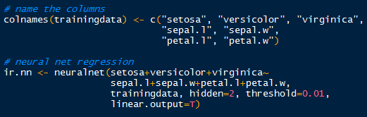
Now that we have the targets and inputs in our training data we can run the neural network. Just to make sure, verify the column names in the training data for accurate model specification, modifying them as appropriate. 

Using the neuralnet() function, we can specify the model starting with the target indicators: setosa+veriscolor+virginica~. Those three outputs are separated by a hidden layer with 2 nodes (hidden=2), which are fed data from the input nodes: sepal.l+sepal.w+petal.l+petal.w. The threshold is set by default at 0.01, so when the derivative of the sum of squares error-like term with respect to the weights drops below 0.01, the process stops (so weights are optimal).


Neuralnet Training


Plotting the Neural Network


Now that we have run the neural network, what does it look like? We can plot the nodes and weights for a specific covariate like so: 


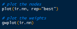
Visualizing the Neural Network

Hopefully I am not the only one who thinks the plot is visually appealing. Towards the bottom of the plot, an Error of 0.0544 is displayed along with the number of steps, 12122. This Error number is similar to the sum of squares.

Iris Neural Network Nodes

By default, the gwplot() plots the first covariate response with the first output, or target indicator. So below, we see species setosa with sepal length weights. The target indicator and covariate can be changed from default.


Validation with Test Data


How did the neural network model the iris training data? We can create a validation table with the target species and the predicted species, and see how they compare. The compute() function allows us to obtain the outputs for a particular data set. To see how well the model fit the training data, use compute() with the iris.nn data with training indexes. The list component $net.result from the compute object gives us the desired output from the overall neural network.


A Good Fit

Observe in the table above that all 75 cases were predicted successfully in the model. While it may seem like a good result, over-fitting can encumber predictions with unknown data, since the model was trained on the training data. No hurrahs yet. Let us take a look at the other half of the iris data we separated earlier into the test set.
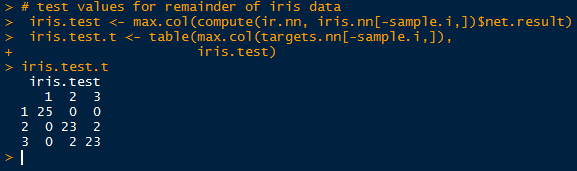

Test Results

Simply take the inverse (-sample.i) of the sample indexes to obtain the mirrored test data set. And look, we did not achieve a perfect fit! Two in group 2 (versicolor) were predicted to belong in group 3 (virginica), and vice versa. Oh no, what happened? Well, the covariates in the training set cannot account for all known and unknown variations in the test covariates. There is likely something the neural network has not seen in the test set, so that it would mislabel the output species. 

This highlights a particular problem with neural networks. Even though the network model can fit the training data superbly well, when encountering unknown data, the weights on the nodes and bias nodes are geared towards modeling the known training data, and will not reflect any patterns in the unknown data. This can be countered by using very large data sets to train the neural network, and by adjusting the threshold so that the model will not over-fit the training data.

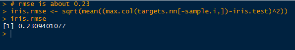
And as a final comment, I calculated the root mean square error (RMSE) for the predicted test results and the observed results. The RMSE from this neural network for the test data is approximately 0.23.


RMSE of Test Data

The results are not too bad, considering we only trained it with 75 cases. In the future I will post another neural network, revisiting the MNIST handwritten digits data, which we model earlier with Random Forests.

Stay tuned for more R posts!


Thanks for reading,

Wayne
@beyondvalence


For further reading:

Neuralnet

Thursday, February 20, 2014

R: Partial Least Squares Regression, RMSEP, and Components


Hello Readers,

Here we will continue our R regression series and after working with ordinary, and robust regression, we will address partial least squares regression. Using the same chemical descriptors data set, we will predict solubility of compounds with a different approach of looking at the predictors themselves and how they relate to each other. 

In many data sets, the predictors we use could be correlated to the response (what we are looking for) and to each other (not good for variability). If too many predictor variables are correlated to each other, then the variability would render the regression unstable.

One way to correct for predictor correlation is to use PCA or principle component analysis which seeks to find a linear combination of predictors to capture the most variance. The jth principal component (PC) can be written as:


PCj = (aj1 * predictor 1) + (aj2 * predictor 2) + ... + (ajp * predictor p)


However this method does not always produce a PC that correlates with the response variable as shown below:


From Max Kuhn's Applied Predictive Modeling

Whereas using partial least squares regression, we see that it is correlated with the response variable.


From Max Kuhn's Applied Predictive Modeling

So start R and let us look at partial least squares regression!


Partial Least Squares


PLS regression, like PCA, seeks to find components which maximize the variability of predictors but differs from PCA as PLS requires the components to have maximum correlation with the response. PLS is a supervised procedure whereas PCA is unsupervised.

First we require the following R packages, specifically the
pls library:


R Packages
The Solubility data from the AppliedPredictiveModeling package is summarized and transformed in the ordinary regression post.

In the pls library, we will use the plsr() function for partial least squares regression. We specify the response variable as solubility, use all the predictor variables with a ".", and include cross-validation parameter as "CV".


plsr() and Prediction
With the familiar predict() function, use the plsFit list object which contains the predicted values for each component iteration of the PLSR algorithm, with default set at the Dayal and MacGregor kernel algorithm "kernelpls". We predict the first 5 solubility values "solTestXtrans[1:5, ]" using 1 and 2 components "ncomp=1:2". The results are shown below.


Solubility Values for 1 and 2 Components
But how do we know from what number of predictors to choose? Well there are several methods, let us take a look at the summary() output of plsFit, truncated into two parts. We look for component number which adequately explains both predictors and response variances.

The first section displays the root mean squared error of prediction (RMSEP), cross-validation estimate, as well as the adj-CV, which is adjusted for bias. Take note of the dimensions of X and Y of the data towards the top of the output.


pls Summary Part 1
The next section shows the percent of variance explained by components for predictors and response. See how the variance explained rises quickly from 1 component and stabilizes above 10..13 components. That would be a good component range for the pls model.

pls Summary Part 2
Another method is by plotting and locating the lowest Root Mean Standard Error of Prediction (RMSEP).


PLS Prediction Error


There are two methods able to produce the visualization of RMSEP. The first uses the function
validationplot() from the pls package which will give us the RMSEP plot for each component iteration in the model. Specify the validation type to be "val.type=RMSEP".


validationplot()
We see from the validation plotting function that there is a sharp decrease in the root mean standard error for the first few numbers of components and then plateaus after about 10. Keep in mind the summary information about the explained variance increments stabilizing around 10.


However we want to find the component number corresponding to lowest point in the RMSEP. Using the RMSEP() function with estimate parameter set to "CV" we can derive the desired value. The plot() will give us the initial graph- see how similar it is to the plot obtained from validationplot(). (They should be the same.)


RMSEP() and plot()


To calculate the lowest RMSEP, we use the which.min() function, which returns the index of the lowest value. The minimum value is found at 10 components and we add a point to the plot using the points() function such that the x and y values are: (component number, minimum RMSEP value).


Finding Lowest RMSEP
The plot with the added locating point in red is shown below.


RMSEP() with points()
Using the training data, we can plot the predicted solubilities from the training set to the actual solubilities, using another plot() function:


plot(plsFit, ncomp=10, asp=1, line=True)


Checking Training Predictions
From the above plot, we see that the points mainly lie along the line. This is expected because the data is from the same training set used to create the plsr model.


Predicted Solubilities


Now that we have an optimal component number (10), we can go ahead and use the plsr model to predict new solubility values for test predictor data. Again we use the
predict() function and specify the test data (solTestXtrans) and the number of components (ncomp=10).


Predicting Solubility from Test Data
Then we plot the observed ('test' data with actual values,  lucky us) and the predicted values together with a line, determining how close the values are.


And the plot does not look too bad, with no indication of anomalies.


Evaluation of plsr Model


Because we have the observed solubility values for the 'test' data we can evaluate how well the model performed. However in the usual circumstances, we would not know the actual values, hence what we are doing- predicting values from the test predictor data.

Using the observed values in solTestY and the predicted values in pls.pred2[,1,1], we can use the defaultSummary() function to obtain the RMSE and Rsquared, as shown below.


Evaluation
From the output, we see that the RMSE is around 0.7366, and the Rsquared is approximately 0.8744, explaining 87% of the test data variance.


And there we have it, folks! This (lengthy) post covered partial least squares regression in R, starting with fitting a model and interpreting the summary to plotting the RMSEP and finding the number of components to use. Then we predicted solubilities from the the test data with the plsr model we fitted to the training data.

Check back for more posts on predictive modeling! Happy programming guys!


Thanks for reading,

Wayne
@beyondvalence

Thursday, December 12, 2013

Visualizing Twitter Tokens- Hashtags, Smileys and URLs in R


Hello Readers!

Tweet, Tweet!
Welcome back to the blog. Today we will discuss how to visualize Twitter tokens trends in tweets, specifically:


The data was obtained from the infochimps site, where they also host data sets for other platforms. For analysis I will be using RStudio.

Let us get started.


The Loading


Unpacked Zip File Content
Once we have downloaded and unzipped the 'tokens by month' data set, we can go ahead a read the tsv file (tab separated values) into R. Use the str() function to get an idea of the data structure.


Reading in Total Tokens by Hour tsv
Looking at the structure, we see that there are 3 columns with 67,992 observations consisting of "tweet_url", "smiley", or "hashtag". The X column denotes the 4 digit year, month, day, and hours in 24 hour format, followed by the count in the X1 column. Use the table() function to determine how many token measures we have of each, and also to check for spelling errors.


Token Measures
We see there are 18,401 hashtag measures, 25,137 smiley measures, and 24,454 tweet_url measures. Keep in mind these are not counts- they are just the number of times the tokens were measured in the data set. The actual counts are in column 3, X1. To obtain the total counts for each measure, we use tapply() to apply a function by index. The totals are shown above, with tweet_urls coming in top at 167,819,007! It seems that people are tweeting more internet links than hashtags and smileys put together.


The tokens() Function


Next we write the tokens() function. Keep in mind of the variables we have to track when we separate the all the information pertaining to the three different tokens. At the same time, I want to convert the dates into an usable Date.Time format. Putting it together, the result will be a list containing the date and count of the hashtag, smiley, and tweet_url tokens.

The first part of the function is shown below.


Token Function Part 1
 We start the function by initializing the variables we need to keep track of and using counters to progress the variables along through each successive record (h, u, and s) of their respective time and count variables in the for loop. We take the pertinent data from each type of token into their own variables to put in a list. 

Next, we take the date variables and convert them into Date.Time format using the strptime() function, shown below. Afterwards, we create the list and instruct the function to return the tokens list. Now run the tokens () function.


Token Function Part 2
Finally, use the completed tokens() function to create the t.tokens list.


The Plotting


Now that we have the tokens in a convenient list, we can visualize the token trends with a plot. Naturally, use the plot() function, a sample method is show below.


Plotting the Hashtag Count
 The second section will create the x axis labels consistent with the Date.Time values in the t.tokens$count.h variable. It will plot the year and month for better readability.

Hashtag Count Plot

We will add the two other tokens next using the lines() function. And to finalize the plot, we will add a legend to interpret which line is which token.


Adding Smiley and URL Count Lines

Now we have the finished plot!

Plot of All Three Token Counts Over Time

Note that starting in January of 2009, user activity, especially in URL content are beginning to spike above the previous background levels. Observe that drastic spikes in URL counts in July and October of 2009 also coincided with hashtag and smiley counts as well. The increases in content can be attributed to the increased in Twitter users, starting in 2009. 

Stay tuned for more Twitter analysis!

Thanks for reading!


Wayne