Loading...
Showing posts with label data model. Show all posts

Thursday, November 14, 2013

P4.3: Data Modeling in PowerPivot: SQL Query Denormalization

Hello Readers,

This post is a continuation from the last post of understanding normalization in data modeling using PowerPivot. As usual, we will be using the AdventureWorks companion material from the Ferrari book. Let us get started.


SQL Querying in PowerPivot


In the previous post I demonstrated how to denormalize a table in PowerPivot by creating calculated columns using the RELATED command. The RELATED command is an easy tool to understand denormalization. However, with SQL queries we can normalize with ease in a large database. Here we will query in SQL the necessary columns and tables to denormalize a data model. The denormalization process will be shifted outside of PowerPivot versus the previous method of denormalizing within PowerPivot using the RELATED command.


A SQL query is a statement written in SQL language used in many modern relational databases. PowerPivot has a built-in SQL query designer, of which we will discuss further.


Begin by adding AdventureWorks data from SQL Server. In the Home tab of PowerPivot, click from Database and From SQL Server option.


Fig. 1: Add External Data from SQL Server in PowerPivot
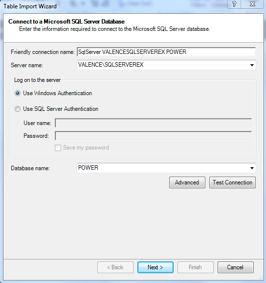
The Table Import Wizard will appear. Type in the Server name and select the Database name from the drop-down menu. In this case, the AdventureWorks tables are located in the POWER Database.


Fig. 2: Connecting to SQL Server Database
After a connection is established, select Write a query because we will demonstrate how to use SQL queries to denormalize a data model.


Fig. 3: Use Query Method
Next we are given the option to enter the SQL query. Knowing SQL, we can type in:

SELECT
  DimProduct.ProductKey
  ,DimProductCategory.EnglishProductCategoryName
  ,DimProductSubcategory.EnglishProductSubcategoryName
FROM
  DimProductSubcategory
  INNER JOIN DimProductCategory
  ON DimProductSubcategory.ProductCategoryKey = DimProductCategory.ProductCategoryKey
  INNER JOIN DimProduct
  ON DimProductSubcategory.ProductSubcategoryKey = DimProduct.ProductSubcategoryKey

But for now, click the Design button as show below in Figure 4 to use the SQL query designer.


Fig. 4: Select PowerPivot Query Designer
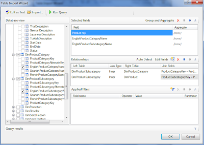
With the SQL query Designer open, select the ProductKey from DimProductEnglishProductCategoryName from DimProductCategory, and EnglishProductSubcategoryName from DimProductSubcategory.


Fig. 5:  SQL Query Designer
In the Relationships section, the DimProductSubcategory has the Primary Keys to the categories and subcategories to the DimProduct and DimProductCategory tables. This illustrates the one-to-many relationship, indicated by the left and right tables. The Join Fields are shown in Figure 5 as well. Now click OK, and we get SQL query statement designed by the point and click SQL query designer (Figure 6.)


Fig. 6: SQL Query Statement from SQL Query Designer
Hitting Finish, the Table Import Wizard implements the query statement and imports the specified table into the PowerPivot database.


Fig. 7: Query Table
Now we have denormalized a data model by using SQL queries to retrieve columns from different tables into one table. Note that 397 rows were imported. This is less than the 606 rows in the DimProduct. Where did the other 209 rows go? The 397 rows from the query is a result of the type of relationship between the tables, in this case is an INNER JOIN, which only returns rows with matching values in both tables. The next post will discuss the different types of JOINS.


Thanks for reading,


Wayne

Thursday, November 7, 2013

P4.2: Data Modeling in PowerPivot: Normalization and Denormalization

Hi Readers, 
Today we will discuss normalization and denormalization of tables in data models. As usual, we will being using the companion material from the Ferrari book. We will be continuing on the data model from the previous post. Let us get started.

Normalization


In the previous post we discussed relationships between tables in the data model with products, product categories, and product subcategories. That particular data model is considered to be normalized. What does it mean to be normalized? Instead of having one detailed table with all the category and subcategory information for each product, the category and subcategory information is referenced in their own tables. This way, the categories and subcategories are not repeated multiple times with each product and allow for efficient data storage. Normalization increases the number of tables, but decreases the overall size of the database by removing redundancies.


Fig. 1: Normalized Product Data Model

Inside the DimProduct table, instead of a product subcategory column listing the subcategories, it has numbers referencing the DimProductSubcategory table. Below in Figure 2, we see that the subcategories are only listed once (which is why the ProductSubcategoryKey column must be an unique Primary Key.) This reduces redundancy of listing the each subcategory multiple times for the products in the DimProduct table.

Fig. 2: DimProductSubcategory Table

Although another table (DimProductSubcategory) was created by normalizing, it occupies less overall physical hard drive space. However, viewing the product data model information as a set of normalized tables from the user perspective is difficult and not logical. Once a database is normalized for storage, the required data must be denormalized for readability when retrieved to be analyzed.

Denormalizing (Reducing Normalization)


For this product data model, we can easily create calculated columns for the product categories and subcategories in the product table and hide the product category and subcategory tables in the model. This would reduce the normalization, thus increasing the complexity and physical storage size of the product table.

In the DimProduct table in PowerPivot, create a calculated column for the ProductCategory using the DAX expression:

  =RELATED(DimProductCategory[EnglishProductName])

as shown below:

Fig. 3: RELATED DAX Expression for ProductCategory
And again for the ProductSubcategory column with the DAX expression:

  =RELATED(DimProductSubcategory[EnglishProductSubcategoryName])

again, shown below:

Fig. 4: RELATED DAX Expression for ProductSubcategory

Now the DimProduct table has decreased normalization and more redundancy, with product categories and subcategories being repeated multiple times, but is more readable for the user. To finish, we can hide the other two tables which are now not required since the relevant data is in our desired product table.

To hide the DimProductCategory and DimProductSubcategory tables, in the PowerPivot Diagram View, right-click the table and select Hide from Client Tools. Normalized tables which are needed for the data model, but can be safely hidden are called technical tables

Fig. 5: Hide from Client Tools, Table

Additionally, the ProductSubcategoryKey, as the Foreign Key in the DimProduct table, is now not required because the table has been denormalized with the actual subcategory column in the table. Yes, it can be hidden too (along with ProductKey and ProductAlternateKey.)

Fig. 6: Hide from Client Tools, Column

Hiding technical tables and technical columns, as well as removing normalization are important steps to improving the usability of a data model. Though relational databases use normalization,  denormalized tables offer ease for analysis and querying, while a normalized data model removes redundancy, occupies less disk space, and improves database operational performance.

Either option can be right or wrong depending on the scenario, and the operations we would like to perform on it. In the next post, I will discuss denormalizing with SQL queries.


Thanks for reading,


Wayne

Tuesday, November 5, 2013

P4.1: Data Modeling in PowerPivot: Relationships

When we wanted to merge two table together, an option would be to use the VLOOKUP function. To analyze the many tables in a data model, VLOOKUP is inefficient and is replaced with relationships, an 'automatic VLOOKUP', which allows us to link entire tables at a time instead of referencing single columns.

As usual, we will be using the Adventure Works companion material (Chapter 4) from the Ferrari book.


Creating the Data Model


Instead of using VLOOKUP multiple times to add columns into the DimProduct table, we will use relationships to merge all three tables together. Opening the PowerPivot window in Diagram View from the workbook we see that the relationships between the tables have already been formed, because PowerPivot detected existing relationships (will be elaborated in further posts.)


Fig. 1: PowerPivot Diagram View
The arrow lines are representations of relationships in Figure 1. The arrow starts at DimProduct, the source table and points to DimProductSubcategory, the target table, and the connection is finished as DimProductSubcategory is linked to the DimProductCategory table. In the measure field towards the bottom half in grid view of the DimProduct table, we can add a calculated field for the number of products, NumOfProducts


Fig. 2: Creating NumOfProducts Calculated Field
Now we can create a PivotTable tabulating the number of products for each ProductCategory from the DimProduct table. The ProductCategory is actually the EnglishProductCategoryName field in the DimProductCategory table, two relationships away, connected by the ProductSubcategoryKey and the ProductCategoryKey.


Fig. 3: ProductCategory PivotTable
Data models are much more efficient in performance compared to VLOOKUP, especially when dealing with large data sets for computational power, and in multiple tables for a chain of relationships. Also, the NumOfProduct field calculation is available for any PivotTable using the data model, so we do not have to create a new definition every time.

So a data model is a set a tables connected by relationships, sometimes with calculated fields or columns. Simple yet powerful.


Notes on Relationships


Though these relationships will not help much in your love life, the following details on PowerPivot relationships will make your life easier when creating and understanding data models.

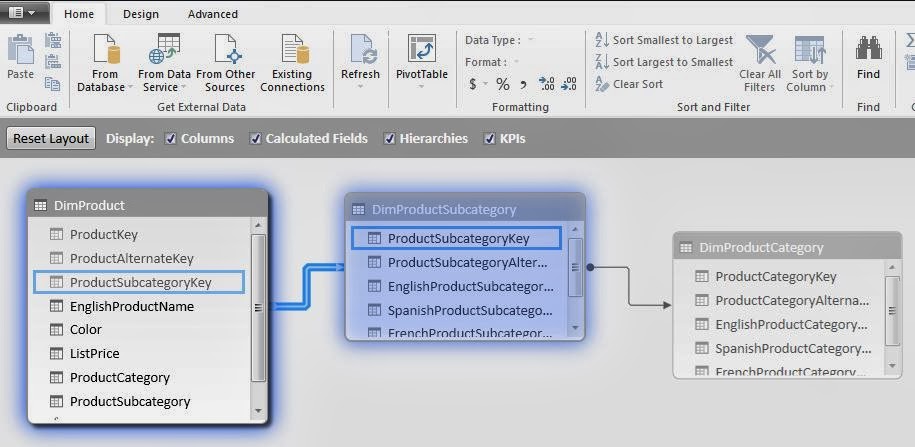
Looking at the Diagram View of the tables and relationships, we focus on the relationship arrow from DimProduct to DimProductSubcategory.

  • DimProduct is the source table (the beginning of the relationship)
  • DimProductSubcategory is the target table (where the values relate to source table)
  • ProductSubcategoryKey column is the Foreign Key in source table (contains values which is searched in target table for related row)
  • ProductSubcategoryKey column is the Primary Key in the target table (needs to have unique values in each row)

These are shown highlighted in blue below:


Fig. 4: DimProduct and DimProductSubcategory Relationship
A specific product can only have one subcategory, whereas a subcategory may have many products. That is why the target table (DimProductSubcategory) must have an unique Primary Key (ProductSubcategory) for the products in the DimProduct table. This type of relationship is called "one-to-many", with the target table being "one side", and the source table being the "many side" of the relationship.

We can test the relationship by recreating it. Click the arrow and press Delete. Then in the Design tab, click Create Relationship.


Fig. 5: Creating a Relationship
In the drop-down boxes, we would want to specify the DimProduct and DimProductSubcategory as tables, with the ProductSubcategoryKey as columns from both. However, if we accidentally flip the tables, and confuse the "one-to-many" to "many-to-one" tables, PowerPivot automatically detects the columns in the tables and lets us know it will create the relationship in the opposite direction.

So now you know the inner workings of relationships in data models. Some DAX functions work only when invoked on the correct side of a relationship, so sides do matter. Stay tuned for more on data modeling!


Thanks for reading,

Wayne

Sunday, August 18, 2013

P3.1: Beginning DAX 1

Hi Readers, this post will introduce the DAX language. As usual, we will use Chapter 3 Sales Example of the companion material of the Ferrari PowerPivot book. Let us get started.


Fundamentals of DAX

First, a little background. DAX stands for Data Analysis eXpressions language. This PowerPivot syntax is similar to Excel expressions, but also allows users to handle data stored in different tables in more advanced calculations. Therefore, while Excel uses table coordinates such as A1, or C3, DAX uses tables and columns as coordinates. Post 1.6 touched upon the notion of row and column oriented databases. Clearly, DAX is column oriented, and can pull a value for a column in a single row, the entire table, or some subset in between.

We will cover DAX syntax, data types handled by DAX, basic operators, and how to refer to tables and columns in PowerPivot in this post. Here we go!


DAX Syntax

Let us start by an example. Opening the PowerPivot window, we observe the Sales table with columns SalesAmount and TotalProductCost towards the end.


Fig. 1: Sales Table in PowerPivot
Subtracting TotalProductCost from the SalesAmount gives us the margin. Type the following formula for the GrossMargin:
=Sales[SalesAmount]-Sales[TotalProductCost]
Fig. 2: GrossMargin Column Added
We can see from the formula (a calculated column) that we refer to the table name and the column name for this DAX expression, which handles numeric values and returns numerical values. This is basic DAX syntax.


DAX Data Types

DAX can handle numerical values, such as:


  • Integer
  • Real
  • Currency
  • Date (or datetime)
  • True/False (Boolean)
  • String
  • BLOB (Binary Large OBject)

PowerPivot has a great type-handling system; we can use DAX expressions and the resulting type is based on the type of terms used in the expressions. So if a term in the expression is a date, then the result would be a date, if an integer, then the result would be an integer. This is called operator overloading. For example, we can add a week to the Date column by adding seven to create a DatePlusOneWeek column.
=Sales[Date] + 7
Fig. 3: DatePlusOneWeek Column Calculation
The DAX expression adds 7 days (one week), to the Date column and returns the Date a week later, in DatePlusOneWeek. June 1, 2008 was transformed into June 8, 2008, as a date numeric type.

PowerPivot will automatically convert numbers into strings and in reverse when the operator requires it. So when we have the expression 

= 5 + 4 
and replace the operator with & to concatenate strings, the 5 and 4 will be converted into strings. The result of 
= 5 & 4 
is "54" (the " " indicates a string.) In reverse, when we have strings  "5" and "4" being added together: 
= "5" + "4"
we get 9. Using the operator to determine the type of the resulting value is convenient, but we will encounter handling errors in later posts.

Considerations of Specific Data types:

Date
PowerPivot stores datetime as a floating point number. In fact, the floating point number corresponds to the number of days starting from December 30, 1899, and the decimal represents the fraction of the day. The seconds, minutes, and hours in a day are converted into decimal fractions. If we evaluate this idea by:
= NOW() + 1
we would have an expression which adds one to the floating point. Thus it adds one day to today and we get essentially the date for tomorrow (with the same hours, minutes, and seconds.)

True and False
True and False represent logical conditions, and is usually called a Boolean data type. For example, the expression
=Sales[TotalProductCost] >= Sales[SalesAmount]
would return True if the TotalProductCost of the row was greater or equal to the SalesAmount, and False if the it was less.


Dax Operators

Figure 4 below shows the different DAX operators and examples. We have seen many before.

Fig. 4: DAX Operator Types

DAX Values

The values used in Figure 4, such as "USA" or 0, are called literals and is straightforward. However, when referencing column names in the format:
'Table'[Column]
we usually can omit the quotation marks if the table name has no special characters or spaces to:
Table[Column]
We also can use the column name by itself, which is always enclosed in square brackets:
[Column]
and the expression will find the referenced column name in the current table.
For the sake of readability, and to prevent mistakes, use the table name in conjunction with the column name.

Note on IntelliSense:

When we type into the formula box in PowerPivot, a helpful window appears, listing the names of all the function names and references. For example, if we type in
=[
to begin a column name, a listing of all the column names will appear.

Fig. 5: IntelliSense Displaying the Possible Column Names
We will continue to explore DAX in the next post, P3.2.


Thanks for reading,
Wayne

Saturday, August 17, 2013

P2.3: Computing Complex Aggregations in PowerPivot: Distinct Count & Refreshing the Data Model

This post will describe how to calculate a complex aggregation such as a distinct count of products in PowerPivot. We will be using the data model created in the previous post, from the companion material of the Ferrari PowerPivot book.


Computing Distinct Count

Calculated fields have an useful feature that enables us to compute complex aggregations. In the last post we calculated the gross margin and also the gross percentage of sales using calculated column and field. Today we would like to determine the number of products in each Color.

Let us begin by creating a simple PivotTable showing the SalesAmount by Color of products.


Fig. 1: Sum of SalesAmount by Color of Product
We want to count the number of products, not the number sold under each Color; whether a particular product sold 8,000 units or only 1 unit, the count would only be 1 for that same product (hence distinct count.)

If we add the ProductKey under the DimProduct table to the PivotTable, we can see that the result is not what we were looking for.


Fig. 2: PivotTable with Sum of ProductKey
From the numbers and the column header, the column is displaying the sum of the product keys. It is logical that Excel took the sum because the values are integers. However we want the sum of the number of unique product keys. We can change the method Excel aggregates the data, by changing the settings of ProductKey in the Values area. Click the drop-down arrow and select the Value Field Settings button.


Fig. 3: Value Field Settings Button
In the Value Field Settings window, we can select an attractive option, which also happens to be called Distinct Count. Note that the Custom Name of the column changes to "Distinct Count of ProductKey".


Fig. 4: Value Field Settings- Distinct Count Option
Now let us observe the new PivotTable showing the proper distinct count. The two red arrows point to rows with counted products but no sales. If we want to count products responsible for sales, we should only count those products that were actually sold. 


Fig. 5: PivotTable with Corrected Distinct Count
The correct field to display in the PivotTable is the ProductKey under the FactInternetSales table, because the table has only product keys of products that were sold. This highlights how easily we could choose the wrong field to aggregate, especially for the computation of distinct count. The PivotTable with correct fields is shown below.


Fig. 6: PivotTable with Proper Distinct Count

Note on Refreshing the Data Model:

We have seen in P2.1 that we can add data to the data model in PowerPivot without going through Excel. Data models are dynamic, and thus, they change constantly as columns or fields are calculated. Refresh the data model by clicking the Refresh button in the Home tab of PowerPivot. It will give the option of refreshing the current table or all of the tables in PowerPivot, as highlighted in Figure 7.

Fig. 7: Refresh Button
When PowerPivot refreshes tables, it will gather the data again from the databases and update the tables and the calculated columns accordingly. Calculated fields are not stored in the data model so they are recalculated as required. Because we work with data sets not numbering in the millions of rows, the refresh process is quick. However, it can take some amount of time when many millions of rows are read again from the database. This is code we will explore later on, which will update the tables upon opening, or clicking a certain button.


Thanks for reading,
Wayne

P2.2: Creating Calculated Columns and Calculated Fields in PowerPivot

This post will explore calculated columns and fields in PowerPivot, using the sample database from the Ferrari PowerPivot book. We will continue to use the PivotTable and data model from the previous post.


Creating a Calculated Column

From the previous post, we created a PivotTable depicting the SalesAmount by Color, and CalendarYear


Fig. 1: SalesAmount by Color by CalendarYear PivotTable
To understand the profitability from the sales, we account at least for the product cost as well. So the TotalProductCost column needs to be added from the FactInternetSales table.


Fig. 2: SalesAmount with TotalProductCost PivotTable

The TotalProductCost column was added beside each SalesAmount column in the PivotTable shown in Figure 2. For certain reports arranging columns side by side is better, but for readability for this report, we could like to position the fields in rows resembling the subtraction to obtain the profit data. So drag the Î£ Values to the Rows area, as in Figure 3.

Fig. 3: Dragging the Î£ Values to Rows Area
The PivotTable is now easier to read and set up for the calculated column.

Fig. 4: Revised SalesAmount and TotalProductCost PivotTable
The FactInternetSales table has no gross margin column, which is the difference between SalesAmount and TotalProductCost. So we will add a column called GrossMargin in PowerPivot as a calculated column, which extends the content of a table and is stored in the data model. First, navigate to the FactInternetSales table in the PowerPivot window. In the Design tab, click the Add button which will add a new column to the end of the table.

Fig. 5: Add Column Button
Now we use simple DAX language to calculate the GrossMargin column. Though DAX syntax can be more intensive, the formula is very straight forward. Type in:
= FactInternetSales[SalesAmount] - FactInternetSales[TotalProductCost]
as shown in the Figure 6 below. It subtracts the TotalProductCost from the SalesAmount for the GrossMargin column, and it is now in the data model. The column can be renamed by right-clicking the column header and selecting Rename Column.

Fig. 6: GrossMargin Formula
Let us add the GrossMargin column to the Values area in the PivotTable. We can find it in the FactInternetSales table where we created it in PowerPivot. It would go in the Values area.

Fig. 7: PivotTable with GrossMargin
We can use DAX to solve more complex calculations, which we will explore in future posts. However with this simple DAX formula we have created a calculated column and displayed it on the PivotTable.


Creating a Calculated Field

A calculated field, also known as measures, are computed at an aggregate level, compared to calculated columns, which are computed for every row. For example, let us compute the gross margin as a percentage of the total sales amount.

Add a new column in PowerPivot to the FactInternetSales table which calculates the gross margin percentage. We might enter this as the formula for GrossMarginPct:
=FactInternetSales[GrossMargin] / FactInternetSales[SalesAmount]
Fig. 8: Formula for GrossMarginPct
Then display the resulting GrossMarginPct in the PivotTable under the Values area.

Fig. 9: PivotTable Including GrossMarginPct
Wait! The GrossMarginPct numbers look quite large and not right at all. In fact, the formula took the summation of all the percentages and displayed the sum, which is not what we wanted (this is the incorrect way to formulate this GrossMarginPct calculated field.) We can remove the GrossMarginPct from the PivotTable.

The correct way to obtain the GrossMargin percentage as a calculated field is to click on the Calculated Fields button in the PowerPivot tab.

Fig. 10: Calculated Fields Button
Name the new field GrossMargin%, and for the formula, type in:
=SUM(FactInternetSales[GrossMargin]) / SUM(FactInternetSales[SalesAmount])
as shown down below.

Fig. 11: Creating the GrossMargin% Field
The syntax for the calculated field is similar to the calculated column formula; it just has an additional SUM function. This will be explained in later posts describing the DAX language. In the window, we are given options at the bottom to format the output of the calculation, and since it is a percentage, select the Percentage format. After we click OK, the calculated field, GrossMargin%, is added to the data model and is available to complete the PivotTable. Select it and confirm that it is in the Values area.

Fig. 12: Revised PivotTable with GrossMargin%
Now these percentages look much more reasonable than the previous gross margin calculation, because it took the aggregate of the SalesAmount and the TotalProductionCost. We take a deeper look at calculated columns and fields later in P3.2.

Note:

The calculated field will be available to the PivotTable or report that we create using the data model. Think of it like this: we are building a data model, not just a report. The data model can be used for many other different reports or PivotTables, so as we transition into a good data modeler, we become better report creators.


Thanks for reading,
Wayne

Sunday, August 11, 2013

P1.7: Exploring Power View Reports in Excel

This post explores the Reports produced by Power View in Excel 2013. The data we will use is from the AdventureWorks dataset, which is in the Chapter 1 workbook from the Alberto Ferrari PowerPivot book.


Creating a Power View Report

Similar to a Dashboard we created in P1.5, Power View in Excel can construct a report which can convey data to the reader, but with more visualization capabilities. Reports from Power View require minimal mouse clicks to embellish and offers Excel users a graphical data exploration tool. PivotTables allow Excel users to explore data using tables, whereas Power View allows us to explore the data graphically in a simple charting environment.

Power View works through the Data Model and not Excel tables, so if you add tables to the Power View report, they will be added to the Data Model. Make sure you have MS Silverlight installed for Power View to work.


Click on the Power View button on the Insert tab in Excel. We will create a new Power View report, so click OK when Create a Power View sheet is selected.


Fig. 1: Power View button
Now we have a Power View report from which we can add fields. Start by clicking on the report and then selecting the ProductCategory and SalesAmount fields from the Sales table from the Power View Fields on the right pane. You can also add an appropriate title to the top of the Report, and this particular one I will name "Sales by Category and Geography".


Fig. 2: Product Category and Sales in Power View Report
Now suppose you would like to show more information, such as sales by geographical region. To start another table, click on an empty area in the Power View Report. If you add more fields with the previous table open, then the fields will be added to the previous table. Select the fields of TerritoryCountry and SalesAmount in the Sales table. This will display a table showing the country and the sales.


Fig. 3: Country and Sales table in Power View Report
Looking at the Sales by Country in a tabular format is not exactly visually appealing. However, we can portray the geographic data on a map, which will enhance the analysis visually. An internet connection is required to map the data. With the TerritoryCountry table selected, click on the Map button in the Design tab, and the table is converted into a map chart showing SalesAmount as circles over the respective country.


Fig. 4: Map Chart of TerritoryCountry and SalesAmount
We can re-size and zoom in or out of the map to display the area we would like to exhibit on the report. The product category table can also be converted into a visually appealing format as a chart by selecting the Column Chart button in the Design tab.


Fig. 5: Column Chart of ProductCategory and SalesAmount

Adding Filters to the Power View Report

While creating a report in Power View, we can also add a filter to aid in analyzing the data. Let us include the Office and SalesManager fields as filters to the report to see the stratified data graphically. Start by adding the Office and SalesManager as two tables on the above report.


Fig. 6: Office and SalesManager Tables on the Sales Report
Now that we have the two tables added, we can change them to what Excel calls a Slicer. With the desired table selected, click on the Slicer button in the Design tab.


Fig. 7: Office Table as Slicer in the Sales Report
In Figure 7, the Office table is now a Slicer, or filter, and the SalesManager table is selected ready to be converted into a Slicer as well, with the highlighted Slicer button. With both fields as Slicers, we can now stratify the Office and SalesManager fields to show data on the Sales Report which only relate to that specific selection in the field. For example, we can select the Seattle office and Alberto Ferrari as the sales manager. The data on the Power View report would only reflect the Sales by the Seattle office and those under the sales manager, Alberto Ferrari.

Fig. 8: Sales in the Seattle Office with Alberto Ferrari as Sales Manager
Filters and slicers allow us to view the data under different field selections. In the Power View Report, the chart is updated automatically with the selected filter, which enables fast and efficient data analysis. We can clear the filters by clicking on the Eraser button on the top right-hand corner of the filter table, shown in Figure 9 below.

Fig. 9: Clear Filter Button

To conclude, Excel charts allow large areas customization, with many options to choose. In contrast, Power View charts give the user the ability to visualize the data and spot patterns from the charts with minimal effort in creation.


Thanks for reading,
Wayne