Loading...

Friday, August 16, 2013

P2.1: Loading Data from External Sources to PowerPivot

This post will describe how to load external data sources to PowerPivot, using examples from Chapter 2 of the Ferrari PowerPivot book.


Loading Data PowerPivot

In the previous posts, we have been adding tables to the data model from Excel. However this method is inefficient, as PowerPivot can load data directly into the data model, without going through Excel. By doing so, we only need to load the data once, and it loads as compressed data into memory. When loading, Excel does not compress data so the resulting size of the file is around 10 times larger at times when loaded through Excel rather than PowerPivot (sizes from previous posts). Also, Excel is limited to storing 1 million rows, and PowerPivot can handle hundreds of millions of rows in memory. So loading data into first into Excel then into PowerPivot can hit the limit of rows and curb efficiency.

However, the data in the data model cannot be edited in PowerPivot, and can be edited in Excel. This can help prevent unwanted modification to the data set in PowerPivot as it is read-only. If the data set is loaded into Excel, all Excel editing features are available. Despite being read-only in PowerPivot, it is possible to add new columns to the original tables by using DAX language, but the original tables stay the same.


Loading from the AdventureWorks Database

In the PowerPivot tab, click on the Manage button to open the PowerPivot window.


Fig. 1: Manage Data Model button
The PowerPivot window should appear, and to add data, click on the Get External Data button on the Home tab.


Fig. 2: Get External Data Button in PowerPivot
For this specific demo, we will use the database that was included in the companion material as a MS Access file. Choose the Access connection and the Table Import Wizard window will appear. Find the Access database file where it was saved by selecting Browse and click the Next button.


Fig. 3: Access Database Table Import Wizard
For accessing a database from Microsoft SQL Server, click the SQL Server button. Fill in the Server Name and use the proper Authentication. 


Fig. 4: Microsoft SQL Server Table Import Wizard
The next window appears allowing two options to import the data: select the desired tables from a list, or write a SQL query to specify the data. For simplicity, select the first option to select from a list.


Fig. 5: Choosing How to Import the Data Window
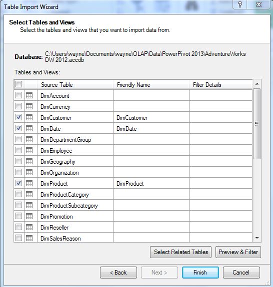
Now we can select the four tables required: DimCustomer, DimDate, DimProduct, and FactInternetSales from the Table Import Wizard.


Fig. 6: Selecting the Tables
After clicking Finish, the tables are loaded into the data model. Select Diagram View in the bottom right-hand corner of the PowerPivot window to see how the tables relate to another. Relationships were explained in P1.2. The FactInternetSales table contains many key fields, as diagrammed below.


Fig. 7: PowerPivot Diagram View

Under the Design tab, clicking Manage Relationships will allow us to modify relationships between tables. The current relationships between the four tables in our data model are shown below in Figure 8.
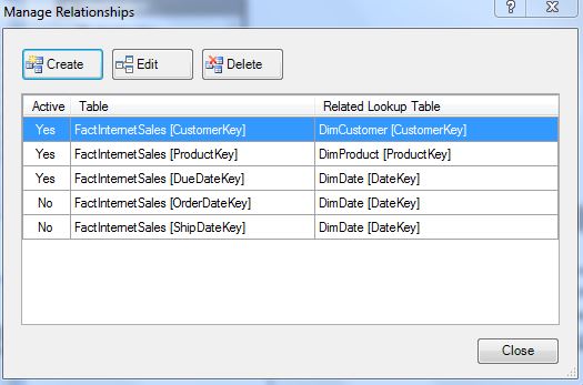

Fig. 8: Manage Relationships Window in the Data Model


Creating a PivotTable in PowerPivot

After we have loaded the data into PowerPivot, we can create a PivotTable from the data model. Select the PivotTable button under the Home tab, highlighted in Figure 9. 


Fig. 9: PivotTable Button in PowerPivot
A dialogue box will appear (Figure 10) asking where to insert the new PivotTable, and we will create it in a New Worksheet. Since we are adding the PivotTable from the data model in PowerPivot, we do not have to specify from which data model we would like to create.


Fig. 10: Determining the Location of the New PivotTable
Clicking OK will complete the PivotTable creation process.


Fig. 10: Blank PivotTable Created from PowerPivot
Now working within the blank PivotTable (Figure 11), we can select the fields from the tables and place them in a defined quadrant:

  • Color from the DimProduct table to Rows quadrant,
  • CalenderYear from the DimDate table to the Columns quadrant,
  • SalesAmount from the FactInternetSales table to the Values quadrant.

Fig. 11: SalesAmount by Color by CalendarYear PivotTable
This shows how easily we can aggregate and slice values from different tables in a report for the SalesAmount, thanks to relationships which link the tables together.

In the next post we will create calculated columns and calculated fields into the PivotTable we just realized.


Thanks for reading,
Wayne

Sunday, August 11, 2013

P1.7: Exploring Power View Reports in Excel

This post explores the Reports produced by Power View in Excel 2013. The data we will use is from the AdventureWorks dataset, which is in the Chapter 1 workbook from the Alberto Ferrari PowerPivot book.


Creating a Power View Report

Similar to a Dashboard we created in P1.5, Power View in Excel can construct a report which can convey data to the reader, but with more visualization capabilities. Reports from Power View require minimal mouse clicks to embellish and offers Excel users a graphical data exploration tool. PivotTables allow Excel users to explore data using tables, whereas Power View allows us to explore the data graphically in a simple charting environment.

Power View works through the Data Model and not Excel tables, so if you add tables to the Power View report, they will be added to the Data Model. Make sure you have MS Silverlight installed for Power View to work.


Click on the Power View button on the Insert tab in Excel. We will create a new Power View report, so click OK when Create a Power View sheet is selected.


Fig. 1: Power View button
Now we have a Power View report from which we can add fields. Start by clicking on the report and then selecting the ProductCategory and SalesAmount fields from the Sales table from the Power View Fields on the right pane. You can also add an appropriate title to the top of the Report, and this particular one I will name "Sales by Category and Geography".


Fig. 2: Product Category and Sales in Power View Report
Now suppose you would like to show more information, such as sales by geographical region. To start another table, click on an empty area in the Power View Report. If you add more fields with the previous table open, then the fields will be added to the previous table. Select the fields of TerritoryCountry and SalesAmount in the Sales table. This will display a table showing the country and the sales.


Fig. 3: Country and Sales table in Power View Report
Looking at the Sales by Country in a tabular format is not exactly visually appealing. However, we can portray the geographic data on a map, which will enhance the analysis visually. An internet connection is required to map the data. With the TerritoryCountry table selected, click on the Map button in the Design tab, and the table is converted into a map chart showing SalesAmount as circles over the respective country.


Fig. 4: Map Chart of TerritoryCountry and SalesAmount
We can re-size and zoom in or out of the map to display the area we would like to exhibit on the report. The product category table can also be converted into a visually appealing format as a chart by selecting the Column Chart button in the Design tab.


Fig. 5: Column Chart of ProductCategory and SalesAmount

Adding Filters to the Power View Report

While creating a report in Power View, we can also add a filter to aid in analyzing the data. Let us include the Office and SalesManager fields as filters to the report to see the stratified data graphically. Start by adding the Office and SalesManager as two tables on the above report.


Fig. 6: Office and SalesManager Tables on the Sales Report
Now that we have the two tables added, we can change them to what Excel calls a Slicer. With the desired table selected, click on the Slicer button in the Design tab.


Fig. 7: Office Table as Slicer in the Sales Report
In Figure 7, the Office table is now a Slicer, or filter, and the SalesManager table is selected ready to be converted into a Slicer as well, with the highlighted Slicer button. With both fields as Slicers, we can now stratify the Office and SalesManager fields to show data on the Sales Report which only relate to that specific selection in the field. For example, we can select the Seattle office and Alberto Ferrari as the sales manager. The data on the Power View report would only reflect the Sales by the Seattle office and those under the sales manager, Alberto Ferrari.

Fig. 8: Sales in the Seattle Office with Alberto Ferrari as Sales Manager
Filters and slicers allow us to view the data under different field selections. In the Power View Report, the chart is updated automatically with the selected filter, which enables fast and efficient data analysis. We can clear the filters by clicking on the Eraser button on the top right-hand corner of the filter table, shown in Figure 9 below.

Fig. 9: Clear Filter Button

To conclude, Excel charts allow large areas customization, with many options to choose. In contrast, Power View charts give the user the ability to visualize the data and spot patterns from the charts with minimal effort in creation.


Thanks for reading,
Wayne

Tuesday, August 6, 2013

P1.6: Notes on PivotTable Conversion to Formulas and Row-Column Oriented Databases

This post will touch on the nuances on what happens to a PivotTable is converted to formulas in Excel, and how PowerPivot uses column oriented databases. (Notes for P1.5).


When Converting to Formulas

When you convert a PivotTable to an Excel table using the Convert to Formulas button, Excel replaces the cells with formulas which reference the Data Model.


Fig. 1: Convert to Formulas Button
For example when converted, the Internet sales table now has labels with from the formula CUBEMEMBER, and table values derived from CUBEVALUE.


CUBEMEMBER Function
Fig. 2: Sample Column Label Formula, CUBEMEMBER
Row and Column labels are retrieved from the Data Model or Cube by the CUBEMEMBER formula. The function accesses the the Data Model in this workbook which is generically called ThisWorkbookDataModel and to return the specific year of 2006, we need the table DimTime which has the FiscalYear. So the column formula for the year 2006 (Figure 2) is:
=CUBEMEMBER("ThisWorkbookDataModel","[DimTime].[FiscalYear].&[2006]")

CUBEVALUE Function

Fig. 3: Sample Table Value Formula, CUBEVALUE
The values in the table are retrieved through the Data Model, which is also a Cube. As with the CUBEMEMBER function, this particular CUBE function also accesses the the local Data Model in the workbook, ThisWorkbookDataModel. The specific value it finds is the value at $B$3, the sum of the SalesAmount. It further narrows it down to the territory group of Europe, which is in $B5, while looking at year 2006, in cell D$4. The CUBEVALUE function references a set of members as coordinates (hence, CUBEMEMBER for the row and column labels), which is how you would navigate OLAP Cubes. The table value formula for the sum of Internet sales in Europe in 2006 (Figure 3) is:
=CUBEVALUE("ThisWorkbookDataModel",$B$3,$B5,D$4)

MDX

Excel uses MDX to communicate with PowerPivot, and references the data in PowerPivot. The MDX syntax, such as CUBEVALUE, is similar to maneuvering in OLAP Cubes by providing a set of coordinates. In fact, PowerPivot stores the data as Cubes and are processed automatically.


Row and Column Oriented Databases

Row oriented databases, such as SQL Server, store data in a row fashion, which lists an entry with all the field values after. Generally row oriented databases have to scan all the rows to complete a query of an entire column of values, such as the summation of Sales. A complete table scan is required if you query one column or twenty columns, and with databases with many entries, it can be time consuming and not efficient.

On the other hand, column oriented databases, such as the xVelocity analytics engine in PowerPivot, stores data by column. If you query Sales in PowerPivot, it would only need to query the column of Sales. Data retrieval-wise, it is vastly more efficient to have a column oriented database because while querying a large entry dataset. You usually only analyze a few fields, mostly for an aggregate value, at a time. So querying a few fields (columns) would be more economical than querying all the rows for the few fields as in a row oriented database.

The most efficient query of a row oriented database would be a single entry row, since all the data for the row is stored together. It would be the most inefficient for a column oriented database because it would have to query all columns for that one row. In comparison, the most efficient query for a column oriented database would be a query of one column, which is also the most inefficient for the row oriented database because it would have to query all rows for a single field column. 

Thanks for reading,
Wayne

Sunday, August 4, 2013

P1.5: Building a Dashboard Report Using PivotTables- Excel 2013

In this post you will learn how to create a dashboard displaying Total Sales, percentage Growth, and ratio of Internet and Reseller sales using PivotTables in Excel 2013. The data is from the Ferrari PowerPivot book.


The Dashboard

A dashboard is a report which displays final results in a compact form. To begin, open the Dashboard workbook from Chapter 1 of the PowerPivot book we have been using. You will observe that this particular dashboard displays Total Sales of the AdventureWorks company. The Total Sales is arranged by country by region, along with percentage Growth of sales, and the percentage of Internet and Reseller sales. With the summarized information in a compact report, the dashboard allows the reader to visualize patterns and to assess the data more comprehensively than viewing a single table.


Fig. 1: Dashboard of Total Sales, Growth of Sales, and Internet-Reseller Sales by Country
By looking at Figure 1, you can observe the complexity in the types of data within the column sections of the dashboard. Creating this condensed report with computations and formatting will require multiple PivotTables or other intermediate tables to import the data to modify on the dashboard for the following reasons:
  • The regions within the Country are geographically sliced. So if there is only one region, then that region is collapsed and removed, leaving only the Country. A PivotTable cannot handle slicing and removing for only specific rows.
  • Column headers slice the headings differently and include different sets of Years, as with two years you can determine the growth percentage between the two. Also, Internet and Resell are from where the products were sold, different than years. Again, mixed slicing cannot be achieved with a PivotTable.
  • The data elements inside the cells are calculated differently. They vary from summation for Total Sales, percentage of sales Growth, and ratio of Internet and Reseller sales. The elements in the dashboard are from different calculations, not available in a PivotTable.
  • The colors in the dashboard allows the viewer to assess quickly the patterns in the data. They are derived from conditional formatting, different formulas for different cells, and are unable to be created with a PivotTable.
So we create a dashboard with data inputted from different PivotTables to devise a dashboard displaying different data requiring different formulas.


Creating the PivotTables

We start by querying the Data Model in the workbook with PivotTables. Because PivotTables have a dynamic quality, the PivotTables can change when the source data is updated with new data. For example, adding new entries or fields can change the positional coordinates of the specific cell in a PivotTable referenced by the Dashboard. Therefore, instead of stopping at PivotTables, Excel tables will be used to construct the Dashboard. By referencing Excel tables instead of PivotTables, there will be no need to change the formulas for the Dashboard every time the data is modified. 

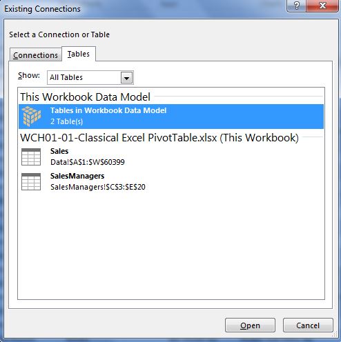
The Dashboard worksheet already has the Data Model created. To add a PivotTable from the Data Model present in the workbook, click the Insert tab and then the PivotTable button as shown in Post 1.3. To access the Data Model, select Choose Connection under Use an external data source and the Existing Connections window will appear. The Data Model in the workbook is under the Tables tab as shown in Figure 2.


Fig. 2: Creating a PivotTable from a Data Model
Now we have a blank PivotTable of the Data Model, from which we can select fields to display in a table. To make the Internet PivotTable, select the fields SalesTerritoryGroup, SalesTerritoyCountry, SalesTerritoryRegion, FiscalYear, and SalesAmount from the DimSalesTerritory, DimTime, and FactInternetSales tables. Place the fields into the quadrants as shown below in Figure 3.


Fig. 3: PivotTable Fields for Internet Sales

For the Resellers PivotTable, you also select the same fields except the SalesAmount field is from the FactResellerSales table. The fields are placed in the same areas below the field selection area. Now you have created the PivotTables for Internet and Reseller Sales, depicted in Figures 4 and 5, respectively. 


Fig. 4: Internet Sales PivotTable


Fig. 5: Reseller Sales PivotTable
Converting PivotTables to Excel tables

To convert the PivotTables to 'regular' Excel tables, use the Convert to Formulas button under the OLAP Tools drop down button located in the Analyze tab. Do this for both Internet Sales and Resellers Sales tables.


Fig. 6: Convert to Formulas Button

After converting both the PivotTables into Excel tables, you know have tables you can use to reference for the Dashboard. The two finished Excel tables are shown in the Figures 7 and 8 below. 


Fig. 7: Reseller Sales Table


Fig. 8: Internet Sales Table.

Creating the Dashboard

Now that we have the two Excel tables, we can create the Dashboard, using standard Excel formulas and certain formatting for cells. Start by copying the row labels to the new empty worksheet which will contain the Dashboard. Next label the column headings. You can add color formatting to distinguish the labels from the data as needed.


Fig. 9: Dashboard Labels
Notice in the Internet and Reseller Sales tables that they do have missing values in some cells. When converting the PivotTable into Excel tables, the empty cells in PivotTables return as empty string cells into Excel tables. Therefore we have to use IF() statements in the Dashboard to return numerical zeros when the cell is an empty string for the Total Sales when adding Internet and Reseller sales. 


Fig. 10: IF() formula for Total Sales in Europe in 2006
For the percentage in Growth columns, you can use the mathematical formula to find the difference between the two desired years and divide by the base year for the percentage.


Fig. 11: Formula for Total Sales Growth in 2007 from 2006
By dividing the sales of the Internet by Total Sales, you can calculate the percentage of sales from Internet sales (and Reseller sales when you divide Reseller sales by Total Sales) in each year.


Fig. 12: Formula for Percentage
The color formatting for the cells can be achieved through conditional formatting where you can set certain values in cells to have certain cell colors. You can format the cells by clicking on the Conditional Formatting button shown below in Figure 13.


Fig. 13: Conditional Formatting Button
Dashboards are indispensable for conveying important data and information in a condensed report. Patterns from conditional formatting in Dashboards can aid in visual analysis of the data. As you can see in Figure 13, some Regions in the United States and Australia show poor growth in red in 2007. Also, the distribution of Internet and Reseller sales in lean towards Resellers in North America, whereas in Europe they are distributed more evenly after the years. 

Now you have created a Dashboard containing information on Total Sales, percentage Growth in Sales, and percentage of Internet and Reseller sales by year and Country-Region. 

Thanks for reading,
Wayne

Wednesday, July 24, 2013

P1.4: Working Within PowerPivot- Excel 2013

Hello Reader. Here we explore the data model using PowerPivot in Excel 2013 with the Chapter 1 AdventureWorks workbook from the Ferrari PowerPivot book.


Working in PowerPivot

So far we have used Excel to create and manage PivotTables and data models. To utilize the advanced features of PowerPivot, we will interact with the data model through PowerPivot. Begin by opening the worksheet with the data model made in Post 2, and in the PowerPivot tab, click on Manage Data Model.


Fig. 1: Manage Data Model Button under PowerPivot Tab
A PowerPivot window appears, showing the Data View of the data model with the loaded tables in the model highlighted on the bottom left of Figure 2. You can browse through the elements in the tables of the data model in this view.


Fig. 2: PowerPivot Data View
To understand the data model from a graphical point of view, click the Diagram View button at the top of Figure 2. There is also a toggle button at the lower right hand corner to toggle between views. The Diagram View displays the tables and their relationships so you can clearly assess which tables are linked together. In Figure 3, relationship arrow starts at the source table, Sales, and ends at SalesManagers, the target table.


Fig. 2: Diagram View

Clicking on the arrow will highlight the the tables linked through the relationship and also the field within the tables which links them together.


Fig. 4: Highlighted Relationship of Tables

Later, you will learn how to modify the data model using the Diagram View in PowerPivot.

Thanks for reading,
Wayne

Monday, July 22, 2013

P1.3: Using a PivotTable to Query a Data Model- Excel 2013

Hello Reader. Here you will learn how to query a data model created in the past post with a PivotTable in Excel 2013.


Querying a Data Model

Start by opening the PivotTable workbook in Chapter 1 with the AdventureWorks dataset in Excel. To query, or use the data model containing the Sales and SalesManagers tables, you select the Insert tab and click on the PivotTable button.


Fig. 1: PivotTable Button on Insert Tab
A dialogue window appears showing options for creating a new PivotTable. In the first section, select Use an external data source and click the Choose Connection button for locating more data.


Fig. 2: Creat PivotTable Options
You can select the desired data model in the workbook by looking under the Tables tab and click Open, shown in the figure below. Also, you can note that individual tables in the workbook can be selected as well, which could be added to the data model by checking the Add this data to the Data Model box at the bottom of Figure 2.


Fig. 3: Data Model in Connections Window
Now you have a PivotTable from which you can select fields to query in the report.


Fig. 4: A New PivotTable
Note
When you create a PowerPivot data model, it is different and distinct from a Excel table. The table is not converted into a PivotTable when you add data from the table to the data model. Instead, Excel creates a PivotTable for the table and links them, so if the table data is modified, it reflects on the updated PivotTable. Once updated, the data model is updated as well. Essentially, the data is in the Excel table, and in PowerPivot.

Thanks for reading,

Wayne

Saturday, July 20, 2013

P1.2: Relationships and Data Models in PowerPivot- Excel 2013

This post describes how to establish relationships between tables, and create a data model in Excel 2013 using the PivotTable workbook in Chapter 1 of the Microsoft Excel 2013 book.


VLOOKUP and Relationships

From the previous post, you created a PivotTable displaying the Sales of Product Categories by Sales Manager, by Year.


Fig. 1: PivotTable of Sales of Product, by Sales Manager by Year
The SalesManager field was added to the Sales sheet via VLOOKUP from the SalesManagers sheet. However, you might have many additional fields (such Office) from the same sheet (of SalesManagers) or others you might like to add to the source sheet (Sales), but doing so with VLOOKUP would be inefficient. Using a relationship to link the target sheet (SalesManagers) to the source sheet (Sales) is the optimal way to enable analysis of multiple sheets of data in a PivotTable.


Creating a Relationship

To create a relationship, you click on the Data tab in Excel and then on the Relationships button as depicted in Figure 2.


Fig. 2: Data tab with Relationships button highlighted
For a new Relationship connecting the SalesManagers sheet to the Sales sheet, you select New.. on the right of the Relationship Manager, to create a new Relationship. Next you select the tables and the field name within the sheets you want to link as shown in Figure 3.


Fig. 3: Creating the Relationship
The table with the information is in the Sales table, and the column the tables have similar is ProductCategory. Now the related table you want to link is in the SalesManager table which has the related column of Category, which corresponds to the elements in ProductCategory in the Sales table. By clicking OK, you have created a relationship between the Sales and SalesManagers tables with the elements in ProductCategory/Category fields, respectively.


Fig. 4: Relationship Manager with new Relationship


The Data Model

A set of tables is a data model when the tables have a relationship linking them together. Otherwise, they are just tables.
Now that two tables have an established relationship, together, the two tables Sales and SalesManagers are considered a data model. To analyze the SalesManagers and Sales tables in a single PivotTable, go to the PivotTable you created, which only has one table's fields to choose from, and in the PivotTable Fields, scroll down and click on More Tables (Figure 5).


Fig. 5: Data Model via More Tables
The dialogue box that appears alludes to the properties of a data model, notifying you that if you want to analyze multiple tables, Excel will create a new PivotTable from the data model. You have two tables connected by a relationship, which forms the data model.


Fig. 6: Creating a New PivotTable Dialogue Box
After you click Yes, the new PivotTable, with two tables in the PivotTable Fields, is created from the data model. When you add the Office field from the SalesManagers table in the rows of the PivotTable , they display properly: in accordance to the office selling the specific product, even though the Office field was not added by VLOOKUP to the Sales table. They are linked via the relationship existing between the two tables by the Product Category.


Fig. 7: Sales of Sales Manager by Office by Year
In Figure 7, the Sales and SalesManagers tables can be seen in the Fields. The two tables can be expanded to reveal the fields, like the SalesManager table, or collasped to hide the fields, shown by the Sales table. You can select the fields from either table and drag it down to be analyzed in the PivotTable.


Thanks for reading,

Wayne